mirror of
https://github.com/spectreconsole/spectre.console.git
synced 2025-10-25 15:19:23 +00:00
Compare commits
146 Commits
| Author | SHA1 | Date | |
|---|---|---|---|
|
3c504155bc | ||
|
|
ae32785f21 | ||
|
c61e386440 | ||
|
|
b7cd7dd53e | ||
|
|
3e1251b86a | ||
|
|
01fdbac51e | ||
|
|
b0b988a1e7 | ||
|
|
2a9fa223de | ||
|
|
4f6eca4fcb | ||
|
|
a5125d640c | ||
|
|
a59e0dcb21 | ||
|
bde61cc6ff | ||
|
|
5c33b87a9c | ||
|
|
aaf77c3b25 | ||
|
|
d70ad661fc | ||
|
|
0d209d8f18 | ||
|
|
380c6aca45 | ||
|
|
b1da5e7ba8 | ||
|
|
be3350a411 | ||
|
|
a1d11e9d0c | ||
|
|
93d1971f48 | ||
|
bca1c889d1 | ||
|
9915a0d6a8 | ||
|
|
f34fc43d00 | ||
|
|
e7f497050c | ||
|
|
3e5e22d6c2 | ||
|
|
10daf727e9 | ||
|
|
03334f693d | ||
|
|
c9c0ad733f | ||
|
|
041bd016a2 | ||
|
|
037a215a78 | ||
|
|
9afc1ea721 | ||
|
b52056ee49 | ||
|
|
3941fd81ab | ||
|
|
5a1b8a1710 | ||
|
|
1410cba6c5 | ||
|
|
70fc14e9cd | ||
|
|
0b4359a52a | ||
|
|
cb2924a609 | ||
|
|
5c119ee0c3 | ||
|
|
b9d182b6e3 | ||
|
|
bfffef630f | ||
|
|
a2f507e58f | ||
|
|
d1d06d6a6b | ||
|
|
52718c499c | ||
|
|
7ef1ac483a | ||
|
|
c0875c912a | ||
|
|
3f2ca49071 | ||
|
0a0380ae0a | ||
|
|
ae92c606bb | ||
|
|
68e92f3365 | ||
|
|
39a8588dc3 | ||
|
|
3c3afe7439 | ||
|
971f9032ba | ||
|
|
5149557560 | ||
|
|
e0947708c9 | ||
|
|
b1db8a9403 | ||
|
|
a2f8652575 | ||
|
|
672faa131f | ||
|
|
e429f6434b | ||
|
|
93ec7401c8 | ||
|
|
697273917e | ||
|
|
2943535973 | ||
|
|
cd0d182f12 | ||
|
|
b197f278ed | ||
|
|
3847a8949f | ||
|
|
eeb3f967b6 | ||
|
|
090b30f731 | ||
|
|
df291ef84e | ||
|
|
7d6104ace4 | ||
|
314456ca17 | ||
|
|
b7f654cd7f | ||
|
|
fea8a36e8a | ||
|
|
0632b38477 | ||
|
|
a7b7d4e556 | ||
|
|
11d331e31d | ||
|
|
ce670a7ca9 | ||
|
|
101e244059 | ||
|
|
504746c5dc | ||
|
|
1601ef24b3 | ||
|
|
b46d0fa4f6 | ||
|
|
4f06687104 | ||
|
|
003e15686f | ||
|
|
3e9796849b | ||
|
|
3cc19520b0 | ||
|
|
87bde3e5a2 | ||
|
|
e6e9a4d950 | ||
|
|
29ce14e1e8 | ||
|
|
ceb3572d6a | ||
|
|
13c56eca01 | ||
|
|
a477884d36 | ||
|
|
ae6d2c63a3 | ||
|
|
e946289bd9 | ||
|
|
bcaaa6b2d3 | ||
|
|
d3588a4b06 | ||
|
|
7471e9d38c | ||
|
|
9f8ca6d648 | ||
|
|
88edfe68ec | ||
|
|
5d32764a64 | ||
|
|
4f6c9c62c7 | ||
|
|
f2677213a4 | ||
|
|
bdaf00a556 | ||
|
|
7de4b6c7b9 | ||
|
|
0bc801e3eb | ||
|
|
88a82cdad0 | ||
|
|
0cecb555d5 | ||
|
|
52e3ee17b0 | ||
|
caf7661e66 | ||
|
|
65f0a085cc | ||
|
|
a123806cd8 | ||
|
|
173645cdd2 | ||
|
|
7fd2efaeb5 | ||
|
|
47fd646d21 | ||
|
|
a06859dcb5 | ||
|
|
7d3a67e6ae | ||
|
|
f4497b1278 | ||
|
|
a16daade6c | ||
|
|
ab73d16583 | ||
|
|
f2566f2ca4 | ||
|
|
358b0225b4 | ||
|
|
68aaf8a2fa | ||
|
|
1b2f2dab82 | ||
|
|
270658b0bb | ||
|
|
21c210dc8a | ||
|
|
c546835198 | ||
|
|
3a432b11c8 | ||
|
|
3210afb698 | ||
|
|
f1912b1d44 | ||
|
|
decb887b0a | ||
|
|
31f117aed0 | ||
|
|
c111c7d463 | ||
|
|
695327ec72 | ||
|
|
6df90442b7 | ||
|
|
7182d01a23 | ||
|
|
8a01b93aca | ||
|
|
effdecb1d4 | ||
|
|
4cfe55cc27 | ||
|
|
5b33f80213 | ||
|
|
d7bbaf4a85 | ||
|
|
0119364728 | ||
|
|
1d74fb909c | ||
|
|
5d132220ba | ||
|
|
a273f74758 | ||
|
|
717931f11c | ||
|
|
bcfc495843 | ||
|
|
9aa36c4cf0 |
1
.github/funding.yml
vendored
Normal file
1
.github/funding.yml
vendored
Normal file
@@ -0,0 +1 @@
|
||||
github: patriksvensson
|
||||
54
.github/workflows/ci.yaml
vendored
54
.github/workflows/ci.yaml
vendored
@@ -6,6 +6,35 @@ env:
|
||||
DOTNET_CLI_TELEMETRY_OPTOUT: true
|
||||
|
||||
jobs:
|
||||
|
||||
###################################################
|
||||
# DOCS
|
||||
###################################################
|
||||
|
||||
docs:
|
||||
name: Documentation
|
||||
runs-on: ubuntu-latest
|
||||
steps:
|
||||
- name: Checkout
|
||||
uses: actions/checkout@master
|
||||
|
||||
- name: Setup dotnet
|
||||
uses: actions/setup-dotnet@v1
|
||||
with:
|
||||
dotnet-version: 5.0.100
|
||||
|
||||
- name: Build
|
||||
shell: bash
|
||||
env:
|
||||
GITHUB_TOKEN: ${{ secrets.GITHUB_TOKEN }}
|
||||
run: |
|
||||
cd docs
|
||||
dotnet run --configuration Release
|
||||
|
||||
###################################################
|
||||
# BUILD
|
||||
###################################################
|
||||
|
||||
build:
|
||||
name: Build
|
||||
if: "!contains(github.event.head_commit.message, 'skip-ci')"
|
||||
@@ -26,13 +55,32 @@ jobs:
|
||||
with:
|
||||
fetch-depth: 0
|
||||
|
||||
- name: Setup dotnet
|
||||
- name: Setup dotnet 3.1.402
|
||||
uses: actions/setup-dotnet@v1
|
||||
with:
|
||||
dotnet-version: 3.1.301
|
||||
dotnet-version: 3.1.402
|
||||
|
||||
- name: Setup dotnet 5.0.100
|
||||
uses: actions/setup-dotnet@v1
|
||||
with:
|
||||
dotnet-version: 5.0.100
|
||||
|
||||
- name: Integration Tests
|
||||
shell: bash
|
||||
run: |
|
||||
dotnet tool restore
|
||||
dotnet example --all
|
||||
|
||||
- name: Build
|
||||
shell: bash
|
||||
run: |
|
||||
dotnet tool restore
|
||||
dotnet cake
|
||||
dotnet cake
|
||||
|
||||
- name: Upload Verify Test Results
|
||||
if: failure()
|
||||
uses: actions/upload-artifact@v2
|
||||
with:
|
||||
name: verify-test-results
|
||||
path: |
|
||||
**/*.received.*
|
||||
35
.github/workflows/docs.yaml
vendored
Normal file
35
.github/workflows/docs.yaml
vendored
Normal file
@@ -0,0 +1,35 @@
|
||||
name: Deploy Documentation
|
||||
on:
|
||||
workflow_dispatch:
|
||||
push:
|
||||
paths:
|
||||
- 'docs/**'
|
||||
- 'src/**'
|
||||
|
||||
jobs:
|
||||
|
||||
###################################################
|
||||
# DOCS
|
||||
###################################################
|
||||
|
||||
build:
|
||||
name: Deploy
|
||||
runs-on: windows-latest
|
||||
steps:
|
||||
- name: Checkout
|
||||
uses: actions/checkout@v2
|
||||
with:
|
||||
fetch-depth: 0
|
||||
|
||||
- name: Setup dotnet
|
||||
uses: actions/setup-dotnet@v1
|
||||
with:
|
||||
dotnet-version: 5.0.100
|
||||
|
||||
- name: Publish
|
||||
shell: bash
|
||||
env:
|
||||
GITHUB_TOKEN: ${{ secrets.GITHUB_TOKEN }}
|
||||
run: |
|
||||
cd docs
|
||||
dotnet run --configuration Release -- deploy
|
||||
49
.github/workflows/publish.yaml
vendored
49
.github/workflows/publish.yaml
vendored
@@ -6,6 +6,8 @@ on:
|
||||
- '*'
|
||||
branches:
|
||||
- main
|
||||
paths:
|
||||
- 'src/**'
|
||||
|
||||
env:
|
||||
DOTNET_SKIP_FIRST_TIME_EXPERIENCE: true
|
||||
@@ -13,13 +15,38 @@ env:
|
||||
|
||||
jobs:
|
||||
|
||||
###################################################
|
||||
# DOCS
|
||||
###################################################
|
||||
|
||||
docs:
|
||||
name: Documentation
|
||||
runs-on: ubuntu-latest
|
||||
steps:
|
||||
- name: Checkout
|
||||
uses: actions/checkout@master
|
||||
|
||||
- name: Setup dotnet
|
||||
uses: actions/setup-dotnet@v1
|
||||
with:
|
||||
dotnet-version: 5.0.100
|
||||
|
||||
- name: Build
|
||||
shell: bash
|
||||
env:
|
||||
GITHUB_TOKEN: ${{ secrets.GITHUB_TOKEN }}
|
||||
run: |
|
||||
cd docs
|
||||
dotnet run --configuration Release
|
||||
|
||||
###################################################
|
||||
# BUILD
|
||||
###################################################
|
||||
|
||||
build:
|
||||
name: Build
|
||||
if: "!contains(github.event.head_commit.message, 'skip-ci')"
|
||||
needs: [docs]
|
||||
if: "!contains(github.event.head_commit.message, 'skip-ci') || startsWith(github.ref, 'refs/tags/')"
|
||||
strategy:
|
||||
matrix:
|
||||
kind: ['linux', 'windows', 'macOS']
|
||||
@@ -37,10 +64,15 @@ jobs:
|
||||
with:
|
||||
fetch-depth: 0
|
||||
|
||||
- name: Setup dotnet
|
||||
- name: Setup dotnet 3.1.402
|
||||
uses: actions/setup-dotnet@v1
|
||||
with:
|
||||
dotnet-version: 3.1.301
|
||||
dotnet-version: 3.1.402
|
||||
|
||||
- name: Setup dotnet 5.0.100
|
||||
uses: actions/setup-dotnet@v1
|
||||
with:
|
||||
dotnet-version: 5.0.100
|
||||
|
||||
- name: Build
|
||||
shell: bash
|
||||
@@ -55,7 +87,7 @@ jobs:
|
||||
publish:
|
||||
name: Publish
|
||||
needs: [build]
|
||||
if: "!contains(github.event.head_commit.message, 'skip-ci')"
|
||||
if: "!contains(github.event.head_commit.message, 'skip-ci') || startsWith(github.ref, 'refs/tags/')"
|
||||
runs-on: ubuntu-latest
|
||||
steps:
|
||||
- name: Checkout
|
||||
@@ -63,10 +95,15 @@ jobs:
|
||||
with:
|
||||
fetch-depth: 0
|
||||
|
||||
- name: Setup dotnet
|
||||
- name: Setup dotnet 3.1.402
|
||||
uses: actions/setup-dotnet@v1
|
||||
with:
|
||||
dotnet-version: 3.1.301
|
||||
dotnet-version: 3.1.402
|
||||
|
||||
- name: Setup dotnet 5.0.100
|
||||
uses: actions/setup-dotnet@v1
|
||||
with:
|
||||
dotnet-version: 5.0.100
|
||||
|
||||
- name: Publish
|
||||
shell: bash
|
||||
|
||||
4
.gitignore
vendored
4
.gitignore
vendored
@@ -5,6 +5,8 @@
|
||||
[Pp]ackages/
|
||||
/.artifacts/
|
||||
/[Tt]ools/
|
||||
.idea
|
||||
.DS_Store
|
||||
|
||||
# Cakeup
|
||||
cakeup-x86_64-latest.exe
|
||||
@@ -86,3 +88,5 @@ packages
|
||||
|
||||
# Windows
|
||||
Thumbs.db
|
||||
|
||||
*.received.*
|
||||
413
README.jp.md
Normal file
413
README.jp.md
Normal file
@@ -0,0 +1,413 @@
|
||||
# `Spectre.Console`
|
||||
|
||||
_[](https://www.nuget.org/packages/spectre.console)_
|
||||
|
||||
綺麗なコンソールアプリケーションを簡単に作成するための.NET Standard 2.0ライブラリです。
|
||||
Python用の素晴らしい[Rich ライブラリ](https://github.com/willmcgugan/rich)に強く影響を受けています。
|
||||
|
||||
## 目次
|
||||
|
||||
1. [特徴](#特徴)
|
||||
2. [例](#例)
|
||||
3. [使用方法](#使用方法)
|
||||
3.1. [Static APIの利用](#static-apiの利用)
|
||||
3.2. [コンソールの作成](#コンソールの作成)
|
||||
4. [例の実行](#例の実行)
|
||||
5. [クイックスタート](#クイックスタート)
|
||||
6. [マークアップ](#マークアップ)
|
||||
7. [絵文字](#絵文字)
|
||||
8. [テーブル](#テーブル)
|
||||
9. [例外](#例外)
|
||||
|
||||
## 特徴
|
||||
|
||||
* ユニットテストを意識して書いています。
|
||||
* table、grid、panel、マークアップ言語に影響を受けた [rich](https://github.com/willmcgugan/rich) に対応しています。
|
||||
* 太字、薄字、斜字、下線、斜線、点滅などの一般的なSGR parameters に対応しています。
|
||||
* ターミナルで 3/4/8/24ビットカラーに対応しています。
|
||||
ライブラリは現在のターミナルの性能を検知し、必要なカラーにダウングレードします
|
||||
|
||||
## 例
|
||||
|
||||

|
||||
|
||||
## 使用方法
|
||||
|
||||
`Spectre.Console` APIはステートフルで、スレッドセーフではありません。
|
||||
異なるスレッドからコンソールに書く必要がある場合、通常の`System.Console` APIを使用するときと同様、適切な注意を払ってください。
|
||||
|
||||
現在の端末がANSIエスケープシーケンスに対応していない場合、
|
||||
`Spectre.Console`は、`System.Console` APIの利用に切り替わります。
|
||||
|
||||
_メモ: このライブラリは現在開発中で、APIは1.0のリリースまでの間に変更されたり、
|
||||
削除されたりする可能性があります。_
|
||||
|
||||
### Static APIの利用
|
||||
|
||||
|
||||
`System.Console` APIでするように、テキストを出力したいだけの時にはstatic APIが最適ですが、綺麗です。
|
||||
|
||||
```csharp
|
||||
AnsiConsole.Foreground = Color.CornflowerBlue;
|
||||
AnsiConsole.Decoration = Decoration.Underline | Decoration.Bold;
|
||||
AnsiConsole.WriteLine("Hello World!");
|
||||
|
||||
AnsiConsole.Reset();
|
||||
AnsiConsole.MarkupLine("[bold yellow on red]{0}[/] [underline]world[/]!", "Goodbye");
|
||||
```
|
||||
|
||||
もし、デフォルトの`IAnsiConsole`への参照を取得したい場合、
|
||||
`AnsiConsole.Console`経由でアクセスできます。
|
||||
|
||||
### コンソールの作成
|
||||
|
||||
単体テスト中にコードの実行環境を制御したい場合など、
|
||||
特定の機能をもつコンソールを明示的に作成すると便利なことがあります。
|
||||
|
||||
単体テストの一部としてコードで `AnsiConsole`を使わないことを推奨します。
|
||||
|
||||
```csharp
|
||||
IAnsiConsole console = AnsiConsole.Create(
|
||||
new AnsiConsoleSettings()
|
||||
{
|
||||
Ansi = AnsiSupport.Yes,
|
||||
ColorSystem = ColorSystemSupport.TrueColor,
|
||||
Out = new StringWriter(),
|
||||
});
|
||||
```
|
||||
|
||||
_メモ: 主導でコンソールを作成しているときに特定のカラーシステムを指定できたとしても、
|
||||
ユーザーのターミナルでは使えないかもしれないことを覚えておいてください。
|
||||
テスト用にIAnsiConsoleを作成していない限り、
|
||||
常に`ColorSystemSupport.Detect` と `AnsiSupport.Detect`を使用してください。_
|
||||
|
||||
## 例の実行
|
||||
|
||||
Spectre.Consoleでできることを見るために、
|
||||
[dotnet-example](https://github.com/patriksvensson/dotnet-example)グローバルツールをインストールします。
|
||||
|
||||
|
||||
```
|
||||
> dotnet tool restore
|
||||
```
|
||||
|
||||
このリポジトリで提供している例が一覧表示されます
|
||||
|
||||
```
|
||||
> dotnet example
|
||||
|
||||
╭────────────┬───────────────────────────────────────┬──────────────────────────────────────────────────────╮
|
||||
│ Name │ Path │ Description │
|
||||
├────────────┼───────────────────────────────────────┼──────────────────────────────────────────────────────┤
|
||||
│ Borders │ examples/Borders/Borders.csproj │ Demonstrates the different kind of borders. │
|
||||
│ Calendars │ examples/Calendars/Calendars.csproj │ Demonstrates how to render calendars. │
|
||||
│ Colors │ examples/Colors/Colors.csproj │ Demonstrates how to use colors in the console. │
|
||||
│ Columns │ examples/Columns/Columns.csproj │ Demonstrates how to render data into columns. │
|
||||
│ Emojis │ examples/Emojis/Emojis.csproj │ Demonstrates how to render emojis. │
|
||||
│ Exceptions │ examples/Exceptions/Exceptions.csproj │ Demonstrates how to render formatted exceptions. │
|
||||
│ Grids │ examples/Grids/Grids.csproj │ Demonstrates how to render grids in a console. │
|
||||
│ Info │ examples/Info/Info.csproj │ Displays the capabilities of the current console. │
|
||||
│ Links │ examples/Links/Links.csproj │ Demonstrates how to render links in a console. │
|
||||
│ Panels │ examples/Panels/Panels.csproj │ Demonstrates how to render items in panels. │
|
||||
│ Rules │ examples/Rules/Rules.csproj │ Demonstrates how to render horizontal rules (lines). │
|
||||
│ Tables │ examples/Tables/Tables.csproj │ Demonstrates how to render tables in a console. │
|
||||
╰────────────┴───────────────────────────────────────┴──────────────────────────────────────────────────────╯
|
||||
```
|
||||
|
||||
そして、例を実行します
|
||||
|
||||
```
|
||||
> dotnet example tables
|
||||
┌──────────┬──────────┬────────┐
|
||||
│ Foo │ Bar │ Baz │
|
||||
├──────────┼──────────┼────────┤
|
||||
│ Hello │ World! │ │
|
||||
│ Bonjour │ le │ monde! │
|
||||
│ Hej │ Världen! │ │
|
||||
└──────────┴──────────┴────────┘
|
||||
```
|
||||
|
||||
## クイックスタート
|
||||
pectre.Consoleの利用を開始する最初の方法は、Nugetパッケージをインストールすることです。
|
||||
|
||||
```shell
|
||||
> dotnet add package Spectre.Console
|
||||
```
|
||||
|
||||
その後、`Spectre.Console`名前空間を参照する必要があります。一度参照したら、提供されている全ての機能を使用できます。
|
||||
|
||||
```csharp
|
||||
using Spectre.Console
|
||||
|
||||
public static class Program
|
||||
{
|
||||
public static void Main(string[] args)
|
||||
{
|
||||
AnsiConsole.Markup("[underline red]Hello[/] World!");
|
||||
}
|
||||
}
|
||||
```
|
||||
|
||||
## マークアップ
|
||||
`Markup`クラスは、コンソールにリッチなテキストを出力することができます。
|
||||
|
||||
### 文法
|
||||
|
||||
コンソールマークアップはbbcodeに影響を受けた文法を利用します。角括弧でスタイルを書いたら(スタイルを参照)、例えば、`[bold red]`
|
||||
は、`[/]`で閉じるまでスタイルが適用されます。
|
||||
|
||||
```csharp
|
||||
AnsiConsole.Render(new Markup("[bold yellow]Hello[/] [red]World![/]"));
|
||||
```
|
||||
|
||||
`Markup` クラスは`IRenderable`を実装しており、table、grid、Panelを使用できることを意味します。
|
||||
`IRenderable`のレンダリングに対応している多くのクラスは、リッチテキストの描画を上書きます。
|
||||
|
||||
```csharp
|
||||
var table = new Table();
|
||||
table.AddColumn(new TableColumn(new Markup("[yellow]Foo[/]")));
|
||||
table.AddColumn(new TableColumn("[blue]Bar[/]"));
|
||||
```
|
||||
|
||||
### 便利なメソッド
|
||||
|
||||
`AnsiConsole`には、新しい`Markup`インスタンスをインスタンス化することなく、コンソールにマークアップテキストを書き込める便利なメソッドがあります。
|
||||
|
||||
```csharp
|
||||
AnsiConsole.Markup("[underline green]Hello[/] ");
|
||||
AnsiConsole.MarkupLine("[bold]World[/]");
|
||||
```
|
||||
|
||||
### エスケープ文字列
|
||||
|
||||
`[`を出力するために、 `[[`を利用し、`]`を出力するために`]]`を利用します。
|
||||
|
||||
```csharp
|
||||
AnsiConsole.Markup("[[Hello]] "); // [Hello]
|
||||
AnsiConsole.Markup("[red][[World]][/]"); // [World]
|
||||
```
|
||||
|
||||
`SafeMarkup`拡張メソッドを使用することもできます。
|
||||
|
||||
```csharp
|
||||
AnsiConsole.Markup("[red]{0}[/]", "Hello [World]".SafeMarkup());
|
||||
```
|
||||
|
||||
### カラー
|
||||
|
||||
`new Style(foreground: Color.Maroon)`のようなコード、または、`AnsiConsole.Markup("[maroon on blue]Hello[/]")`のようなマークアップテキストで色を使用できます。
|
||||
|
||||
### 背景色の設定
|
||||
|
||||
カラー指定の際に、`on`を付けることで、マークアップで背景色を設定できます。
|
||||
|
||||
```
|
||||
[bold yellow on blue]Hello[/]
|
||||
[default on blue]World[/]
|
||||
```
|
||||
|
||||
### 絵文字の描画
|
||||
|
||||
マークアップの一部として絵文字を出力するために、emojiショートコードが使用できます。
|
||||
|
||||
```csharp
|
||||
AnsiConsole.MarkupLine("Hello :globe_showing_europe_africa:!");
|
||||
```
|
||||
|
||||
emojiのスタイルについては、付録の[Emoji](./appendix/emojis) を参照してください。
|
||||
|
||||
### カラー
|
||||
|
||||
上の例では、全ての色は名前で参照されています。
|
||||
しかし、16進数やRGB表現をマークダウンで色指定に使用できます。
|
||||
|
||||
```csharp
|
||||
AnsiConsole.Markup("[red]Foo[/] ");
|
||||
AnsiConsole.Markup("[#ff0000]Bar[/] ");
|
||||
AnsiConsole.Markup("[rgb(255,0,0)]Baz[/] ");
|
||||
```
|
||||
|
||||
## 絵文字
|
||||
|
||||
どのような絵文字が使用できるかは、使用しているOSやターミナルに依存し、どのように表示されるかは保証されません。絵文字の幅計算は正確ではないため、表、パネル、グリッドで使用する場合は表示がずれるかもしれません。
|
||||
|
||||
完全な互換性を確保するために、Unicode 13.0 より以前の`Emoji_Presentation`カテゴリにあるものだけを使用することを検討してください。
|
||||
公式の絵文字一覧
|
||||
https://www.unicode.org/Public/UCD/latest/ucd/emoji/emoji-data.txt
|
||||
|
||||
|
||||
```csharp
|
||||
// Markup
|
||||
AnsiConsole.MarkupLine("Hello :globe_showing_europe_africa:!");
|
||||
|
||||
// Constant
|
||||
var hello = "Hello " + Emoji.Known.GlobeShowingEuropeAfrica;
|
||||
```
|
||||
|
||||
テキスト内の絵文字を置き換えることができます。
|
||||
|
||||
```csharp
|
||||
var phrase = "Mmmm :birthday_cake:";
|
||||
var rendered
|
||||
```
|
||||
|
||||
既存の絵文字を別のものにしたり、完全に新しい物を追加したいことがあります。このために、`Emoji.Remap`メソッドを使用できます。
|
||||
この方法は、マークアップ文字と`Emoji.Replace`の両方で動作します。
|
||||
|
||||
```csharp
|
||||
// Remap the emoji
|
||||
Emoji.Remap("globe_showing_europe_africa", "😄");
|
||||
|
||||
// Render markup
|
||||
AnsiConsole.MarkupLine("Hello :globe_showing_europe_africa:!");
|
||||
|
||||
// Replace emojis in string
|
||||
var phrase = "Hello :globe_showing_europe_africa:!";
|
||||
var rendered = Emoji.Replace(phrase);
|
||||
```
|
||||
|
||||
## テーブル
|
||||
|
||||
テーブルはターミナルで表データを表示するのに完璧な方法です。
|
||||
`Spectre.Console` は、テーブルの描画にとても優れていて、全てのカラムは中に合わせて調整してくれます。
|
||||
`IRenderable`を実装しているものは、列ヘッダやセル、別のテーブルとして使用できます。
|
||||
|
||||
### 使い方
|
||||
|
||||
テーブルを描画するために、`Table`インスタンスを作成し、必要な数の列を追加し、行を追加します。
|
||||
テーブルをコンソールの`Render`メソッドに渡して終わりです。
|
||||
|
||||
```csharp
|
||||
// テーブルの作成
|
||||
var table = new Table();
|
||||
|
||||
// 列の追加
|
||||
table.AddColumn("Foo");
|
||||
table.AddColumn(new TableColumn("Bar").Centered());
|
||||
|
||||
// 行の追加
|
||||
table.AddRow("Baz", "[green]Qux[/]");
|
||||
table.AddRow(new Markup("[blue]Corgi[/]"), new Panel("Waldo"));
|
||||
|
||||
// コンソールにテーブルの描画
|
||||
AnsiConsole.Render(table);
|
||||
```
|
||||
|
||||
これは次のように出力を描画します。
|
||||
|
||||

|
||||
|
||||
### 罫線
|
||||
|
||||
|
||||
```csharp
|
||||
// 罫線を設定します
|
||||
table.SetBorder(Border.None);
|
||||
table.SetBorder(Border.Ascii);
|
||||
table.SetBorder(Border.Square);
|
||||
table.SetBorder(Border.Rounded);
|
||||
```
|
||||
|
||||
### 拡大 / 縮小
|
||||
|
||||
```csharp
|
||||
// テーブル幅を最大に設定します
|
||||
table.Expand();
|
||||
|
||||
// テーブル幅を最小に設定します
|
||||
table.Collapse();
|
||||
```
|
||||
|
||||
### ヘッダーを隠す
|
||||
|
||||
```csharp
|
||||
// 全ての列のヘッダーを隠します
|
||||
table.HideHeaders();
|
||||
```
|
||||
|
||||
### テーブル幅の設定
|
||||
|
||||
```csharp
|
||||
// テーブル幅50セルに設定します
|
||||
table.SetWidth(50);
|
||||
```
|
||||
|
||||
### 整列(アライメント)
|
||||
|
||||
```csharp
|
||||
// 整列を明示的に設定する
|
||||
column.SetAlignment(Justify.Right);
|
||||
```
|
||||
|
||||
### パディング
|
||||
|
||||
```csharp
|
||||
// 左と右のパディングを設定する
|
||||
column.SetPadding(left: 3, right: 5);
|
||||
|
||||
// 個別にパディングを設定する
|
||||
column.PadLeft(3);
|
||||
column.PadRight(5);
|
||||
```
|
||||
|
||||
### 列改行の無効化
|
||||
|
||||
```csharp
|
||||
// 列改行の無効化
|
||||
column.NoWrap();
|
||||
```
|
||||
|
||||
### 列幅の設定
|
||||
|
||||
```csharp
|
||||
// 列幅の設定(これはまだ柔軟な拡張メソッドがありません)
|
||||
column.Width = 15;
|
||||
```
|
||||
|
||||
## 例外
|
||||
例外はターミナルで見たときに読みやすいとは限りません。
|
||||
`WriteException`メソッドを使用することで、例外をもう少し読みやすくすることができます。
|
||||
|
||||
```csharp
|
||||
AnsiConsole.WriteException(ex);
|
||||
```
|
||||
|
||||

|
||||
### 例外の省略表示
|
||||
|
||||
例外の特定部分を短くして、さらに読みやすくしたり、パスをクリック可能なハイパーリンクにすることもできます。
|
||||
ハイパーリンクがクリックできるかはターミナル次第です。
|
||||
|
||||
|
||||
```csharp
|
||||
AnsiConsole.WriteException(ex,
|
||||
ExceptionFormats.ShortenPaths | ExceptionFormats.ShortenTypes |
|
||||
ExceptionFormats.ShortenMethods | ExceptionFormats.ShowLinks);
|
||||
```
|
||||
|
||||

|
||||
|
||||
### 例外出力のカスタマイズ
|
||||
|
||||
例外の特定部分を短縮するだけでなく、デフォルトのスタイルを上書きすることもできます。
|
||||
|
||||
```csharp
|
||||
AnsiConsole.WriteException(ex, new ExceptionSettings
|
||||
{
|
||||
Format = ExceptionFormats.ShortenEverything | ExceptionFormats.ShowLinks,
|
||||
Style = new ExceptionStyle
|
||||
{
|
||||
Exception = Style.WithForeground(Color.Grey),
|
||||
Message = Style.WithForeground(Color.White),
|
||||
NonEmphasized = Style.WithForeground(Color.Cornsilk1),
|
||||
Parenthesis = Style.WithForeground(Color.Cornsilk1),
|
||||
Method = Style.WithForeground(Color.Red),
|
||||
ParameterName = Style.WithForeground(Color.Cornsilk1),
|
||||
ParameterType = Style.WithForeground(Color.Red),
|
||||
Path = Style.WithForeground(Color.Red),
|
||||
LineNumber = Style.WithForeground(Color.Cornsilk1),
|
||||
}
|
||||
});
|
||||
```
|
||||
|
||||

|
||||
358
README.md
358
README.md
@@ -2,361 +2,71 @@
|
||||
|
||||
_[](https://www.nuget.org/packages/spectre.console)_
|
||||
|
||||
A .NET Standard 2.0 library that makes it easier to create beautiful console applications.
|
||||
A .NET 5/.NET Standard 2.0 library that makes it easier to create beautiful, cross platform, console applications.
|
||||
It is heavily inspired by the excellent [Rich library](https://github.com/willmcgugan/rich)
|
||||
for Python.
|
||||
|
||||
## Table of Contents
|
||||
|
||||
1. [Features](#features)
|
||||
2. [Example](#example)
|
||||
3. [Usage](#usage)
|
||||
3.1. [Using the static API](#using-the-static-api)
|
||||
3.2. [Creating a console](#creating-a-console)
|
||||
4. [Available styles](#available-styles)
|
||||
5. [Predefined colors](#predefined-colors)
|
||||
2. [Installing](#installing)
|
||||
3. [Documentation](#documentation)
|
||||
4. [Examples](#examples)
|
||||
5. [License](#license)
|
||||
|
||||
## Features
|
||||
|
||||
* Written with unit testing in mind.
|
||||
* Supports tables, grids, panels, and a [rich](https://github.com/willmcgugan/rich) inspired markup language.
|
||||
* Supports the most common SRG parameters when it comes to text
|
||||
styling such as bold, dim, italic, underline, strikethrough,
|
||||
and blinking text.
|
||||
* Supports 3/4/8/24-bit colors in the terminal.
|
||||
The library will detect the capabilities of the current terminal
|
||||
and downgrade colors as needed.
|
||||
and downgrade colors as needed.
|
||||
|
||||
## Example
|
||||
|
||||
|
||||

|
||||
|
||||
## Usage
|
||||
## Installing
|
||||
|
||||
The `Spectre.Console` API is stateful and is not thread-safe.
|
||||
If you need to write to the console from different threads, make sure that
|
||||
you take appropriate precautions, just like when you use the
|
||||
regular `System.Console` API.
|
||||
|
||||
If the current terminal does not support ANSI escape sequences,
|
||||
`Spectre.Console` will fallback to using the `System.Console` API.
|
||||
|
||||
_NOTE: This library is currently under development and API's
|
||||
might change or get removed at any point up until a 1.0 release._
|
||||
|
||||
### Using the static API
|
||||
|
||||
The static API is perfect when you just want to output text
|
||||
like you usually do with the `System.Console` API, but prettier.
|
||||
The fastest way of getting started using `Spectre.Console` is to install the NuGet package.
|
||||
|
||||
```csharp
|
||||
AnsiConsole.Foreground = Color.CornflowerBlue;
|
||||
AnsiConsole.Decoration = Decoration.Underline | Decoration.Bold;
|
||||
AnsiConsole.WriteLine("Hello World!");
|
||||
|
||||
AnsiConsole.Reset();
|
||||
AnsiConsole.MarkupLine("[bold yellow on red]{0}[/] [underline]world[/]!", "Goodbye");
|
||||
dotnet add package Spectre.Console
|
||||
```
|
||||
|
||||
If you want to get a reference to the default `IAnsiConsole`,
|
||||
you can access it via `AnsiConsole.Console`.
|
||||
## Documentation
|
||||
|
||||
### Creating a console
|
||||
The documentation for `Spectre.Console` can be found at
|
||||
https://spectresystems.github.io/spectre.console/
|
||||
|
||||
Sometimes it's useful to explicitly create a console with specific
|
||||
capabilities, such as during unit testing when you want control
|
||||
over the environment your code runs in.
|
||||
## Examples
|
||||
|
||||
It's recommended to not use `AnsiConsole` in code that run as
|
||||
part of a unit test.
|
||||
To see `Spectre.Console` in action, install the
|
||||
[dotnet-example](https://github.com/patriksvensson/dotnet-example)
|
||||
global tool.
|
||||
|
||||
```csharp
|
||||
IAnsiConsole console = AnsiConsole.Create(
|
||||
new AnsiConsoleSettings()
|
||||
{
|
||||
Ansi = AnsiSupport.Yes,
|
||||
ColorSystem = ColorSystemSupport.TrueColor,
|
||||
Out = new StringWriter(),
|
||||
});
|
||||
```
|
||||
> dotnet tool restore
|
||||
```
|
||||
|
||||
_NOTE: Even if you can specify a specific color system to use
|
||||
when manually creating a console, remember that the user's terminal
|
||||
might not be able to use it, so unless you're creating an IAnsiConsole
|
||||
for testing, always use `ColorSystemSupport.Detect` and `AnsiSupport.Detect`._
|
||||
Now you can list available examples in this repository:
|
||||
|
||||
## Available styles
|
||||
```
|
||||
> dotnet example
|
||||
```
|
||||
|
||||
_NOTE: Not all styles are supported in every terminal._
|
||||
And to run an example:
|
||||
|
||||
Name | Description
|
||||
--- | ---
|
||||
`bold` | Bold text
|
||||
`dim` | Dim or faint text
|
||||
`italic` | Italic text
|
||||
`underline` | Underlined text
|
||||
`invert` | Swaps the foreground and background colors
|
||||
`conceal` | Hides the text
|
||||
`slowblink` | Makes text blink slowly
|
||||
`rapidblink` | Makes text blink
|
||||
`strikethrough` | Shows text with a horizontal line through the center
|
||||
```
|
||||
> dotnet example tables
|
||||
```
|
||||
|
||||
## Predefined colors
|
||||
## License
|
||||
|
||||
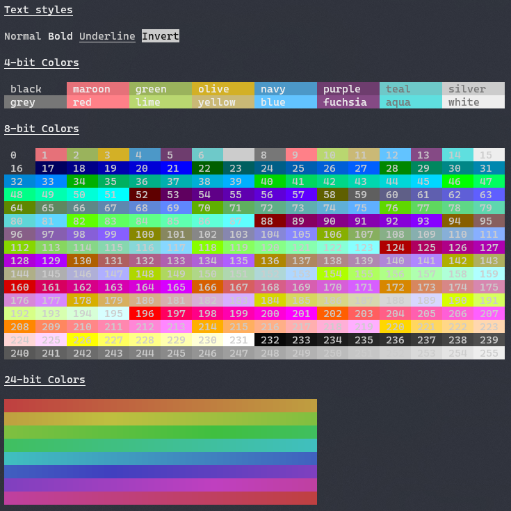
Number | Name | RGB | Hex | System.ConsoleColor
|
||||
--- | --- | --- | --- | ---
|
||||
`0` | `black` | `0,0,0` | `#000000` | `Black`
|
||||
`1` | `maroon` | `128,0,0` | `#800000` | `DarkRed`
|
||||
`2` | `green` | `0,128,0` | `#008000` | `DarkGreen`
|
||||
`3` | `olive` | `128,128,0` | `#808000` | `DarkYellow`
|
||||
`4` | `navy` | `0,0,128` | `#000080` | `DarkBlue`
|
||||
`5` | `purple` | `128,0,128` | `#800080` | `DarkMagenta`
|
||||
`6` | `teal` | `0,128,128` | `#008080` | `DarkCyan`
|
||||
`7` | `silver` | `192,192,192` | `#c0c0c0` | `Gray`
|
||||
`8` | `grey` | `128,128,128` | `#808080` | `DarkGray`
|
||||
`9` | `red` | `255,0,0` | `#ff0000` | `Red`
|
||||
`10` | `lime` | `0,255,0` | `#00ff00` | `Green`
|
||||
`11` | `yellow` | `255,255,0` | `#ffff00` | `Yellow`
|
||||
`12` | `blue` | `0,0,255` | `#0000ff` | `Blue`
|
||||
`13` | `fuchsia` | `255,0,255` | `#ff00ff` | `Magenta`
|
||||
`14` | `aqua` | `0,255,255` | `#00ffff` | `Cyan`
|
||||
`15` | `white` | `255,255,255` | `#ffffff` | `White`
|
||||
`16` | `grey0` | `0,0,0` | `#000000`
|
||||
`17` | `navyblue` | `0,0,95` | `#00005f`
|
||||
`18` | `darkblue` | `0,0,135` | `#000087`
|
||||
`19` | `blue3` | `0,0,175` | `#0000af`
|
||||
`20` | `blue3_1` | `0,0,215` | `#0000d7`
|
||||
`21` | `blue1` | `0,0,255` | `#0000ff`
|
||||
`22` | `darkgreen` | `0,95,0` | `#005f00`
|
||||
`23` | `deepskyblue4` | `0,95,95` | `#005f5f`
|
||||
`24` | `deepskyblue4_1` | `0,95,135` | `#005f87`
|
||||
`25` | `deepskyblue4_2` | `0,95,175` | `#005faf`
|
||||
`26` | `dodgerblue3` | `0,95,215` | `#005fd7`
|
||||
`27` | `dodgerblue2` | `0,95,255` | `#005fff`
|
||||
`28` | `green4` | `0,135,0` | `#008700`
|
||||
`29` | `springgreen4` | `0,135,95` | `#00875f`
|
||||
`30` | `turquoise4` | `0,135,135` | `#008787`
|
||||
`31` | `deepskyblue3` | `0,135,175` | `#0087af`
|
||||
`32` | `deepskyblue3_1` | `0,135,215` | `#0087d7`
|
||||
`33` | `dodgerblue1` | `0,135,255` | `#0087ff`
|
||||
`34` | `green3` | `0,175,0` | `#00af00`
|
||||
`35` | `springgreen3` | `0,175,95` | `#00af5f`
|
||||
`36` | `darkcyan` | `0,175,135` | `#00af87`
|
||||
`37` | `lightseagreen` | `0,175,175` | `#00afaf`
|
||||
`38` | `deepskyblue2` | `0,175,215` | `#00afd7`
|
||||
`39` | `deepskyblue1` | `0,175,255` | `#00afff`
|
||||
`40` | `green3_1` | `0,215,0` | `#00d700`
|
||||
`41` | `springgreen3_1` | `0,215,95` | `#00d75f`
|
||||
`42` | `springgreen2` | `0,215,135` | `#00d787`
|
||||
`43` | `cyan3` | `0,215,175` | `#00d7af`
|
||||
`44` | `darkturquoise` | `0,215,215` | `#00d7d7`
|
||||
`45` | `turquoise2` | `0,215,255` | `#00d7ff`
|
||||
`46` | `green1` | `0,255,0` | `#00ff00`
|
||||
`47` | `springgreen2_1` | `0,255,95` | `#00ff5f`
|
||||
`48` | `springgreen1` | `0,255,135` | `#00ff87`
|
||||
`49` | `mediumspringgreen` | `0,255,175` | `#00ffaf`
|
||||
`50` | `cyan2` | `0,255,215` | `#00ffd7`
|
||||
`51` | `cyan1` | `0,255,255` | `#00ffff`
|
||||
`52` | `darkred` | `95,0,0` | `#5f0000`
|
||||
`53` | `deeppink4` | `95,0,95` | `#5f005f`
|
||||
`54` | `purple4` | `95,0,135` | `#5f0087`
|
||||
`55` | `purple4_1` | `95,0,175` | `#5f00af`
|
||||
`56` | `purple3` | `95,0,215` | `#5f00d7`
|
||||
`57` | `blueviolet` | `95,0,255` | `#5f00ff`
|
||||
`58` | `orange4` | `95,95,0` | `#5f5f00`
|
||||
`59` | `grey37` | `95,95,95` | `#5f5f5f`
|
||||
`60` | `mediumpurple4` | `95,95,135` | `#5f5f87`
|
||||
`61` | `slateblue3` | `95,95,175` | `#5f5faf`
|
||||
`62` | `slateblue3_1` | `95,95,215` | `#5f5fd7`
|
||||
`63` | `royalblue1` | `95,95,255` | `#5f5fff`
|
||||
`64` | `chartreuse4` | `95,135,0` | `#5f8700`
|
||||
`65` | `darkseagreen4` | `95,135,95` | `#5f875f`
|
||||
`66` | `paleturquoise4` | `95,135,135` | `#5f8787`
|
||||
`67` | `steelblue` | `95,135,175` | `#5f87af`
|
||||
`68` | `steelblue3` | `95,135,215` | `#5f87d7`
|
||||
`69` | `cornflowerblue` | `95,135,255` | `#5f87ff`
|
||||
`70` | `chartreuse3` | `95,175,0` | `#5faf00`
|
||||
`71` | `darkseagreen4_1` | `95,175,95` | `#5faf5f`
|
||||
`72` | `cadetblue` | `95,175,135` | `#5faf87`
|
||||
`73` | `cadetblue_1` | `95,175,175` | `#5fafaf`
|
||||
`74` | `skyblue3` | `95,175,215` | `#5fafd7`
|
||||
`75` | `steelblue1` | `95,175,255` | `#5fafff`
|
||||
`76` | `chartreuse3_1` | `95,215,0` | `#5fd700`
|
||||
`77` | `palegreen3` | `95,215,95` | `#5fd75f`
|
||||
`78` | `seagreen3` | `95,215,135` | `#5fd787`
|
||||
`79` | `aquamarine3` | `95,215,175` | `#5fd7af`
|
||||
`80` | `mediumturquoise` | `95,215,215` | `#5fd7d7`
|
||||
`81` | `steelblue1_1` | `95,215,255` | `#5fd7ff`
|
||||
`82` | `chartreuse2` | `95,255,0` | `#5fff00`
|
||||
`83` | `seagreen2` | `95,255,95` | `#5fff5f`
|
||||
`84` | `seagreen1` | `95,255,135` | `#5fff87`
|
||||
`85` | `seagreen1_1` | `95,255,175` | `#5fffaf`
|
||||
`86` | `aquamarine1` | `95,255,215` | `#5fffd7`
|
||||
`87` | `darkslategray2` | `95,255,255` | `#5fffff`
|
||||
`88` | `darkred_1` | `135,0,0` | `#870000`
|
||||
`89` | `deeppink4_1` | `135,0,95` | `#87005f`
|
||||
`90` | `darkmagenta` | `135,0,135` | `#870087`
|
||||
`91` | `darkmagenta_1` | `135,0,175` | `#8700af`
|
||||
`92` | `darkviolet` | `135,0,215` | `#8700d7`
|
||||
`93` | `purple_1` | `135,0,255` | `#8700ff`
|
||||
`94` | `orange4_1` | `135,95,0` | `#875f00`
|
||||
`95` | `lightpink4` | `135,95,95` | `#875f5f`
|
||||
`96` | `plum4` | `135,95,135` | `#875f87`
|
||||
`97` | `mediumpurple3` | `135,95,175` | `#875faf`
|
||||
`98` | `mediumpurple3_1` | `135,95,215` | `#875fd7`
|
||||
`99` | `slateblue1` | `135,95,255` | `#875fff`
|
||||
`100` | `yellow4` | `135,135,0` | `#878700`
|
||||
`101` | `wheat4` | `135,135,95` | `#87875f`
|
||||
`102` | `grey53` | `135,135,135` | `#878787`
|
||||
`103` | `lightslategrey` | `135,135,175` | `#8787af`
|
||||
`104` | `mediumpurple` | `135,135,215` | `#8787d7`
|
||||
`105` | `lightslateblue` | `135,135,255` | `#8787ff`
|
||||
`106` | `yellow4_1` | `135,175,0` | `#87af00`
|
||||
`107` | `darkolivegreen3` | `135,175,95` | `#87af5f`
|
||||
`108` | `darkseagreen` | `135,175,135` | `#87af87`
|
||||
`109` | `lightskyblue3` | `135,175,175` | `#87afaf`
|
||||
`110` | `lightskyblue3_1` | `135,175,215` | `#87afd7`
|
||||
`111` | `skyblue2` | `135,175,255` | `#87afff`
|
||||
`112` | `chartreuse2_1` | `135,215,0` | `#87d700`
|
||||
`113` | `darkolivegreen3_1` | `135,215,95` | `#87d75f`
|
||||
`114` | `palegreen3_1` | `135,215,135` | `#87d787`
|
||||
`115` | `darkseagreen3` | `135,215,175` | `#87d7af`
|
||||
`116` | `darkslategray3` | `135,215,215` | `#87d7d7`
|
||||
`117` | `skyblue1` | `135,215,255` | `#87d7ff`
|
||||
`118` | `chartreuse1` | `135,255,0` | `#87ff00`
|
||||
`119` | `lightgreen` | `135,255,95` | `#87ff5f`
|
||||
`120` | `lightgreen_1` | `135,255,135` | `#87ff87`
|
||||
`121` | `palegreen1` | `135,255,175` | `#87ffaf`
|
||||
`122` | `aquamarine1_1` | `135,255,215` | `#87ffd7`
|
||||
`123` | `darkslategray1` | `135,255,255` | `#87ffff`
|
||||
`124` | `red3` | `175,0,0` | `#af0000`
|
||||
`125` | `deeppink4_2` | `175,0,95` | `#af005f`
|
||||
`126` | `mediumvioletred` | `175,0,135` | `#af0087`
|
||||
`127` | `magenta3` | `175,0,175` | `#af00af`
|
||||
`128` | `darkviolet_1` | `175,0,215` | `#af00d7`
|
||||
`129` | `purple_2` | `175,0,255` | `#af00ff`
|
||||
`130` | `darkorange3` | `175,95,0` | `#af5f00`
|
||||
`131` | `indianred` | `175,95,95` | `#af5f5f`
|
||||
`132` | `hotpink3` | `175,95,135` | `#af5f87`
|
||||
`133` | `mediumorchid3` | `175,95,175` | `#af5faf`
|
||||
`134` | `mediumorchid` | `175,95,215` | `#af5fd7`
|
||||
`135` | `mediumpurple2` | `175,95,255` | `#af5fff`
|
||||
`136` | `darkgoldenrod` | `175,135,0` | `#af8700`
|
||||
`137` | `lightsalmon3` | `175,135,95` | `#af875f`
|
||||
`138` | `rosybrown` | `175,135,135` | `#af8787`
|
||||
`139` | `grey63` | `175,135,175` | `#af87af`
|
||||
`140` | `mediumpurple2_1` | `175,135,215` | `#af87d7`
|
||||
`141` | `mediumpurple1` | `175,135,255` | `#af87ff`
|
||||
`142` | `gold3` | `175,175,0` | `#afaf00`
|
||||
`143` | `darkkhaki` | `175,175,95` | `#afaf5f`
|
||||
`144` | `navajowhite3` | `175,175,135` | `#afaf87`
|
||||
`145` | `grey69` | `175,175,175` | `#afafaf`
|
||||
`146` | `lightsteelblue3` | `175,175,215` | `#afafd7`
|
||||
`147` | `lightsteelblue` | `175,175,255` | `#afafff`
|
||||
`148` | `yellow3` | `175,215,0` | `#afd700`
|
||||
`149` | `darkolivegreen3_2` | `175,215,95` | `#afd75f`
|
||||
`150` | `darkseagreen3_1` | `175,215,135` | `#afd787`
|
||||
`151` | `darkseagreen2` | `175,215,175` | `#afd7af`
|
||||
`152` | `lightcyan3` | `175,215,215` | `#afd7d7`
|
||||
`153` | `lightskyblue1` | `175,215,255` | `#afd7ff`
|
||||
`154` | `greenyellow` | `175,255,0` | `#afff00`
|
||||
`155` | `darkolivegreen2` | `175,255,95` | `#afff5f`
|
||||
`156` | `palegreen1_1` | `175,255,135` | `#afff87`
|
||||
`157` | `darkseagreen2_1` | `175,255,175` | `#afffaf`
|
||||
`158` | `darkseagreen1` | `175,255,215` | `#afffd7`
|
||||
`159` | `paleturquoise1` | `175,255,255` | `#afffff`
|
||||
`160` | `red3_1` | `215,0,0` | `#d70000`
|
||||
`161` | `deeppink3` | `215,0,95` | `#d7005f`
|
||||
`162` | `deeppink3_1` | `215,0,135` | `#d70087`
|
||||
`163` | `magenta3_1` | `215,0,175` | `#d700af`
|
||||
`164` | `magenta3_2` | `215,0,215` | `#d700d7`
|
||||
`165` | `magenta2` | `215,0,255` | `#d700ff`
|
||||
`166` | `darkorange3_1` | `215,95,0` | `#d75f00`
|
||||
`167` | `indianred_1` | `215,95,95` | `#d75f5f`
|
||||
`168` | `hotpink3_1` | `215,95,135` | `#d75f87`
|
||||
`169` | `hotpink2` | `215,95,175` | `#d75faf`
|
||||
`170` | `orchid` | `215,95,215` | `#d75fd7`
|
||||
`171` | `mediumorchid1` | `215,95,255` | `#d75fff`
|
||||
`172` | `orange3` | `215,135,0` | `#d78700`
|
||||
`173` | `lightsalmon3_1` | `215,135,95` | `#d7875f`
|
||||
`174` | `lightpink3` | `215,135,135` | `#d78787`
|
||||
`175` | `pink3` | `215,135,175` | `#d787af`
|
||||
`176` | `plum3` | `215,135,215` | `#d787d7`
|
||||
`177` | `violet` | `215,135,255` | `#d787ff`
|
||||
`178` | `gold3_1` | `215,175,0` | `#d7af00`
|
||||
`179` | `lightgoldenrod3` | `215,175,95` | `#d7af5f`
|
||||
`180` | `tan` | `215,175,135` | `#d7af87`
|
||||
`181` | `mistyrose3` | `215,175,175` | `#d7afaf`
|
||||
`182` | `thistle3` | `215,175,215` | `#d7afd7`
|
||||
`183` | `plum2` | `215,175,255` | `#d7afff`
|
||||
`184` | `yellow3_1` | `215,215,0` | `#d7d700`
|
||||
`185` | `khaki3` | `215,215,95` | `#d7d75f`
|
||||
`186` | `lightgoldenrod2` | `215,215,135` | `#d7d787`
|
||||
`187` | `lightyellow3` | `215,215,175` | `#d7d7af`
|
||||
`188` | `grey84` | `215,215,215` | `#d7d7d7`
|
||||
`189` | `lightsteelblue1` | `215,215,255` | `#d7d7ff`
|
||||
`190` | `yellow2` | `215,255,0` | `#d7ff00`
|
||||
`191` | `darkolivegreen1` | `215,255,95` | `#d7ff5f`
|
||||
`192` | `darkolivegreen1_1` | `215,255,135` | `#d7ff87`
|
||||
`193` | `darkseagreen1_1` | `215,255,175` | `#d7ffaf`
|
||||
`194` | `honeydew2` | `215,255,215` | `#d7ffd7`
|
||||
`195` | `lightcyan1` | `215,255,255` | `#d7ffff`
|
||||
`196` | `red1` | `255,0,0` | `#ff0000`
|
||||
`197` | `deeppink2` | `255,0,95` | `#ff005f`
|
||||
`198` | `deeppink1` | `255,0,135` | `#ff0087`
|
||||
`199` | `deeppink1_1` | `255,0,175` | `#ff00af`
|
||||
`200` | `magenta2_1` | `255,0,215` | `#ff00d7`
|
||||
`201` | `magenta1` | `255,0,255` | `#ff00ff`
|
||||
`202` | `orangered1` | `255,95,0` | `#ff5f00`
|
||||
`203` | `indianred1` | `255,95,95` | `#ff5f5f`
|
||||
`204` | `indianred1_1` | `255,95,135` | `#ff5f87`
|
||||
`205` | `hotpink` | `255,95,175` | `#ff5faf`
|
||||
`206` | `hotpink_1` | `255,95,215` | `#ff5fd7`
|
||||
`207` | `mediumorchid1_1` | `255,95,255` | `#ff5fff`
|
||||
`208` | `darkorange` | `255,135,0` | `#ff8700`
|
||||
`209` | `salmon1` | `255,135,95` | `#ff875f`
|
||||
`210` | `lightcoral` | `255,135,135` | `#ff8787`
|
||||
`211` | `palevioletred1` | `255,135,175` | `#ff87af`
|
||||
`212` | `orchid2` | `255,135,215` | `#ff87d7`
|
||||
`213` | `orchid1` | `255,135,255` | `#ff87ff`
|
||||
`214` | `orange1` | `255,175,0` | `#ffaf00`
|
||||
`215` | `sandybrown` | `255,175,95` | `#ffaf5f`
|
||||
`216` | `lightsalmon1` | `255,175,135` | `#ffaf87`
|
||||
`217` | `lightpink1` | `255,175,175` | `#ffafaf`
|
||||
`218` | `pink1` | `255,175,215` | `#ffafd7`
|
||||
`219` | `plum1` | `255,175,255` | `#ffafff`
|
||||
`220` | `gold1` | `255,215,0` | `#ffd700`
|
||||
`221` | `lightgoldenrod2_1` | `255,215,95` | `#ffd75f`
|
||||
`222` | `lightgoldenrod2_2` | `255,215,135` | `#ffd787`
|
||||
`223` | `navajowhite1` | `255,215,175` | `#ffd7af`
|
||||
`224` | `mistyrose1` | `255,215,215` | `#ffd7d7`
|
||||
`225` | `thistle1` | `255,215,255` | `#ffd7ff`
|
||||
`226` | `yellow1` | `255,255,0` | `#ffff00`
|
||||
`227` | `lightgoldenrod1` | `255,255,95` | `#ffff5f`
|
||||
`228` | `khaki1` | `255,255,135` | `#ffff87`
|
||||
`229` | `wheat1` | `255,255,175` | `#ffffaf`
|
||||
`230` | `cornsilk1` | `255,255,215` | `#ffffd7`
|
||||
`231` | `grey100` | `255,255,255` | `#ffffff`
|
||||
`232` | `grey3` | `8,8,8` | `#080808`
|
||||
`233` | `grey7` | `18,18,18` | `#121212`
|
||||
`234` | `grey11` | `28,28,28` | `#1c1c1c`
|
||||
`235` | `grey15` | `38,38,38` | `#262626`
|
||||
`236` | `grey19` | `48,48,48` | `#303030`
|
||||
`237` | `grey23` | `58,58,58` | `#3a3a3a`
|
||||
`238` | `grey27` | `68,68,68` | `#444444`
|
||||
`239` | `grey30` | `78,78,78` | `#4e4e4e`
|
||||
`240` | `grey35` | `88,88,88` | `#585858`
|
||||
`241` | `grey39` | `98,98,98` | `#626262`
|
||||
`242` | `grey42` | `108,108,108` | `#6c6c6c`
|
||||
`243` | `grey46` | `118,118,118` | `#767676`
|
||||
`244` | `grey50` | `128,128,128` | `#808080`
|
||||
`245` | `grey54` | `138,138,138` | `#8a8a8a`
|
||||
`246` | `grey58` | `148,148,148` | `#949494`
|
||||
`247` | `grey62` | `158,158,158` | `#9e9e9e`
|
||||
`248` | `grey66` | `168,168,168` | `#a8a8a8`
|
||||
`249` | `grey70` | `178,178,178` | `#b2b2b2`
|
||||
`250` | `grey74` | `188,188,188` | `#bcbcbc`
|
||||
`251` | `grey78` | `198,198,198` | `#c6c6c6`
|
||||
`252` | `grey82` | `208,208,208` | `#d0d0d0`
|
||||
`253` | `grey85` | `218,218,218` | `#dadada`
|
||||
`254` | `grey89` | `228,228,228` | `#e4e4e4`
|
||||
`255` | `grey93` | `238,238,238` | `#eeeeee`
|
||||
Copyright © Spectre Systems.
|
||||
|
||||
Spectre.Console is provided as-is under the MIT license. For more information see LICENSE.
|
||||
|
||||
* For SixLabors.ImageSharp, see https://github.com/SixLabors/ImageSharp/blob/master/LICENSE
|
||||
65
README.zh.md
Normal file
65
README.zh.md
Normal file
@@ -0,0 +1,65 @@
|
||||
# `Spectre.Console`
|
||||
|
||||
_[](https://www.nuget.org/packages/spectre.console)_
|
||||
|
||||
`Spectre.Console`是一个 .NET 5/.NET Standard 2.0 的库,能让您在终端里更方便地生成精美的界面。
|
||||
|
||||
深受 [Rich](https://github.com/willmcgugan/rich) 这个优秀库的启发。
|
||||
|
||||
## 目录
|
||||
|
||||
1. [功能](#features)
|
||||
2. [安装](#installing)
|
||||
3. [文档](#documentation)
|
||||
4. [例子](#examples)
|
||||
5. [License](#license)
|
||||
|
||||
## 功能
|
||||
|
||||
* 编写时考虑到了单元测试。
|
||||
* 支持 tables、grid、panel 和 [rich](https://github.com/willmcgugan/rich) 所支持的标记语言。
|
||||
* 支持大部分的 SRG 参数,包括粗体、暗淡字、斜体、下划线、删除线和闪烁文本。
|
||||
* 支持终端显示 3/4/8/24 位色。自动检测终端类型,自适应颜色范围。
|
||||
|
||||

|
||||
|
||||
## 安装
|
||||
|
||||
最快的安装方式,就是用NuGet包管理直接安装Spectre.Console。
|
||||
|
||||
```csharp
|
||||
dotnet add package Spectre.Console
|
||||
```
|
||||
|
||||
## 文档
|
||||
|
||||
`Spectre.Console`的文档可以在这里查看
|
||||
https://spectresystems.github.io/spectre.console/
|
||||
|
||||
## 例子
|
||||
|
||||
如果想直接运行`Spectre.Console`的例子,则需要安装[dotnet-example](https://github.com/patriksvensson/dotnet-example)工具。
|
||||
|
||||
```
|
||||
> dotnet tool restore
|
||||
```
|
||||
|
||||
然后你可以列出仓库里的所有例子:
|
||||
|
||||
```
|
||||
> dotnet example
|
||||
```
|
||||
|
||||
跑一个看看效果:
|
||||
|
||||
```
|
||||
> dotnet example tables
|
||||
```
|
||||
|
||||
## License
|
||||
|
||||
版权所有 © Spectre Systems。
|
||||
|
||||
Spectre.Console 基于 MIT 协议提供。查看 LICENSE 文件了解更多信息。
|
||||
|
||||
* SixLabors.ImageSharp 的协议请查看 https://github.com/SixLabors/ImageSharp/blob/master/LICENSE
|
||||
@@ -39,7 +39,6 @@ Task("Package")
|
||||
OutputDirectory = "./.artifacts",
|
||||
MSBuildSettings = new DotNetCoreMSBuildSettings()
|
||||
.TreatAllWarningsAs(MSBuildTreatAllWarningsAs.Error)
|
||||
.WithProperty("SymbolPackageFormat", "snupkg")
|
||||
});
|
||||
});
|
||||
|
||||
|
||||
39
docs/.gitignore
vendored
Normal file
39
docs/.gitignore
vendored
Normal file
@@ -0,0 +1,39 @@
|
||||
[Bb]in/
|
||||
[Bb]uild/
|
||||
[Oo]bj/
|
||||
[Dd]ebug/
|
||||
[Rr]elease/
|
||||
[Pp]ackages/
|
||||
[Tt]ools/
|
||||
![Tt]ools/packages.config
|
||||
[Oo]utput/
|
||||
![Ii]nput/
|
||||
nuget.exe
|
||||
*.com
|
||||
*.class
|
||||
*.exe
|
||||
*.o
|
||||
*.so
|
||||
*.user
|
||||
Thumbs.db
|
||||
_ReSharper*
|
||||
*ReSharper.user
|
||||
*dotCover
|
||||
.JustCode
|
||||
*.suo
|
||||
.svn
|
||||
ipch
|
||||
*.ilk
|
||||
*.sdf
|
||||
*.opensdf
|
||||
*.pdb
|
||||
/*.~vsd
|
||||
*UpgradeWizard*
|
||||
.vs/*
|
||||
TestResult.xml
|
||||
/debug.log
|
||||
/packages.xml
|
||||
*.ncrunch*
|
||||
.*crunch*.local.xml
|
||||
/_NCrunch_Statiq.Framework
|
||||
*.pfx
|
||||
49
docs/Docs.csproj
Normal file
49
docs/Docs.csproj
Normal file
@@ -0,0 +1,49 @@
|
||||
<Project Sdk="Microsoft.NET.Sdk">
|
||||
|
||||
<PropertyGroup>
|
||||
<OutputType>Exe</OutputType>
|
||||
<TargetFramework>net5.0</TargetFramework>
|
||||
<RunWorkingDirectory>$(MSBuildProjectDirectory)</RunWorkingDirectory>
|
||||
<DefaultItemExcludes>$(DefaultItemExcludes);output\**;.gitignore</DefaultItemExcludes>
|
||||
<MinVerSkip Condition="'$(Configuration)' == 'Debug'">true</MinVerSkip>
|
||||
</PropertyGroup>
|
||||
|
||||
<ItemGroup>
|
||||
<Compile Remove="input\**" />
|
||||
<Compile Remove="sass\**" />
|
||||
</ItemGroup>
|
||||
|
||||
<ItemGroup>
|
||||
<None Include="input\**">
|
||||
<CopyToOutputDirectory>Never</CopyToOutputDirectory>
|
||||
</None>
|
||||
<None Include="sass\**">
|
||||
<CopyToOutputDirectory>Never</CopyToOutputDirectory>
|
||||
</None>
|
||||
</ItemGroup>
|
||||
|
||||
<ItemGroup>
|
||||
<None Remove="src\Data\emojis.json" />
|
||||
</ItemGroup>
|
||||
|
||||
<ItemGroup>
|
||||
<EmbeddedResource Include="src\Data\emojis.json" />
|
||||
</ItemGroup>
|
||||
|
||||
<ItemGroup>
|
||||
<PackageReference Include="Statiq.Web" Version="1.0.0-beta.13" />
|
||||
<PackageReference Include="MinVer" PrivateAssets="All" Version="2.3.1" />
|
||||
</ItemGroup>
|
||||
|
||||
<ItemGroup>
|
||||
<Folder Include="input\assets\images\emojis\" />
|
||||
</ItemGroup>
|
||||
|
||||
<Target Name="Versioning" BeforeTargets="MinVer">
|
||||
<PropertyGroup Label="Build">
|
||||
<MinVerDefaultPreReleasePhase>preview</MinVerDefaultPreReleasePhase>
|
||||
<MinVerVerbosity>normal</MinVerVerbosity>
|
||||
</PropertyGroup>
|
||||
</Target>
|
||||
|
||||
</Project>
|
||||
25
docs/Docs.sln
Normal file
25
docs/Docs.sln
Normal file
@@ -0,0 +1,25 @@
|
||||
|
||||
Microsoft Visual Studio Solution File, Format Version 12.00
|
||||
# Visual Studio Version 16
|
||||
VisualStudioVersion = 16.0.30011.22
|
||||
MinimumVisualStudioVersion = 10.0.40219.1
|
||||
Project("{9A19103F-16F7-4668-BE54-9A1E7A4F7556}") = "Docs", "Docs.csproj", "{C337F609-A890-4E52-BDA3-91658039B0E3}"
|
||||
EndProject
|
||||
Global
|
||||
GlobalSection(SolutionConfigurationPlatforms) = preSolution
|
||||
Debug|Any CPU = Debug|Any CPU
|
||||
Release|Any CPU = Release|Any CPU
|
||||
EndGlobalSection
|
||||
GlobalSection(ProjectConfigurationPlatforms) = postSolution
|
||||
{C337F609-A890-4E52-BDA3-91658039B0E3}.Debug|Any CPU.ActiveCfg = Debug|Any CPU
|
||||
{C337F609-A890-4E52-BDA3-91658039B0E3}.Debug|Any CPU.Build.0 = Debug|Any CPU
|
||||
{C337F609-A890-4E52-BDA3-91658039B0E3}.Release|Any CPU.ActiveCfg = Release|Any CPU
|
||||
{C337F609-A890-4E52-BDA3-91658039B0E3}.Release|Any CPU.Build.0 = Release|Any CPU
|
||||
EndGlobalSection
|
||||
GlobalSection(SolutionProperties) = preSolution
|
||||
HideSolutionNode = FALSE
|
||||
EndGlobalSection
|
||||
GlobalSection(ExtensibilityGlobals) = postSolution
|
||||
SolutionGuid = {2FB3922B-494A-45EB-A479-FC507B8E107C}
|
||||
EndGlobalSection
|
||||
EndGlobal
|
||||
1
docs/Preview.ps1
Normal file
1
docs/Preview.ps1
Normal file
@@ -0,0 +1 @@
|
||||
dotnet run -- preview --virtual-dir "spectre.console"
|
||||
38
docs/Program.cs
Normal file
38
docs/Program.cs
Normal file
@@ -0,0 +1,38 @@
|
||||
using System.Threading.Tasks;
|
||||
using Docs.Shortcodes;
|
||||
using Statiq.App;
|
||||
using Statiq.Common;
|
||||
using Statiq.Web;
|
||||
|
||||
namespace Docs
|
||||
{
|
||||
public static class Program
|
||||
{
|
||||
public static async Task<int> Main(string[] args) =>
|
||||
await Bootstrapper.Factory
|
||||
.CreateWeb(args)
|
||||
.AddSetting(Keys.Host, "spectresystems.github.io")
|
||||
.AddSetting(Keys.LinkRoot, "/spectre.console")
|
||||
.AddSetting(Keys.LinksUseHttps, true)
|
||||
.AddSetting(Constants.EditLink, ConfigureEditLink())
|
||||
.ConfigureSite("spectresystems", "spectre.console", "main")
|
||||
.ConfigureDeployment(deployBranch: "docs")
|
||||
.AddShortcode("Children", typeof(ChildrenShortcode))
|
||||
.AddShortcode("ColorTable", typeof(ColorTableShortcode))
|
||||
.AddShortcode("EmojiTable", typeof(EmojiTableShortcode))
|
||||
.AddPipelines()
|
||||
.RunAsync();
|
||||
|
||||
private static Config<string> ConfigureEditLink()
|
||||
{
|
||||
return Config.FromDocument((doc, ctx) =>
|
||||
{
|
||||
return string.Format("https://github.com/{0}/{1}/edit/{2}/docs/input/{3}",
|
||||
ctx.GetString(Constants.Site.Owner),
|
||||
ctx.GetString(Constants.Site.Repository),
|
||||
ctx.GetString(Constants.Site.Branch),
|
||||
doc.Source.GetRelativeInputPath());
|
||||
});
|
||||
}
|
||||
}
|
||||
}
|
||||
50
docs/README.md
Normal file
50
docs/README.md
Normal file
@@ -0,0 +1,50 @@
|
||||
# Documentation
|
||||
|
||||
To start contributing to the [Spectre.Console](https://github.com/spectresystems/spectre.console) documentation, you will need the [.NET Core SDK](https://dot.net) 3.1 or higher.
|
||||
|
||||
## Running Preview Site
|
||||
|
||||
The documentation site uses [Statiq](https://statiq.dev), a static site generator. To build the documentation site run the following in a command-line terminal.
|
||||
|
||||
```
|
||||
> dotnet run preview --virtual-dir "spectre.console"
|
||||
```
|
||||
|
||||
After the build is complete, you can navigate to [http://localhost:5080/spectre.console](http://localhost:5080/spectre.console).
|
||||
|
||||
**Note that the site runs under a virtual directory.**
|
||||
|
||||
## Editing Content
|
||||
|
||||
The documentation is written using [Markdown](https://www.markdownguide.org/basic-syntax/).
|
||||
|
||||
Markdown files can be found under the following directories:
|
||||
|
||||
- [/input](./input)
|
||||
- [/appendix](./input/appendix)
|
||||
|
||||
## Editing Layout
|
||||
|
||||
Layout and styling can also be found in the [input](./input) directory. Look for Sass, Css, and Images under the [assets](./input/assets) directory.
|
||||
|
||||
## Custom Build Features
|
||||
|
||||
The documentation site has custom enhancements to Statiq located under the [./src](./src) directory. Enhancements to the build process include:
|
||||
|
||||
- [Extension Methods](./src/Extensions)
|
||||
- [Models](./src/Models)
|
||||
- [Pipelines](./src/Pipelines)
|
||||
- [Shortcodes](./src/Shortcodes)
|
||||
- [Utilities](./src/Utilities)
|
||||
|
||||
## License
|
||||
|
||||
MIT License
|
||||
|
||||
Copyright (c) 2020 Spectre Systems AB
|
||||
|
||||
Permission is hereby granted, free of charge, to any person obtaining a copy of this software and associated documentation files (the "Software"), to deal in the Software without restriction, including without limitation the rights to use, copy, modify, merge, publish, distribute, sublicense, and/or sell copies of the Software, and to permit persons to whom the Software is furnished to do so, subject to the following conditions:
|
||||
|
||||
The above copyright notice and this permission notice shall be included in all copies or substantial portions of the Software.
|
||||
|
||||
THE SOFTWARE IS PROVIDED "AS IS", WITHOUT WARRANTY OF ANY KIND, EXPRESS OR IMPLIED, INCLUDING BUT NOT LIMITED TO THE WARRANTIES OF MERCHANTABILITY, FITNESS FOR A PARTICULAR PURPOSE AND NONINFRINGEMENT. IN NO EVENT SHALL THE AUTHORS OR COPYRIGHT HOLDERS BE LIABLE FOR ANY CLAIM, DAMAGES OR OTHER LIABILITY, WHETHER IN AN ACTION OF CONTRACT, TORT OR OTHERWISE, ARISING FROM, OUT OF OR IN CONNECTION WITH THE SOFTWARE OR THE USE OR OTHER DEALINGS IN THE SOFTWARE.
|
||||
256
docs/input/_layout.cshtml
Normal file
256
docs/input/_layout.cshtml
Normal file
@@ -0,0 +1,256 @@
|
||||
<!DOCTYPE html>
|
||||
<html>
|
||||
<head>
|
||||
<meta charset="utf-8">
|
||||
<meta http-equiv="X-UA-Compatible" content="IE=Edge">
|
||||
<meta name="viewport" content="width=device-width, initial-scale=1.0">
|
||||
|
||||
<link href="@Context.GetLink("/assets/bootstrap/bootstrap.css")" rel="stylesheet" />
|
||||
<link href="@Context.GetLink("/assets/css/styles.css")" rel="stylesheet" />
|
||||
<link href="https://fonts.googleapis.com/css2?family=Roboto+Mono:wght@400;700&family=Roboto+Slab:wght@400;700&family=Roboto:ital,wght@0,300;0,400;0,700;1,300;1,400;1,700&display=swap" rel="stylesheet" data-no-mirror>
|
||||
<link rel="stylesheet" href="https://cdn.jsdelivr.net/npm/prismjs@1.19.0/themes/prism.css">
|
||||
|
||||
<script src="https://code.jquery.com/jquery-3.4.1.slim.min.js" integrity="sha384-J6qa4849blE2+poT4WnyKhv5vZF5SrPo0iEjwBvKU7imGFAV0wwj1yYfoRSJoZ+n" crossorigin="anonymous"></script>
|
||||
<script src="https://cdn.jsdelivr.net/npm/popper.js@1.16.0/dist/umd/popper.min.js" integrity="sha384-Q6E9RHvbIyZFJoft+2mJbHaEWldlvI9IOYy5n3zV9zzTtmI3UksdQRVvoxMfooAo" crossorigin="anonymous"></script>
|
||||
<script src="https://stackpath.bootstrapcdn.com/bootstrap/4.4.1/js/bootstrap.min.js" integrity="sha384-wfSDF2E50Y2D1uUdj0O3uMBJnjuUD4Ih7YwaYd1iqfktj0Uod8GCExl3Og8ifwB6" crossorigin="anonymous"></script>
|
||||
<script src="https://kit.fontawesome.com/a1cad7ed9a.js" crossorigin="anonymous" data-no-mirror></script>
|
||||
<script src="https://cdn.jsdelivr.net/npm/mermaid@8.4.8/dist/mermaid.min.js"></script>
|
||||
<script src="https://cdn.jsdelivr.net/npm/svg-pan-zoom@3.6.1/dist/svg-pan-zoom.min.js"></script>
|
||||
<script src="https://cdn.jsdelivr.net/npm/prismjs@1.19.0/components/prism-core.min.js"></script>
|
||||
<script src="https://cdn.jsdelivr.net/npm/prismjs@1.19.0/plugins/autoloader/prism-autoloader.min.js" data-no-mirror></script>
|
||||
|
||||
@{
|
||||
string title = @Document.ContainsKey(Keys.Title) ? $"Spectre.Console - {Document.GetString(Keys.Title)}" : "Spectre.Console";
|
||||
}
|
||||
<title>@title</title>
|
||||
</head>
|
||||
<body class="d-flex flex-column">
|
||||
<div class="flex-grow-1 d-flex flex-column">
|
||||
|
||||
<nav id="topnav" class="navbar navbar-expand-lg navbar-light">
|
||||
<div class="container py-3">
|
||||
<a class="navbar-brand" href="@Context.GetLink("/")"><img id="logo" src="@Context.GetLink("/assets/logo.svg")" alt="Spectre.Console"> Spectre.Console</a>
|
||||
<button class="navbar-toggler" type="button" data-toggle="collapse" data-target="#navbarText" aria-controls="navbarText" aria-expanded="false" aria-label="Toggle navigation">
|
||||
<span class="navbar-toggler-icon"></span>
|
||||
</button>
|
||||
<div class="collapse navbar-collapse" id="navbarText">
|
||||
<ul class="navbar-nav mr-auto">
|
||||
</ul>
|
||||
<ul class="navbar-nav">
|
||||
<li class="nav-item">
|
||||
<a class="nav-link font-weight-light font-size-lg text-red" href="https://github.com/sponsors/patriksvensson"><i class="far fa-heart"></i> Sponsor</a>
|
||||
</li>
|
||||
<li class="nav-item">
|
||||
<a class="nav-link font-weight-light font-size-lg" href="https://github.com/spectresystems/spectre.console"><i class="fab fa-github"></i> GitHub</a>
|
||||
</li>
|
||||
</ul>
|
||||
</div>
|
||||
</div>
|
||||
</nav>
|
||||
|
||||
@if (IsSectionDefined(Constants.Sections.Splash))
|
||||
{
|
||||
@RenderSection(Constants.Sections.Splash, false)
|
||||
}
|
||||
@{
|
||||
string section = "docs";
|
||||
}
|
||||
|
||||
<div class="flex-grow-1 d-flex bg-body flex-column @(section != null ? "section-" + section : null)">
|
||||
@if(section != null)
|
||||
{
|
||||
<div id="titlebar" class="py-4">
|
||||
<div class="container">
|
||||
<div class="row">
|
||||
@{
|
||||
string titleBarClasses = Document.GetBool(Constants.NoSidebar) ? string.Empty : "offset-md-3 offset-lg-2";
|
||||
}
|
||||
<div class="@titleBarClasses px-3 px-md-0">
|
||||
<div class="section text-uppercase">Spectre.Console</div>
|
||||
<div class="text-white m-0 title">@(Document.GetString(Keys.Title) ?? Document.GetTitle())</div>
|
||||
@if (IsSectionDefined(Constants.Sections.Subtitle))
|
||||
{
|
||||
@RenderSection(Constants.Sections.Subtitle, false)
|
||||
}
|
||||
</div>
|
||||
</div>
|
||||
</div>
|
||||
</div>
|
||||
<div id="undertitle">
|
||||
<div class="container bg-body">
|
||||
<div class="row">
|
||||
@if (Document.GetBool(Constants.NoSidebar))
|
||||
{
|
||||
<div class="col">
|
||||
</div>
|
||||
}
|
||||
else
|
||||
{
|
||||
<div class="col-md-3 col-lg-2 bg-body">
|
||||
</div>
|
||||
<div class="col-md-9 col-lg-8 bg-white">
|
||||
</div>
|
||||
}
|
||||
<div class="col-lg-2 d-none d-lg-block bg-section">
|
||||
</div>
|
||||
</div>
|
||||
</div>
|
||||
</div>
|
||||
}
|
||||
|
||||
<div class="flex-grow-1 d-flex flex-column bg-body">
|
||||
@if (Document.GetBool(Constants.NoContainer))
|
||||
{
|
||||
<div class="bg-white">
|
||||
@RenderBody()
|
||||
</div>
|
||||
}
|
||||
else
|
||||
{
|
||||
<div class="container flex-grow-1 d-flex flex-column bg-white">
|
||||
<div class="row flex-grow-1 align-items-stretch">
|
||||
@if (Document.GetBool(Constants.NoSidebar))
|
||||
{
|
||||
IgnoreSection(Constants.Sections.Sidebar);
|
||||
|
||||
<div class="col">
|
||||
@RenderBody()
|
||||
</div>
|
||||
}
|
||||
else
|
||||
{
|
||||
<div class="sidebar col-md-3 col-lg-2 pt-2 bg-body">
|
||||
@if (IsSectionDefined(Constants.Sections.Sidebar))
|
||||
{
|
||||
@RenderSection(Constants.Sections.Sidebar, false)
|
||||
}
|
||||
else
|
||||
{
|
||||
IDocument root = OutputPages["index.html"].First();
|
||||
<div class="sidebar-nav-item @(Document.IdEquals(root) ? "active" : null)">
|
||||
@if(root.ShowLink())
|
||||
{
|
||||
@Html.DocumentLink(root)
|
||||
}
|
||||
else
|
||||
{
|
||||
@root.GetTitle()
|
||||
}
|
||||
</div>
|
||||
|
||||
@foreach (IDocument document in OutputPages.GetChildrenOf(root).OnlyVisible())
|
||||
{
|
||||
if(string.IsNullOrWhiteSpace(document.GetTitle()))
|
||||
{
|
||||
continue;
|
||||
}
|
||||
|
||||
DocumentList<IDocument> documentChildren = OutputPages.GetChildrenOf(document);
|
||||
<div class="sidebar-nav-item @(Document.IdEquals(document) ? "active" : null) @(documentChildren.Any() ? "has-children" : null)">
|
||||
@if(document.ShowLink())
|
||||
{
|
||||
@Html.DocumentLink(document)
|
||||
}
|
||||
else
|
||||
{
|
||||
@document.GetTitle()
|
||||
}
|
||||
</div>
|
||||
|
||||
@if (documentChildren.OnlyVisible().Any())
|
||||
{
|
||||
<div class="sidebar-nav-children @(Document.IdEquals(document) || documentChildren.Any(x => Document.IdEquals(x)) ? "active" : null)">
|
||||
@foreach (IDocument child in documentChildren.OnlyVisible())
|
||||
{
|
||||
<div class="sidebar-nav-child @(Document.IdEquals(child) ? "active" : null)">
|
||||
@Html.DocumentLink(child)
|
||||
</div>
|
||||
}
|
||||
</div>
|
||||
}
|
||||
}
|
||||
}
|
||||
</div>
|
||||
<div class="col-md-9 col-lg-8 pt-4 pt-md-0 pb-4 px-4">
|
||||
@RenderBody()
|
||||
</div>
|
||||
}
|
||||
<div class="col-lg-2 d-none d-lg-block bg-body pl-3 pt-3">
|
||||
@{
|
||||
IReadOnlyList<IDocument> headings = Document.GetDocumentList(Statiq.Html.HtmlKeys.Headings);
|
||||
if (headings.Count > 0)
|
||||
{
|
||||
<div class="border-bottom mb-3">
|
||||
<p class="small font-weight-bold">On This Page</p>
|
||||
@foreach (IDocument heading in headings)
|
||||
{
|
||||
<p class="small"><a href="#@(heading.GetString(Statiq.Html.HtmlKeys.HeadingId))">@(await heading.GetContentStringAsync())</a></p>
|
||||
}
|
||||
</div>
|
||||
}
|
||||
}
|
||||
@if (Document.ContainsKey("EditLink"))
|
||||
{
|
||||
<p class="small font-weight-bold"><a href="@Document.GetString("EditLink")"><i class="fad fa-pencil"></i> Edit This Page</a></p>
|
||||
}
|
||||
</div>
|
||||
</div>
|
||||
</div>
|
||||
}
|
||||
</div>
|
||||
</div>
|
||||
</div>
|
||||
<div id="footer" class="p-3 text-white font-size-sm">
|
||||
<div class="container">
|
||||
<div>
|
||||
<span>© @DateTime.Today.Year Spectre Systems AB</span>
|
||||
<span class="float-right" style="color: #888888;">@VersionUtilities.GetVersion()</span>
|
||||
</div>
|
||||
</div>
|
||||
</div>
|
||||
<script>
|
||||
$(document).ready(function() {
|
||||
mermaid.initialize(
|
||||
{
|
||||
flowchart:
|
||||
{
|
||||
useMaxWidth: false
|
||||
},
|
||||
startOnLoad: false,
|
||||
cloneCssStyles: false
|
||||
});
|
||||
mermaid.init(undefined, ".mermaid");
|
||||
|
||||
// Remove the max-width setting that Mermaid sets
|
||||
var mermaidSvg = $('.mermaid svg');
|
||||
mermaidSvg.addClass('img-responsive');
|
||||
mermaidSvg.css('max-width', '');
|
||||
|
||||
// Make it scrollable
|
||||
var target = document.querySelector(".mermaid svg");
|
||||
if(target !== null)
|
||||
{
|
||||
var panZoom = window.panZoom = svgPanZoom(target, {
|
||||
zoomEnabled: true,
|
||||
controlIconsEnabled: true,
|
||||
fit: true,
|
||||
center: true,
|
||||
maxZoom: 20,
|
||||
zoomScaleSensitivity: 0.6
|
||||
});
|
||||
|
||||
// Do the reset once right away to fit the diagram
|
||||
panZoom.resize();
|
||||
panZoom.fit();
|
||||
panZoom.center();
|
||||
|
||||
$(window).resize(function(){
|
||||
panZoom.resize();
|
||||
panZoom.fit();
|
||||
panZoom.center();
|
||||
});
|
||||
}
|
||||
});
|
||||
</script>
|
||||
</body>
|
||||
</html>
|
||||
42
docs/input/_posts.cshtml
Normal file
42
docs/input/_posts.cshtml
Normal file
@@ -0,0 +1,42 @@
|
||||
<div>
|
||||
@foreach (IDocument post in Document.GetChildren())
|
||||
{
|
||||
IDocument topicDocument = Outputs[nameof(Archives)][$"blog/topics/{post.GetString("topic")}/index.html"];
|
||||
string excerpt = post.GetString(Statiq.Html.HtmlKeys.Excerpt);
|
||||
<div>
|
||||
<div class="p-3 mb-2 bg-light page-box">
|
||||
<h5><a href="@Context.GetLink(post)">@post.GetString("Title")</a></h5>
|
||||
<div class="small text-black-50">
|
||||
@post.GetDateTime("Published").ToLongDateString() in
|
||||
<a href="@(topicDocument.GetLink())"><span class="badge badge-light">@topicDocument.GetTitle()</span></a>
|
||||
</div>
|
||||
@if (!string.IsNullOrEmpty(excerpt))
|
||||
{
|
||||
@Html.Raw(excerpt)
|
||||
<p class="small"><a href="@Context.GetLink(post)">Read more...</a></p>
|
||||
}
|
||||
</div>
|
||||
</div>
|
||||
}
|
||||
@{
|
||||
IDocument older = Document.GetDocument(Keys.Next);
|
||||
IDocument newer = Document.GetDocument(Keys.Previous);
|
||||
}
|
||||
@if (older != null || newer != null)
|
||||
{
|
||||
<div class="d-flex flex-row justify-content-between">
|
||||
<div>
|
||||
@if (older != null)
|
||||
{
|
||||
<a class="btn btn-primary" href="@Context.GetLink(older)" role="button">Older</a>
|
||||
}
|
||||
</div>
|
||||
<div>
|
||||
@if (newer != null)
|
||||
{
|
||||
<a class="btn btn-primary" href="@Context.GetLink(newer)" role="button">Newer</a>
|
||||
}
|
||||
</div>
|
||||
</div>
|
||||
}
|
||||
</div>
|
||||
8
docs/input/_viewimports.cshtml
Normal file
8
docs/input/_viewimports.cshtml
Normal file
@@ -0,0 +1,8 @@
|
||||
@using Statiq.Common
|
||||
@using Statiq.Razor
|
||||
@using Statiq.Web
|
||||
@using Statiq.Web.Pipelines
|
||||
@using Docs
|
||||
@using Docs.Utilities;
|
||||
|
||||
@inherits StatiqRazorPage<IDocument>
|
||||
3
docs/input/_viewstart.cshtml
Normal file
3
docs/input/_viewstart.cshtml
Normal file
@@ -0,0 +1,3 @@
|
||||
@{
|
||||
Layout = @"/_layout.cshtml";
|
||||
}
|
||||
33
docs/input/appendix/borders.md
Normal file
33
docs/input/appendix/borders.md
Normal file
@@ -0,0 +1,33 @@
|
||||
Title: Borders
|
||||
Order: 2
|
||||
---
|
||||
|
||||
There is different built-in borders you can use for tables and panels.
|
||||
|
||||
# Table borders
|
||||
|
||||
<img src="../assets/images/borders/table.png" style="max-width: 100%;">
|
||||
|
||||
## Example
|
||||
|
||||
To set a table border to `SimpleHeavy`:
|
||||
|
||||
```csharp
|
||||
var table = new Table();
|
||||
table.Border = TableBorder.SimpleHeavy;
|
||||
```
|
||||
|
||||
---
|
||||
|
||||
# Panel borders
|
||||
|
||||
<img src="../assets/images/borders/panel.png" style="max-width: 100%;">
|
||||
|
||||
## Example
|
||||
|
||||
To set a panel border to `Rounded`:
|
||||
|
||||
```csharp
|
||||
var panel = new Panel("Hello World");
|
||||
panel.Border = BoxBorder.Rounded;
|
||||
```
|
||||
31
docs/input/appendix/colors.md
Normal file
31
docs/input/appendix/colors.md
Normal file
@@ -0,0 +1,31 @@
|
||||
Title: Colors
|
||||
Order: 0
|
||||
---
|
||||
|
||||
The following is a list of the standard 8-bit colors supported in terminals.
|
||||
|
||||
Note that the first 16 colors are generally defined by the system or your terminal software, and may not display exactly as rendered here.
|
||||
|
||||
# Usage
|
||||
|
||||
You can either use the colors in code, such as `new Style(foreground: Color.Maroon)` or
|
||||
in markup text such as `AnsiConsole.Markup("[maroon on blue]Hello[/]")`.
|
||||
|
||||
# Standard colors
|
||||
|
||||
<div class="input-group mb-3">
|
||||
<div class="input-group-prepend">
|
||||
<span class="input-group-text" id="basic-addon1">
|
||||
<i class="fas fa-search" aria-hidden="true"></i>
|
||||
</span>
|
||||
</div>
|
||||
<input
|
||||
class="form-control w-100 filter"
|
||||
data-table="color-results"
|
||||
type="text" placeholder="Search Colors..." autocomplete="off"
|
||||
aria-label="Search Colors">
|
||||
</div>
|
||||
|
||||
<?# ColorTable /?>
|
||||
|
||||
<script type="text/javascript" src="../assets/js/table-search.js"></script>
|
||||
72
docs/input/appendix/emojis.md
Normal file
72
docs/input/appendix/emojis.md
Normal file
@@ -0,0 +1,72 @@
|
||||
Title: Emojis
|
||||
Order: 3
|
||||
---
|
||||
|
||||
Please note that what emojis that can be used is completely up to
|
||||
the operating system and/or terminal you're using, and no guarantees
|
||||
can be made of how it will look. Calculating the width of emojis
|
||||
is also not an exact science in many ways, so milage might vary when
|
||||
used in tables, panels or grids.
|
||||
|
||||
To ensure best compatibility, consider only using emojis introduced
|
||||
before Unicode 13.0 that belongs in the `Emoji_Presentation` category
|
||||
in the official emoji list at
|
||||
https://www.unicode.org/Public/UCD/latest/ucd/emoji/emoji-data.txt
|
||||
|
||||
# Usage
|
||||
|
||||
```csharp
|
||||
// Markup
|
||||
AnsiConsole.MarkupLine("Hello :globe_showing_europe_africa:!");
|
||||
|
||||
// Constant
|
||||
var hello = "Hello " + Emoji.Known.GlobeShowingEuropeAfrica;
|
||||
```
|
||||
|
||||
# Replacing emojis in text
|
||||
|
||||
```csharp
|
||||
var phrase = "Mmmm :birthday_cake:";
|
||||
var rendered = Emoji.Replace(phrase);
|
||||
```
|
||||
|
||||
# Remapping or adding an emoji
|
||||
|
||||
Sometimes you want to remap an existing emoji, or
|
||||
add a completely new one. For this you can use the
|
||||
`Emoji.Remap` method. This approach works both with
|
||||
markup strings and `Emoji.Replace`.
|
||||
|
||||
```csharp
|
||||
// Remap the emoji
|
||||
Emoji.Remap("globe_showing_europe_africa", "😄");
|
||||
|
||||
// Render markup
|
||||
AnsiConsole.MarkupLine("Hello :globe_showing_europe_africa:!");
|
||||
|
||||
// Replace emojis in string
|
||||
var phrase = "Hello :globe_showing_europe_africa:!";
|
||||
var rendered = Emoji.Replace(phrase);
|
||||
```
|
||||
|
||||
# Emojis
|
||||
|
||||
_The images in the table below might not render correctly in your
|
||||
browser for the same reasons mentioned in the `Compatibility` section._
|
||||
|
||||
<div class="input-group mb-3">
|
||||
<div class="input-group-prepend">
|
||||
<span class="input-group-text" id="basic-addon1">
|
||||
<i class="fas fa-search" aria-hidden="true"></i>
|
||||
</span>
|
||||
</div>
|
||||
<input
|
||||
class="form-control w-100 filter"
|
||||
data-table="emoji-results"
|
||||
type="text" placeholder="Search Emojis..." autocomplete="off"
|
||||
aria-label="Search Emojis">
|
||||
</div>
|
||||
|
||||
<?# EmojiTable /?>
|
||||
|
||||
<script type="text/javascript" src="../assets/js/table-search.js"></script>
|
||||
12
docs/input/appendix/index.cshtml
Normal file
12
docs/input/appendix/index.cshtml
Normal file
@@ -0,0 +1,12 @@
|
||||
Title: Appendix
|
||||
Order: 10
|
||||
---
|
||||
|
||||
<h1>Sections</h1>
|
||||
|
||||
<ul>
|
||||
@foreach (IDocument child in OutputPages.GetChildrenOf(Document))
|
||||
{
|
||||
<li>@Html.DocumentLink(child)</li>
|
||||
}
|
||||
</ul>
|
||||
44
docs/input/appendix/styles.md
Normal file
44
docs/input/appendix/styles.md
Normal file
@@ -0,0 +1,44 @@
|
||||
Title: Styles
|
||||
Order: 1
|
||||
---
|
||||
|
||||
Note that what styles that can be used is defined by the system or your terminal software, and may not appear as they should.
|
||||
|
||||
<table class="table">
|
||||
<tr>
|
||||
<td><code>bold</code></td>
|
||||
<td>Bold text</td>
|
||||
</tr>
|
||||
<tr>
|
||||
<td><code>dim</code></td>
|
||||
<td>Dim or faint text</td>
|
||||
</tr>
|
||||
<tr>
|
||||
<td><code>italic</code></td>
|
||||
<td>Italic text</td>
|
||||
</tr>
|
||||
<tr>
|
||||
<td><code>underline</code></td>
|
||||
<td>Underlined text</td>
|
||||
</tr>
|
||||
<tr>
|
||||
<td><code>invert</code></td>
|
||||
<td>Swaps the foreground and background colors</td>
|
||||
</tr>
|
||||
<tr>
|
||||
<td><code>conceal</code></td>
|
||||
<td>Hides the text</td>
|
||||
</tr>
|
||||
<tr>
|
||||
<td><code>slowblink</code></td>
|
||||
<td>Makes text blink slowly</td>
|
||||
</tr>
|
||||
<tr>
|
||||
<td><code>rapidblink</code></td>
|
||||
<td>Makes text blink</td>
|
||||
</tr>
|
||||
<tr>
|
||||
<td><code>strikethrough</code></td>
|
||||
<td>Shows text with a horizontal line through the center</td>
|
||||
</tr>
|
||||
</table>
|
||||
51
docs/input/assets/bootstrap/_alert.scss
Normal file
51
docs/input/assets/bootstrap/_alert.scss
Normal file
@@ -0,0 +1,51 @@
|
||||
//
|
||||
// Base styles
|
||||
//
|
||||
|
||||
.alert {
|
||||
position: relative;
|
||||
padding: $alert-padding-y $alert-padding-x;
|
||||
margin-bottom: $alert-margin-bottom;
|
||||
border: $alert-border-width solid transparent;
|
||||
@include border-radius($alert-border-radius);
|
||||
}
|
||||
|
||||
// Headings for larger alerts
|
||||
.alert-heading {
|
||||
// Specified to prevent conflicts of changing $headings-color
|
||||
color: inherit;
|
||||
}
|
||||
|
||||
// Provide class for links that match alerts
|
||||
.alert-link {
|
||||
font-weight: $alert-link-font-weight;
|
||||
}
|
||||
|
||||
|
||||
// Dismissible alerts
|
||||
//
|
||||
// Expand the right padding and account for the close button's positioning.
|
||||
|
||||
.alert-dismissible {
|
||||
padding-right: $close-font-size + $alert-padding-x * 2;
|
||||
|
||||
// Adjust close link position
|
||||
.close {
|
||||
position: absolute;
|
||||
top: 0;
|
||||
right: 0;
|
||||
padding: $alert-padding-y $alert-padding-x;
|
||||
color: inherit;
|
||||
}
|
||||
}
|
||||
|
||||
|
||||
// Alternate styles
|
||||
//
|
||||
// Generate contextual modifier classes for colorizing the alert.
|
||||
|
||||
@each $color, $value in $theme-colors {
|
||||
.alert-#{$color} {
|
||||
@include alert-variant(theme-color-level($color, $alert-bg-level), theme-color-level($color, $alert-border-level), theme-color-level($color, $alert-color-level));
|
||||
}
|
||||
}
|
||||
54
docs/input/assets/bootstrap/_badge.scss
Normal file
54
docs/input/assets/bootstrap/_badge.scss
Normal file
@@ -0,0 +1,54 @@
|
||||
// Base class
|
||||
//
|
||||
// Requires one of the contextual, color modifier classes for `color` and
|
||||
// `background-color`.
|
||||
|
||||
.badge {
|
||||
display: inline-block;
|
||||
padding: $badge-padding-y $badge-padding-x;
|
||||
@include font-size($badge-font-size);
|
||||
font-weight: $badge-font-weight;
|
||||
line-height: 1;
|
||||
text-align: center;
|
||||
white-space: nowrap;
|
||||
vertical-align: baseline;
|
||||
@include border-radius($badge-border-radius);
|
||||
@include transition($badge-transition);
|
||||
|
||||
@at-root a#{&} {
|
||||
@include hover-focus() {
|
||||
text-decoration: none;
|
||||
}
|
||||
}
|
||||
|
||||
// Empty badges collapse automatically
|
||||
&:empty {
|
||||
display: none;
|
||||
}
|
||||
}
|
||||
|
||||
// Quick fix for badges in buttons
|
||||
.btn .badge {
|
||||
position: relative;
|
||||
top: -1px;
|
||||
}
|
||||
|
||||
// Pill badges
|
||||
//
|
||||
// Make them extra rounded with a modifier to replace v3's badges.
|
||||
|
||||
.badge-pill {
|
||||
padding-right: $badge-pill-padding-x;
|
||||
padding-left: $badge-pill-padding-x;
|
||||
@include border-radius($badge-pill-border-radius);
|
||||
}
|
||||
|
||||
// Colors
|
||||
//
|
||||
// Contextual variations (linked badges get darker on :hover).
|
||||
|
||||
@each $color, $value in $theme-colors {
|
||||
.badge-#{$color} {
|
||||
@include badge-variant($value);
|
||||
}
|
||||
}
|
||||
42
docs/input/assets/bootstrap/_breadcrumb.scss
Normal file
42
docs/input/assets/bootstrap/_breadcrumb.scss
Normal file
@@ -0,0 +1,42 @@
|
||||
.breadcrumb {
|
||||
display: flex;
|
||||
flex-wrap: wrap;
|
||||
padding: $breadcrumb-padding-y $breadcrumb-padding-x;
|
||||
margin-bottom: $breadcrumb-margin-bottom;
|
||||
@include font-size($breadcrumb-font-size);
|
||||
list-style: none;
|
||||
background-color: $breadcrumb-bg;
|
||||
@include border-radius($breadcrumb-border-radius);
|
||||
}
|
||||
|
||||
.breadcrumb-item {
|
||||
// The separator between breadcrumbs (by default, a forward-slash: "/")
|
||||
+ .breadcrumb-item {
|
||||
padding-left: $breadcrumb-item-padding;
|
||||
|
||||
&::before {
|
||||
display: inline-block; // Suppress underlining of the separator in modern browsers
|
||||
padding-right: $breadcrumb-item-padding;
|
||||
color: $breadcrumb-divider-color;
|
||||
content: escape-svg($breadcrumb-divider);
|
||||
}
|
||||
}
|
||||
|
||||
// IE9-11 hack to properly handle hyperlink underlines for breadcrumbs built
|
||||
// without `<ul>`s. The `::before` pseudo-element generates an element
|
||||
// *within* the .breadcrumb-item and thereby inherits the `text-decoration`.
|
||||
//
|
||||
// To trick IE into suppressing the underline, we give the pseudo-element an
|
||||
// underline and then immediately remove it.
|
||||
+ .breadcrumb-item:hover::before {
|
||||
text-decoration: underline;
|
||||
}
|
||||
// stylelint-disable-next-line no-duplicate-selectors
|
||||
+ .breadcrumb-item:hover::before {
|
||||
text-decoration: none;
|
||||
}
|
||||
|
||||
&.active {
|
||||
color: $breadcrumb-active-color;
|
||||
}
|
||||
}
|
||||
163
docs/input/assets/bootstrap/_button-group.scss
Normal file
163
docs/input/assets/bootstrap/_button-group.scss
Normal file
@@ -0,0 +1,163 @@
|
||||
// stylelint-disable selector-no-qualifying-type
|
||||
|
||||
// Make the div behave like a button
|
||||
.btn-group,
|
||||
.btn-group-vertical {
|
||||
position: relative;
|
||||
display: inline-flex;
|
||||
vertical-align: middle; // match .btn alignment given font-size hack above
|
||||
|
||||
> .btn {
|
||||
position: relative;
|
||||
flex: 1 1 auto;
|
||||
|
||||
// Bring the hover, focused, and "active" buttons to the front to overlay
|
||||
// the borders properly
|
||||
@include hover() {
|
||||
z-index: 1;
|
||||
}
|
||||
&:focus,
|
||||
&:active,
|
||||
&.active {
|
||||
z-index: 1;
|
||||
}
|
||||
}
|
||||
}
|
||||
|
||||
// Optional: Group multiple button groups together for a toolbar
|
||||
.btn-toolbar {
|
||||
display: flex;
|
||||
flex-wrap: wrap;
|
||||
justify-content: flex-start;
|
||||
|
||||
.input-group {
|
||||
width: auto;
|
||||
}
|
||||
}
|
||||
|
||||
.btn-group {
|
||||
// Prevent double borders when buttons are next to each other
|
||||
> .btn:not(:first-child),
|
||||
> .btn-group:not(:first-child) {
|
||||
margin-left: -$btn-border-width;
|
||||
}
|
||||
|
||||
// Reset rounded corners
|
||||
> .btn:not(:last-child):not(.dropdown-toggle),
|
||||
> .btn-group:not(:last-child) > .btn {
|
||||
@include border-right-radius(0);
|
||||
}
|
||||
|
||||
> .btn:not(:first-child),
|
||||
> .btn-group:not(:first-child) > .btn {
|
||||
@include border-left-radius(0);
|
||||
}
|
||||
}
|
||||
|
||||
// Sizing
|
||||
//
|
||||
// Remix the default button sizing classes into new ones for easier manipulation.
|
||||
|
||||
.btn-group-sm > .btn { @extend .btn-sm; }
|
||||
.btn-group-lg > .btn { @extend .btn-lg; }
|
||||
|
||||
|
||||
//
|
||||
// Split button dropdowns
|
||||
//
|
||||
|
||||
.dropdown-toggle-split {
|
||||
padding-right: $btn-padding-x * .75;
|
||||
padding-left: $btn-padding-x * .75;
|
||||
|
||||
&::after,
|
||||
.dropup &::after,
|
||||
.dropright &::after {
|
||||
margin-left: 0;
|
||||
}
|
||||
|
||||
.dropleft &::before {
|
||||
margin-right: 0;
|
||||
}
|
||||
}
|
||||
|
||||
.btn-sm + .dropdown-toggle-split {
|
||||
padding-right: $btn-padding-x-sm * .75;
|
||||
padding-left: $btn-padding-x-sm * .75;
|
||||
}
|
||||
|
||||
.btn-lg + .dropdown-toggle-split {
|
||||
padding-right: $btn-padding-x-lg * .75;
|
||||
padding-left: $btn-padding-x-lg * .75;
|
||||
}
|
||||
|
||||
|
||||
// The clickable button for toggling the menu
|
||||
// Set the same inset shadow as the :active state
|
||||
.btn-group.show .dropdown-toggle {
|
||||
@include box-shadow($btn-active-box-shadow);
|
||||
|
||||
// Show no shadow for `.btn-link` since it has no other button styles.
|
||||
&.btn-link {
|
||||
@include box-shadow(none);
|
||||
}
|
||||
}
|
||||
|
||||
|
||||
//
|
||||
// Vertical button groups
|
||||
//
|
||||
|
||||
.btn-group-vertical {
|
||||
flex-direction: column;
|
||||
align-items: flex-start;
|
||||
justify-content: center;
|
||||
|
||||
> .btn,
|
||||
> .btn-group {
|
||||
width: 100%;
|
||||
}
|
||||
|
||||
> .btn:not(:first-child),
|
||||
> .btn-group:not(:first-child) {
|
||||
margin-top: -$btn-border-width;
|
||||
}
|
||||
|
||||
// Reset rounded corners
|
||||
> .btn:not(:last-child):not(.dropdown-toggle),
|
||||
> .btn-group:not(:last-child) > .btn {
|
||||
@include border-bottom-radius(0);
|
||||
}
|
||||
|
||||
> .btn:not(:first-child),
|
||||
> .btn-group:not(:first-child) > .btn {
|
||||
@include border-top-radius(0);
|
||||
}
|
||||
}
|
||||
|
||||
|
||||
// Checkbox and radio options
|
||||
//
|
||||
// In order to support the browser's form validation feedback, powered by the
|
||||
// `required` attribute, we have to "hide" the inputs via `clip`. We cannot use
|
||||
// `display: none;` or `visibility: hidden;` as that also hides the popover.
|
||||
// Simply visually hiding the inputs via `opacity` would leave them clickable in
|
||||
// certain cases which is prevented by using `clip` and `pointer-events`.
|
||||
// This way, we ensure a DOM element is visible to position the popover from.
|
||||
//
|
||||
// See https://github.com/twbs/bootstrap/pull/12794 and
|
||||
// https://github.com/twbs/bootstrap/pull/14559 for more information.
|
||||
|
||||
.btn-group-toggle {
|
||||
> .btn,
|
||||
> .btn-group > .btn {
|
||||
margin-bottom: 0; // Override default `<label>` value
|
||||
|
||||
input[type="radio"],
|
||||
input[type="checkbox"] {
|
||||
position: absolute;
|
||||
clip: rect(0, 0, 0, 0);
|
||||
pointer-events: none;
|
||||
}
|
||||
}
|
||||
}
|
||||
139
docs/input/assets/bootstrap/_buttons.scss
Normal file
139
docs/input/assets/bootstrap/_buttons.scss
Normal file
@@ -0,0 +1,139 @@
|
||||
// stylelint-disable selector-no-qualifying-type
|
||||
|
||||
//
|
||||
// Base styles
|
||||
//
|
||||
|
||||
.btn {
|
||||
display: inline-block;
|
||||
font-family: $btn-font-family;
|
||||
font-weight: $btn-font-weight;
|
||||
color: $body-color;
|
||||
text-align: center;
|
||||
white-space: $btn-white-space;
|
||||
vertical-align: middle;
|
||||
cursor: if($enable-pointer-cursor-for-buttons, pointer, null);
|
||||
user-select: none;
|
||||
background-color: transparent;
|
||||
border: $btn-border-width solid transparent;
|
||||
@include button-size($btn-padding-y, $btn-padding-x, $btn-font-size, $btn-line-height, $btn-border-radius);
|
||||
@include transition($btn-transition);
|
||||
|
||||
@include hover() {
|
||||
color: $body-color;
|
||||
text-decoration: none;
|
||||
}
|
||||
|
||||
&:focus,
|
||||
&.focus {
|
||||
outline: 0;
|
||||
box-shadow: $btn-focus-box-shadow;
|
||||
}
|
||||
|
||||
// Disabled comes first so active can properly restyle
|
||||
&.disabled,
|
||||
&:disabled {
|
||||
opacity: $btn-disabled-opacity;
|
||||
@include box-shadow(none);
|
||||
}
|
||||
|
||||
&:not(:disabled):not(.disabled):active,
|
||||
&:not(:disabled):not(.disabled).active {
|
||||
@include box-shadow($btn-active-box-shadow);
|
||||
|
||||
&:focus {
|
||||
@include box-shadow($btn-focus-box-shadow, $btn-active-box-shadow);
|
||||
}
|
||||
}
|
||||
}
|
||||
|
||||
// Future-proof disabling of clicks on `<a>` elements
|
||||
a.btn.disabled,
|
||||
fieldset:disabled a.btn {
|
||||
pointer-events: none;
|
||||
}
|
||||
|
||||
|
||||
//
|
||||
// Alternate buttons
|
||||
//
|
||||
|
||||
@each $color, $value in $theme-colors {
|
||||
.btn-#{$color} {
|
||||
@include button-variant($value, $value);
|
||||
}
|
||||
}
|
||||
|
||||
@each $color, $value in $theme-colors {
|
||||
.btn-outline-#{$color} {
|
||||
@include button-outline-variant($value);
|
||||
}
|
||||
}
|
||||
|
||||
|
||||
//
|
||||
// Link buttons
|
||||
//
|
||||
|
||||
// Make a button look and behave like a link
|
||||
.btn-link {
|
||||
font-weight: $font-weight-normal;
|
||||
color: $link-color;
|
||||
text-decoration: $link-decoration;
|
||||
|
||||
@include hover() {
|
||||
color: $link-hover-color;
|
||||
text-decoration: $link-hover-decoration;
|
||||
}
|
||||
|
||||
&:focus,
|
||||
&.focus {
|
||||
text-decoration: $link-hover-decoration;
|
||||
box-shadow: none;
|
||||
}
|
||||
|
||||
&:disabled,
|
||||
&.disabled {
|
||||
color: $btn-link-disabled-color;
|
||||
pointer-events: none;
|
||||
}
|
||||
|
||||
// No need for an active state here
|
||||
}
|
||||
|
||||
|
||||
//
|
||||
// Button Sizes
|
||||
//
|
||||
|
||||
.btn-lg {
|
||||
@include button-size($btn-padding-y-lg, $btn-padding-x-lg, $btn-font-size-lg, $btn-line-height-lg, $btn-border-radius-lg);
|
||||
}
|
||||
|
||||
.btn-sm {
|
||||
@include button-size($btn-padding-y-sm, $btn-padding-x-sm, $btn-font-size-sm, $btn-line-height-sm, $btn-border-radius-sm);
|
||||
}
|
||||
|
||||
|
||||
//
|
||||
// Block button
|
||||
//
|
||||
|
||||
.btn-block {
|
||||
display: block;
|
||||
width: 100%;
|
||||
|
||||
// Vertically space out multiple block buttons
|
||||
+ .btn-block {
|
||||
margin-top: $btn-block-spacing-y;
|
||||
}
|
||||
}
|
||||
|
||||
// Specificity overrides
|
||||
input[type="submit"],
|
||||
input[type="reset"],
|
||||
input[type="button"] {
|
||||
&.btn-block {
|
||||
width: 100%;
|
||||
}
|
||||
}
|
||||
278
docs/input/assets/bootstrap/_card.scss
Normal file
278
docs/input/assets/bootstrap/_card.scss
Normal file
@@ -0,0 +1,278 @@
|
||||
//
|
||||
// Base styles
|
||||
//
|
||||
|
||||
.card {
|
||||
position: relative;
|
||||
display: flex;
|
||||
flex-direction: column;
|
||||
min-width: 0; // See https://github.com/twbs/bootstrap/pull/22740#issuecomment-305868106
|
||||
height: $card-height;
|
||||
word-wrap: break-word;
|
||||
background-color: $card-bg;
|
||||
background-clip: border-box;
|
||||
border: $card-border-width solid $card-border-color;
|
||||
@include border-radius($card-border-radius);
|
||||
|
||||
> hr {
|
||||
margin-right: 0;
|
||||
margin-left: 0;
|
||||
}
|
||||
|
||||
> .list-group:first-child {
|
||||
.list-group-item:first-child {
|
||||
@include border-top-radius($card-border-radius);
|
||||
}
|
||||
}
|
||||
|
||||
> .list-group:last-child {
|
||||
.list-group-item:last-child {
|
||||
@include border-bottom-radius($card-border-radius);
|
||||
}
|
||||
}
|
||||
}
|
||||
|
||||
.card-body {
|
||||
// Enable `flex-grow: 1` for decks and groups so that card blocks take up
|
||||
// as much space as possible, ensuring footers are aligned to the bottom.
|
||||
flex: 1 1 auto;
|
||||
// Workaround for the image size bug in IE
|
||||
// See: https://github.com/twbs/bootstrap/pull/28855
|
||||
min-height: 1px;
|
||||
padding: $card-spacer-x;
|
||||
color: $card-color;
|
||||
}
|
||||
|
||||
.card-title {
|
||||
margin-bottom: $card-spacer-y;
|
||||
}
|
||||
|
||||
.card-subtitle {
|
||||
margin-top: -$card-spacer-y / 2;
|
||||
margin-bottom: 0;
|
||||
}
|
||||
|
||||
.card-text:last-child {
|
||||
margin-bottom: 0;
|
||||
}
|
||||
|
||||
.card-link {
|
||||
@include hover() {
|
||||
text-decoration: none;
|
||||
}
|
||||
|
||||
+ .card-link {
|
||||
margin-left: $card-spacer-x;
|
||||
}
|
||||
}
|
||||
|
||||
//
|
||||
// Optional textual caps
|
||||
//
|
||||
|
||||
.card-header {
|
||||
padding: $card-spacer-y $card-spacer-x;
|
||||
margin-bottom: 0; // Removes the default margin-bottom of <hN>
|
||||
color: $card-cap-color;
|
||||
background-color: $card-cap-bg;
|
||||
border-bottom: $card-border-width solid $card-border-color;
|
||||
|
||||
&:first-child {
|
||||
@include border-radius($card-inner-border-radius $card-inner-border-radius 0 0);
|
||||
}
|
||||
|
||||
+ .list-group {
|
||||
.list-group-item:first-child {
|
||||
border-top: 0;
|
||||
}
|
||||
}
|
||||
}
|
||||
|
||||
.card-footer {
|
||||
padding: $card-spacer-y $card-spacer-x;
|
||||
background-color: $card-cap-bg;
|
||||
border-top: $card-border-width solid $card-border-color;
|
||||
|
||||
&:last-child {
|
||||
@include border-radius(0 0 $card-inner-border-radius $card-inner-border-radius);
|
||||
}
|
||||
}
|
||||
|
||||
|
||||
//
|
||||
// Header navs
|
||||
//
|
||||
|
||||
.card-header-tabs {
|
||||
margin-right: -$card-spacer-x / 2;
|
||||
margin-bottom: -$card-spacer-y;
|
||||
margin-left: -$card-spacer-x / 2;
|
||||
border-bottom: 0;
|
||||
}
|
||||
|
||||
.card-header-pills {
|
||||
margin-right: -$card-spacer-x / 2;
|
||||
margin-left: -$card-spacer-x / 2;
|
||||
}
|
||||
|
||||
// Card image
|
||||
.card-img-overlay {
|
||||
position: absolute;
|
||||
top: 0;
|
||||
right: 0;
|
||||
bottom: 0;
|
||||
left: 0;
|
||||
padding: $card-img-overlay-padding;
|
||||
}
|
||||
|
||||
.card-img,
|
||||
.card-img-top,
|
||||
.card-img-bottom {
|
||||
flex-shrink: 0; // For IE: https://github.com/twbs/bootstrap/issues/29396
|
||||
width: 100%; // Required because we use flexbox and this inherently applies align-self: stretch
|
||||
}
|
||||
|
||||
.card-img,
|
||||
.card-img-top {
|
||||
@include border-top-radius($card-inner-border-radius);
|
||||
}
|
||||
|
||||
.card-img,
|
||||
.card-img-bottom {
|
||||
@include border-bottom-radius($card-inner-border-radius);
|
||||
}
|
||||
|
||||
|
||||
// Card deck
|
||||
|
||||
.card-deck {
|
||||
.card {
|
||||
margin-bottom: $card-deck-margin;
|
||||
}
|
||||
|
||||
@include media-breakpoint-up(sm) {
|
||||
display: flex;
|
||||
flex-flow: row wrap;
|
||||
margin-right: -$card-deck-margin;
|
||||
margin-left: -$card-deck-margin;
|
||||
|
||||
.card {
|
||||
// Flexbugs #4: https://github.com/philipwalton/flexbugs#flexbug-4
|
||||
flex: 1 0 0%;
|
||||
margin-right: $card-deck-margin;
|
||||
margin-bottom: 0; // Override the default
|
||||
margin-left: $card-deck-margin;
|
||||
}
|
||||
}
|
||||
}
|
||||
|
||||
|
||||
//
|
||||
// Card groups
|
||||
//
|
||||
|
||||
.card-group {
|
||||
// The child selector allows nested `.card` within `.card-group`
|
||||
// to display properly.
|
||||
> .card {
|
||||
margin-bottom: $card-group-margin;
|
||||
}
|
||||
|
||||
@include media-breakpoint-up(sm) {
|
||||
display: flex;
|
||||
flex-flow: row wrap;
|
||||
// The child selector allows nested `.card` within `.card-group`
|
||||
// to display properly.
|
||||
> .card {
|
||||
// Flexbugs #4: https://github.com/philipwalton/flexbugs#flexbug-4
|
||||
flex: 1 0 0%;
|
||||
margin-bottom: 0;
|
||||
|
||||
+ .card {
|
||||
margin-left: 0;
|
||||
border-left: 0;
|
||||
}
|
||||
|
||||
// Handle rounded corners
|
||||
@if $enable-rounded {
|
||||
&:not(:last-child) {
|
||||
@include border-right-radius(0);
|
||||
|
||||
.card-img-top,
|
||||
.card-header {
|
||||
// stylelint-disable-next-line property-blacklist
|
||||
border-top-right-radius: 0;
|
||||
}
|
||||
.card-img-bottom,
|
||||
.card-footer {
|
||||
// stylelint-disable-next-line property-blacklist
|
||||
border-bottom-right-radius: 0;
|
||||
}
|
||||
}
|
||||
|
||||
&:not(:first-child) {
|
||||
@include border-left-radius(0);
|
||||
|
||||
.card-img-top,
|
||||
.card-header {
|
||||
// stylelint-disable-next-line property-blacklist
|
||||
border-top-left-radius: 0;
|
||||
}
|
||||
.card-img-bottom,
|
||||
.card-footer {
|
||||
// stylelint-disable-next-line property-blacklist
|
||||
border-bottom-left-radius: 0;
|
||||
}
|
||||
}
|
||||
}
|
||||
}
|
||||
}
|
||||
}
|
||||
|
||||
|
||||
//
|
||||
// Columns
|
||||
//
|
||||
|
||||
.card-columns {
|
||||
.card {
|
||||
margin-bottom: $card-columns-margin;
|
||||
}
|
||||
|
||||
@include media-breakpoint-up(sm) {
|
||||
column-count: $card-columns-count;
|
||||
column-gap: $card-columns-gap;
|
||||
orphans: 1;
|
||||
widows: 1;
|
||||
|
||||
.card {
|
||||
display: inline-block; // Don't let them vertically span multiple columns
|
||||
width: 100%; // Don't let their width change
|
||||
}
|
||||
}
|
||||
}
|
||||
|
||||
|
||||
//
|
||||
// Accordion
|
||||
//
|
||||
|
||||
.accordion {
|
||||
> .card {
|
||||
overflow: hidden;
|
||||
|
||||
&:not(:last-of-type) {
|
||||
border-bottom: 0;
|
||||
@include border-bottom-radius(0);
|
||||
}
|
||||
|
||||
&:not(:first-of-type) {
|
||||
@include border-top-radius(0);
|
||||
}
|
||||
|
||||
> .card-header {
|
||||
@include border-radius(0);
|
||||
margin-bottom: -$card-border-width;
|
||||
}
|
||||
}
|
||||
}
|
||||
197
docs/input/assets/bootstrap/_carousel.scss
Normal file
197
docs/input/assets/bootstrap/_carousel.scss
Normal file
@@ -0,0 +1,197 @@
|
||||
// Notes on the classes:
|
||||
//
|
||||
// 1. .carousel.pointer-event should ideally be pan-y (to allow for users to scroll vertically)
|
||||
// even when their scroll action started on a carousel, but for compatibility (with Firefox)
|
||||
// we're preventing all actions instead
|
||||
// 2. The .carousel-item-left and .carousel-item-right is used to indicate where
|
||||
// the active slide is heading.
|
||||
// 3. .active.carousel-item is the current slide.
|
||||
// 4. .active.carousel-item-left and .active.carousel-item-right is the current
|
||||
// slide in its in-transition state. Only one of these occurs at a time.
|
||||
// 5. .carousel-item-next.carousel-item-left and .carousel-item-prev.carousel-item-right
|
||||
// is the upcoming slide in transition.
|
||||
|
||||
.carousel {
|
||||
position: relative;
|
||||
}
|
||||
|
||||
.carousel.pointer-event {
|
||||
touch-action: pan-y;
|
||||
}
|
||||
|
||||
.carousel-inner {
|
||||
position: relative;
|
||||
width: 100%;
|
||||
overflow: hidden;
|
||||
@include clearfix();
|
||||
}
|
||||
|
||||
.carousel-item {
|
||||
position: relative;
|
||||
display: none;
|
||||
float: left;
|
||||
width: 100%;
|
||||
margin-right: -100%;
|
||||
backface-visibility: hidden;
|
||||
@include transition($carousel-transition);
|
||||
}
|
||||
|
||||
.carousel-item.active,
|
||||
.carousel-item-next,
|
||||
.carousel-item-prev {
|
||||
display: block;
|
||||
}
|
||||
|
||||
.carousel-item-next:not(.carousel-item-left),
|
||||
.active.carousel-item-right {
|
||||
transform: translateX(100%);
|
||||
}
|
||||
|
||||
.carousel-item-prev:not(.carousel-item-right),
|
||||
.active.carousel-item-left {
|
||||
transform: translateX(-100%);
|
||||
}
|
||||
|
||||
|
||||
//
|
||||
// Alternate transitions
|
||||
//
|
||||
|
||||
.carousel-fade {
|
||||
.carousel-item {
|
||||
opacity: 0;
|
||||
transition-property: opacity;
|
||||
transform: none;
|
||||
}
|
||||
|
||||
.carousel-item.active,
|
||||
.carousel-item-next.carousel-item-left,
|
||||
.carousel-item-prev.carousel-item-right {
|
||||
z-index: 1;
|
||||
opacity: 1;
|
||||
}
|
||||
|
||||
.active.carousel-item-left,
|
||||
.active.carousel-item-right {
|
||||
z-index: 0;
|
||||
opacity: 0;
|
||||
@include transition(opacity 0s $carousel-transition-duration);
|
||||
}
|
||||
}
|
||||
|
||||
|
||||
//
|
||||
// Left/right controls for nav
|
||||
//
|
||||
|
||||
.carousel-control-prev,
|
||||
.carousel-control-next {
|
||||
position: absolute;
|
||||
top: 0;
|
||||
bottom: 0;
|
||||
z-index: 1;
|
||||
// Use flex for alignment (1-3)
|
||||
display: flex; // 1. allow flex styles
|
||||
align-items: center; // 2. vertically center contents
|
||||
justify-content: center; // 3. horizontally center contents
|
||||
width: $carousel-control-width;
|
||||
color: $carousel-control-color;
|
||||
text-align: center;
|
||||
opacity: $carousel-control-opacity;
|
||||
@include transition($carousel-control-transition);
|
||||
|
||||
// Hover/focus state
|
||||
@include hover-focus() {
|
||||
color: $carousel-control-color;
|
||||
text-decoration: none;
|
||||
outline: 0;
|
||||
opacity: $carousel-control-hover-opacity;
|
||||
}
|
||||
}
|
||||
.carousel-control-prev {
|
||||
left: 0;
|
||||
@if $enable-gradients {
|
||||
background-image: linear-gradient(90deg, rgba($black, .25), rgba($black, .001));
|
||||
}
|
||||
}
|
||||
.carousel-control-next {
|
||||
right: 0;
|
||||
@if $enable-gradients {
|
||||
background-image: linear-gradient(270deg, rgba($black, .25), rgba($black, .001));
|
||||
}
|
||||
}
|
||||
|
||||
// Icons for within
|
||||
.carousel-control-prev-icon,
|
||||
.carousel-control-next-icon {
|
||||
display: inline-block;
|
||||
width: $carousel-control-icon-width;
|
||||
height: $carousel-control-icon-width;
|
||||
background: no-repeat 50% / 100% 100%;
|
||||
}
|
||||
.carousel-control-prev-icon {
|
||||
background-image: escape-svg($carousel-control-prev-icon-bg);
|
||||
}
|
||||
.carousel-control-next-icon {
|
||||
background-image: escape-svg($carousel-control-next-icon-bg);
|
||||
}
|
||||
|
||||
|
||||
// Optional indicator pips
|
||||
//
|
||||
// Add an ordered list with the following class and add a list item for each
|
||||
// slide your carousel holds.
|
||||
|
||||
.carousel-indicators {
|
||||
position: absolute;
|
||||
right: 0;
|
||||
bottom: 0;
|
||||
left: 0;
|
||||
z-index: 15;
|
||||
display: flex;
|
||||
justify-content: center;
|
||||
padding-left: 0; // override <ol> default
|
||||
// Use the .carousel-control's width as margin so we don't overlay those
|
||||
margin-right: $carousel-control-width;
|
||||
margin-left: $carousel-control-width;
|
||||
list-style: none;
|
||||
|
||||
li {
|
||||
box-sizing: content-box;
|
||||
flex: 0 1 auto;
|
||||
width: $carousel-indicator-width;
|
||||
height: $carousel-indicator-height;
|
||||
margin-right: $carousel-indicator-spacer;
|
||||
margin-left: $carousel-indicator-spacer;
|
||||
text-indent: -999px;
|
||||
cursor: pointer;
|
||||
background-color: $carousel-indicator-active-bg;
|
||||
background-clip: padding-box;
|
||||
// Use transparent borders to increase the hit area by 10px on top and bottom.
|
||||
border-top: $carousel-indicator-hit-area-height solid transparent;
|
||||
border-bottom: $carousel-indicator-hit-area-height solid transparent;
|
||||
opacity: .5;
|
||||
@include transition($carousel-indicator-transition);
|
||||
}
|
||||
|
||||
.active {
|
||||
opacity: 1;
|
||||
}
|
||||
}
|
||||
|
||||
|
||||
// Optional captions
|
||||
//
|
||||
//
|
||||
|
||||
.carousel-caption {
|
||||
position: absolute;
|
||||
right: (100% - $carousel-caption-width) / 2;
|
||||
bottom: 20px;
|
||||
left: (100% - $carousel-caption-width) / 2;
|
||||
z-index: 10;
|
||||
padding-top: 20px;
|
||||
padding-bottom: 20px;
|
||||
color: $carousel-caption-color;
|
||||
text-align: center;
|
||||
}
|
||||
41
docs/input/assets/bootstrap/_close.scss
Normal file
41
docs/input/assets/bootstrap/_close.scss
Normal file
@@ -0,0 +1,41 @@
|
||||
.close {
|
||||
float: right;
|
||||
@include font-size($close-font-size);
|
||||
font-weight: $close-font-weight;
|
||||
line-height: 1;
|
||||
color: $close-color;
|
||||
text-shadow: $close-text-shadow;
|
||||
opacity: .5;
|
||||
|
||||
// Override <a>'s hover style
|
||||
@include hover() {
|
||||
color: $close-color;
|
||||
text-decoration: none;
|
||||
}
|
||||
|
||||
&:not(:disabled):not(.disabled) {
|
||||
@include hover-focus() {
|
||||
opacity: .75;
|
||||
}
|
||||
}
|
||||
}
|
||||
|
||||
// Additional properties for button version
|
||||
// iOS requires the button element instead of an anchor tag.
|
||||
// If you want the anchor version, it requires `href="#"`.
|
||||
// See https://developer.mozilla.org/en-US/docs/Web/Events/click#Safari_Mobile
|
||||
|
||||
// stylelint-disable-next-line selector-no-qualifying-type
|
||||
button.close {
|
||||
padding: 0;
|
||||
background-color: transparent;
|
||||
border: 0;
|
||||
appearance: none;
|
||||
}
|
||||
|
||||
// Future-proof disabling of clicks on `<a>` elements
|
||||
|
||||
// stylelint-disable-next-line selector-no-qualifying-type
|
||||
a.close.disabled {
|
||||
pointer-events: none;
|
||||
}
|
||||
48
docs/input/assets/bootstrap/_code.scss
Normal file
48
docs/input/assets/bootstrap/_code.scss
Normal file
@@ -0,0 +1,48 @@
|
||||
// Inline code
|
||||
code {
|
||||
@include font-size($code-font-size);
|
||||
color: $code-color;
|
||||
word-wrap: break-word;
|
||||
|
||||
// Streamline the style when inside anchors to avoid broken underline and more
|
||||
a > & {
|
||||
color: inherit;
|
||||
}
|
||||
}
|
||||
|
||||
// User input typically entered via keyboard
|
||||
kbd {
|
||||
padding: $kbd-padding-y $kbd-padding-x;
|
||||
@include font-size($kbd-font-size);
|
||||
color: $kbd-color;
|
||||
background-color: $kbd-bg;
|
||||
@include border-radius($border-radius-sm);
|
||||
@include box-shadow($kbd-box-shadow);
|
||||
|
||||
kbd {
|
||||
padding: 0;
|
||||
@include font-size(100%);
|
||||
font-weight: $nested-kbd-font-weight;
|
||||
@include box-shadow(none);
|
||||
}
|
||||
}
|
||||
|
||||
// Blocks of code
|
||||
pre {
|
||||
display: block;
|
||||
@include font-size($code-font-size);
|
||||
color: $pre-color;
|
||||
|
||||
// Account for some code outputs that place code tags in pre tags
|
||||
code {
|
||||
@include font-size(inherit);
|
||||
color: inherit;
|
||||
word-break: normal;
|
||||
}
|
||||
}
|
||||
|
||||
// Enable scrollable blocks of code
|
||||
.pre-scrollable {
|
||||
max-height: $pre-scrollable-max-height;
|
||||
overflow-y: scroll;
|
||||
}
|
||||
521
docs/input/assets/bootstrap/_custom-forms.scss
Normal file
521
docs/input/assets/bootstrap/_custom-forms.scss
Normal file
@@ -0,0 +1,521 @@
|
||||
// Embedded icons from Open Iconic.
|
||||
// Released under MIT and copyright 2014 Waybury.
|
||||
// https://useiconic.com/open
|
||||
|
||||
|
||||
// Checkboxes and radios
|
||||
//
|
||||
// Base class takes care of all the key behavioral aspects.
|
||||
|
||||
.custom-control {
|
||||
position: relative;
|
||||
display: block;
|
||||
min-height: $font-size-base * $line-height-base;
|
||||
padding-left: $custom-control-gutter + $custom-control-indicator-size;
|
||||
}
|
||||
|
||||
.custom-control-inline {
|
||||
display: inline-flex;
|
||||
margin-right: $custom-control-spacer-x;
|
||||
}
|
||||
|
||||
.custom-control-input {
|
||||
position: absolute;
|
||||
left: 0;
|
||||
z-index: -1; // Put the input behind the label so it doesn't overlay text
|
||||
width: $custom-control-indicator-size;
|
||||
height: ($font-size-base * $line-height-base + $custom-control-indicator-size) / 2;
|
||||
opacity: 0;
|
||||
|
||||
&:checked ~ .custom-control-label::before {
|
||||
color: $custom-control-indicator-checked-color;
|
||||
border-color: $custom-control-indicator-checked-border-color;
|
||||
@include gradient-bg($custom-control-indicator-checked-bg);
|
||||
@include box-shadow($custom-control-indicator-checked-box-shadow);
|
||||
}
|
||||
|
||||
&:focus ~ .custom-control-label::before {
|
||||
// the mixin is not used here to make sure there is feedback
|
||||
@if $enable-shadows {
|
||||
box-shadow: $input-box-shadow, $input-focus-box-shadow;
|
||||
} @else {
|
||||
box-shadow: $custom-control-indicator-focus-box-shadow;
|
||||
}
|
||||
}
|
||||
|
||||
&:focus:not(:checked) ~ .custom-control-label::before {
|
||||
border-color: $custom-control-indicator-focus-border-color;
|
||||
}
|
||||
|
||||
&:not(:disabled):active ~ .custom-control-label::before {
|
||||
color: $custom-control-indicator-active-color;
|
||||
background-color: $custom-control-indicator-active-bg;
|
||||
border-color: $custom-control-indicator-active-border-color;
|
||||
@include box-shadow($custom-control-indicator-active-box-shadow);
|
||||
}
|
||||
|
||||
// Use [disabled] and :disabled to work around https://github.com/twbs/bootstrap/issues/28247
|
||||
&[disabled],
|
||||
&:disabled {
|
||||
~ .custom-control-label {
|
||||
color: $custom-control-label-disabled-color;
|
||||
|
||||
&::before {
|
||||
background-color: $custom-control-indicator-disabled-bg;
|
||||
}
|
||||
}
|
||||
}
|
||||
}
|
||||
|
||||
// Custom control indicators
|
||||
//
|
||||
// Build the custom controls out of pseudo-elements.
|
||||
|
||||
.custom-control-label {
|
||||
position: relative;
|
||||
margin-bottom: 0;
|
||||
color: $custom-control-label-color;
|
||||
vertical-align: top;
|
||||
cursor: $custom-control-cursor;
|
||||
|
||||
// Background-color and (when enabled) gradient
|
||||
&::before {
|
||||
position: absolute;
|
||||
top: ($font-size-base * $line-height-base - $custom-control-indicator-size) / 2;
|
||||
left: -($custom-control-gutter + $custom-control-indicator-size);
|
||||
display: block;
|
||||
width: $custom-control-indicator-size;
|
||||
height: $custom-control-indicator-size;
|
||||
pointer-events: none;
|
||||
content: "";
|
||||
background-color: $custom-control-indicator-bg;
|
||||
border: $custom-control-indicator-border-color solid $custom-control-indicator-border-width;
|
||||
@include box-shadow($custom-control-indicator-box-shadow);
|
||||
}
|
||||
|
||||
// Foreground (icon)
|
||||
&::after {
|
||||
position: absolute;
|
||||
top: ($font-size-base * $line-height-base - $custom-control-indicator-size) / 2;
|
||||
left: -($custom-control-gutter + $custom-control-indicator-size);
|
||||
display: block;
|
||||
width: $custom-control-indicator-size;
|
||||
height: $custom-control-indicator-size;
|
||||
content: "";
|
||||
background: no-repeat 50% / #{$custom-control-indicator-bg-size};
|
||||
}
|
||||
}
|
||||
|
||||
|
||||
// Checkboxes
|
||||
//
|
||||
// Tweak just a few things for checkboxes.
|
||||
|
||||
.custom-checkbox {
|
||||
.custom-control-label::before {
|
||||
@include border-radius($custom-checkbox-indicator-border-radius);
|
||||
}
|
||||
|
||||
.custom-control-input:checked ~ .custom-control-label {
|
||||
&::after {
|
||||
background-image: escape-svg($custom-checkbox-indicator-icon-checked);
|
||||
}
|
||||
}
|
||||
|
||||
.custom-control-input:indeterminate ~ .custom-control-label {
|
||||
&::before {
|
||||
border-color: $custom-checkbox-indicator-indeterminate-border-color;
|
||||
@include gradient-bg($custom-checkbox-indicator-indeterminate-bg);
|
||||
@include box-shadow($custom-checkbox-indicator-indeterminate-box-shadow);
|
||||
}
|
||||
&::after {
|
||||
background-image: escape-svg($custom-checkbox-indicator-icon-indeterminate);
|
||||
}
|
||||
}
|
||||
|
||||
.custom-control-input:disabled {
|
||||
&:checked ~ .custom-control-label::before {
|
||||
background-color: $custom-control-indicator-checked-disabled-bg;
|
||||
}
|
||||
&:indeterminate ~ .custom-control-label::before {
|
||||
background-color: $custom-control-indicator-checked-disabled-bg;
|
||||
}
|
||||
}
|
||||
}
|
||||
|
||||
// Radios
|
||||
//
|
||||
// Tweak just a few things for radios.
|
||||
|
||||
.custom-radio {
|
||||
.custom-control-label::before {
|
||||
// stylelint-disable-next-line property-blacklist
|
||||
border-radius: $custom-radio-indicator-border-radius;
|
||||
}
|
||||
|
||||
.custom-control-input:checked ~ .custom-control-label {
|
||||
&::after {
|
||||
background-image: escape-svg($custom-radio-indicator-icon-checked);
|
||||
}
|
||||
}
|
||||
|
||||
.custom-control-input:disabled {
|
||||
&:checked ~ .custom-control-label::before {
|
||||
background-color: $custom-control-indicator-checked-disabled-bg;
|
||||
}
|
||||
}
|
||||
}
|
||||
|
||||
|
||||
// switches
|
||||
//
|
||||
// Tweak a few things for switches
|
||||
|
||||
.custom-switch {
|
||||
padding-left: $custom-switch-width + $custom-control-gutter;
|
||||
|
||||
.custom-control-label {
|
||||
&::before {
|
||||
left: -($custom-switch-width + $custom-control-gutter);
|
||||
width: $custom-switch-width;
|
||||
pointer-events: all;
|
||||
// stylelint-disable-next-line property-blacklist
|
||||
border-radius: $custom-switch-indicator-border-radius;
|
||||
}
|
||||
|
||||
&::after {
|
||||
top: add(($font-size-base * $line-height-base - $custom-control-indicator-size) / 2, $custom-control-indicator-border-width * 2);
|
||||
left: add(-($custom-switch-width + $custom-control-gutter), $custom-control-indicator-border-width * 2);
|
||||
width: $custom-switch-indicator-size;
|
||||
height: $custom-switch-indicator-size;
|
||||
background-color: $custom-control-indicator-border-color;
|
||||
// stylelint-disable-next-line property-blacklist
|
||||
border-radius: $custom-switch-indicator-border-radius;
|
||||
@include transition(transform .15s ease-in-out, $custom-forms-transition);
|
||||
}
|
||||
}
|
||||
|
||||
.custom-control-input:checked ~ .custom-control-label {
|
||||
&::after {
|
||||
background-color: $custom-control-indicator-bg;
|
||||
transform: translateX($custom-switch-width - $custom-control-indicator-size);
|
||||
}
|
||||
}
|
||||
|
||||
.custom-control-input:disabled {
|
||||
&:checked ~ .custom-control-label::before {
|
||||
background-color: $custom-control-indicator-checked-disabled-bg;
|
||||
}
|
||||
}
|
||||
}
|
||||
|
||||
|
||||
// Select
|
||||
//
|
||||
// Replaces the browser default select with a custom one, mostly pulled from
|
||||
// https://primer.github.io/.
|
||||
//
|
||||
|
||||
.custom-select {
|
||||
display: inline-block;
|
||||
width: 100%;
|
||||
height: $custom-select-height;
|
||||
padding: $custom-select-padding-y ($custom-select-padding-x + $custom-select-indicator-padding) $custom-select-padding-y $custom-select-padding-x;
|
||||
font-family: $custom-select-font-family;
|
||||
@include font-size($custom-select-font-size);
|
||||
font-weight: $custom-select-font-weight;
|
||||
line-height: $custom-select-line-height;
|
||||
color: $custom-select-color;
|
||||
vertical-align: middle;
|
||||
background: $custom-select-bg $custom-select-background;
|
||||
border: $custom-select-border-width solid $custom-select-border-color;
|
||||
@include border-radius($custom-select-border-radius, 0);
|
||||
@include box-shadow($custom-select-box-shadow);
|
||||
appearance: none;
|
||||
|
||||
&:focus {
|
||||
border-color: $custom-select-focus-border-color;
|
||||
outline: 0;
|
||||
@if $enable-shadows {
|
||||
box-shadow: $custom-select-box-shadow, $custom-select-focus-box-shadow;
|
||||
} @else {
|
||||
box-shadow: $custom-select-focus-box-shadow;
|
||||
}
|
||||
|
||||
&::-ms-value {
|
||||
// For visual consistency with other platforms/browsers,
|
||||
// suppress the default white text on blue background highlight given to
|
||||
// the selected option text when the (still closed) <select> receives focus
|
||||
// in IE and (under certain conditions) Edge.
|
||||
// See https://github.com/twbs/bootstrap/issues/19398.
|
||||
color: $input-color;
|
||||
background-color: $input-bg;
|
||||
}
|
||||
}
|
||||
|
||||
&[multiple],
|
||||
&[size]:not([size="1"]) {
|
||||
height: auto;
|
||||
padding-right: $custom-select-padding-x;
|
||||
background-image: none;
|
||||
}
|
||||
|
||||
&:disabled {
|
||||
color: $custom-select-disabled-color;
|
||||
background-color: $custom-select-disabled-bg;
|
||||
}
|
||||
|
||||
// Hides the default caret in IE11
|
||||
&::-ms-expand {
|
||||
display: none;
|
||||
}
|
||||
|
||||
// Remove outline from select box in FF
|
||||
&:-moz-focusring {
|
||||
color: transparent;
|
||||
text-shadow: 0 0 0 $custom-select-color;
|
||||
}
|
||||
}
|
||||
|
||||
.custom-select-sm {
|
||||
height: $custom-select-height-sm;
|
||||
padding-top: $custom-select-padding-y-sm;
|
||||
padding-bottom: $custom-select-padding-y-sm;
|
||||
padding-left: $custom-select-padding-x-sm;
|
||||
@include font-size($custom-select-font-size-sm);
|
||||
}
|
||||
|
||||
.custom-select-lg {
|
||||
height: $custom-select-height-lg;
|
||||
padding-top: $custom-select-padding-y-lg;
|
||||
padding-bottom: $custom-select-padding-y-lg;
|
||||
padding-left: $custom-select-padding-x-lg;
|
||||
@include font-size($custom-select-font-size-lg);
|
||||
}
|
||||
|
||||
|
||||
// File
|
||||
//
|
||||
// Custom file input.
|
||||
|
||||
.custom-file {
|
||||
position: relative;
|
||||
display: inline-block;
|
||||
width: 100%;
|
||||
height: $custom-file-height;
|
||||
margin-bottom: 0;
|
||||
}
|
||||
|
||||
.custom-file-input {
|
||||
position: relative;
|
||||
z-index: 2;
|
||||
width: 100%;
|
||||
height: $custom-file-height;
|
||||
margin: 0;
|
||||
opacity: 0;
|
||||
|
||||
&:focus ~ .custom-file-label {
|
||||
border-color: $custom-file-focus-border-color;
|
||||
box-shadow: $custom-file-focus-box-shadow;
|
||||
}
|
||||
|
||||
// Use [disabled] and :disabled to work around https://github.com/twbs/bootstrap/issues/28247
|
||||
&[disabled] ~ .custom-file-label,
|
||||
&:disabled ~ .custom-file-label {
|
||||
background-color: $custom-file-disabled-bg;
|
||||
}
|
||||
|
||||
@each $lang, $value in $custom-file-text {
|
||||
&:lang(#{$lang}) ~ .custom-file-label::after {
|
||||
content: $value;
|
||||
}
|
||||
}
|
||||
|
||||
~ .custom-file-label[data-browse]::after {
|
||||
content: attr(data-browse);
|
||||
}
|
||||
}
|
||||
|
||||
.custom-file-label {
|
||||
position: absolute;
|
||||
top: 0;
|
||||
right: 0;
|
||||
left: 0;
|
||||
z-index: 1;
|
||||
height: $custom-file-height;
|
||||
padding: $custom-file-padding-y $custom-file-padding-x;
|
||||
font-family: $custom-file-font-family;
|
||||
font-weight: $custom-file-font-weight;
|
||||
line-height: $custom-file-line-height;
|
||||
color: $custom-file-color;
|
||||
background-color: $custom-file-bg;
|
||||
border: $custom-file-border-width solid $custom-file-border-color;
|
||||
@include border-radius($custom-file-border-radius);
|
||||
@include box-shadow($custom-file-box-shadow);
|
||||
|
||||
&::after {
|
||||
position: absolute;
|
||||
top: 0;
|
||||
right: 0;
|
||||
bottom: 0;
|
||||
z-index: 3;
|
||||
display: block;
|
||||
height: $custom-file-height-inner;
|
||||
padding: $custom-file-padding-y $custom-file-padding-x;
|
||||
line-height: $custom-file-line-height;
|
||||
color: $custom-file-button-color;
|
||||
content: "Browse";
|
||||
@include gradient-bg($custom-file-button-bg);
|
||||
border-left: inherit;
|
||||
@include border-radius(0 $custom-file-border-radius $custom-file-border-radius 0);
|
||||
}
|
||||
}
|
||||
|
||||
// Range
|
||||
//
|
||||
// Style range inputs the same across browsers. Vendor-specific rules for pseudo
|
||||
// elements cannot be mixed. As such, there are no shared styles for focus or
|
||||
// active states on prefixed selectors.
|
||||
|
||||
.custom-range {
|
||||
width: 100%;
|
||||
height: add($custom-range-thumb-height, $custom-range-thumb-focus-box-shadow-width * 2);
|
||||
padding: 0; // Need to reset padding
|
||||
background-color: transparent;
|
||||
appearance: none;
|
||||
|
||||
&:focus {
|
||||
outline: none;
|
||||
|
||||
// Pseudo-elements must be split across multiple rulesets to have an effect.
|
||||
// No box-shadow() mixin for focus accessibility.
|
||||
&::-webkit-slider-thumb { box-shadow: $custom-range-thumb-focus-box-shadow; }
|
||||
&::-moz-range-thumb { box-shadow: $custom-range-thumb-focus-box-shadow; }
|
||||
&::-ms-thumb { box-shadow: $custom-range-thumb-focus-box-shadow; }
|
||||
}
|
||||
|
||||
&::-moz-focus-outer {
|
||||
border: 0;
|
||||
}
|
||||
|
||||
&::-webkit-slider-thumb {
|
||||
width: $custom-range-thumb-width;
|
||||
height: $custom-range-thumb-height;
|
||||
margin-top: ($custom-range-track-height - $custom-range-thumb-height) / 2; // Webkit specific
|
||||
@include gradient-bg($custom-range-thumb-bg);
|
||||
border: $custom-range-thumb-border;
|
||||
@include border-radius($custom-range-thumb-border-radius);
|
||||
@include box-shadow($custom-range-thumb-box-shadow);
|
||||
@include transition($custom-forms-transition);
|
||||
appearance: none;
|
||||
|
||||
&:active {
|
||||
@include gradient-bg($custom-range-thumb-active-bg);
|
||||
}
|
||||
}
|
||||
|
||||
&::-webkit-slider-runnable-track {
|
||||
width: $custom-range-track-width;
|
||||
height: $custom-range-track-height;
|
||||
color: transparent; // Why?
|
||||
cursor: $custom-range-track-cursor;
|
||||
background-color: $custom-range-track-bg;
|
||||
border-color: transparent;
|
||||
@include border-radius($custom-range-track-border-radius);
|
||||
@include box-shadow($custom-range-track-box-shadow);
|
||||
}
|
||||
|
||||
&::-moz-range-thumb {
|
||||
width: $custom-range-thumb-width;
|
||||
height: $custom-range-thumb-height;
|
||||
@include gradient-bg($custom-range-thumb-bg);
|
||||
border: $custom-range-thumb-border;
|
||||
@include border-radius($custom-range-thumb-border-radius);
|
||||
@include box-shadow($custom-range-thumb-box-shadow);
|
||||
@include transition($custom-forms-transition);
|
||||
appearance: none;
|
||||
|
||||
&:active {
|
||||
@include gradient-bg($custom-range-thumb-active-bg);
|
||||
}
|
||||
}
|
||||
|
||||
&::-moz-range-track {
|
||||
width: $custom-range-track-width;
|
||||
height: $custom-range-track-height;
|
||||
color: transparent;
|
||||
cursor: $custom-range-track-cursor;
|
||||
background-color: $custom-range-track-bg;
|
||||
border-color: transparent; // Firefox specific?
|
||||
@include border-radius($custom-range-track-border-radius);
|
||||
@include box-shadow($custom-range-track-box-shadow);
|
||||
}
|
||||
|
||||
&::-ms-thumb {
|
||||
width: $custom-range-thumb-width;
|
||||
height: $custom-range-thumb-height;
|
||||
margin-top: 0; // Edge specific
|
||||
margin-right: $custom-range-thumb-focus-box-shadow-width; // Workaround that overflowed box-shadow is hidden.
|
||||
margin-left: $custom-range-thumb-focus-box-shadow-width; // Workaround that overflowed box-shadow is hidden.
|
||||
@include gradient-bg($custom-range-thumb-bg);
|
||||
border: $custom-range-thumb-border;
|
||||
@include border-radius($custom-range-thumb-border-radius);
|
||||
@include box-shadow($custom-range-thumb-box-shadow);
|
||||
@include transition($custom-forms-transition);
|
||||
appearance: none;
|
||||
|
||||
&:active {
|
||||
@include gradient-bg($custom-range-thumb-active-bg);
|
||||
}
|
||||
}
|
||||
|
||||
&::-ms-track {
|
||||
width: $custom-range-track-width;
|
||||
height: $custom-range-track-height;
|
||||
color: transparent;
|
||||
cursor: $custom-range-track-cursor;
|
||||
background-color: transparent;
|
||||
border-color: transparent;
|
||||
border-width: $custom-range-thumb-height / 2;
|
||||
@include box-shadow($custom-range-track-box-shadow);
|
||||
}
|
||||
|
||||
&::-ms-fill-lower {
|
||||
background-color: $custom-range-track-bg;
|
||||
@include border-radius($custom-range-track-border-radius);
|
||||
}
|
||||
|
||||
&::-ms-fill-upper {
|
||||
margin-right: 15px; // arbitrary?
|
||||
background-color: $custom-range-track-bg;
|
||||
@include border-radius($custom-range-track-border-radius);
|
||||
}
|
||||
|
||||
&:disabled {
|
||||
&::-webkit-slider-thumb {
|
||||
background-color: $custom-range-thumb-disabled-bg;
|
||||
}
|
||||
|
||||
&::-webkit-slider-runnable-track {
|
||||
cursor: default;
|
||||
}
|
||||
|
||||
&::-moz-range-thumb {
|
||||
background-color: $custom-range-thumb-disabled-bg;
|
||||
}
|
||||
|
||||
&::-moz-range-track {
|
||||
cursor: default;
|
||||
}
|
||||
|
||||
&::-ms-thumb {
|
||||
background-color: $custom-range-thumb-disabled-bg;
|
||||
}
|
||||
}
|
||||
}
|
||||
|
||||
.custom-control-label::before,
|
||||
.custom-file-label,
|
||||
.custom-select {
|
||||
@include transition($custom-forms-transition);
|
||||
}
|
||||
191
docs/input/assets/bootstrap/_dropdown.scss
Normal file
191
docs/input/assets/bootstrap/_dropdown.scss
Normal file
@@ -0,0 +1,191 @@
|
||||
// The dropdown wrapper (`<div>`)
|
||||
.dropup,
|
||||
.dropright,
|
||||
.dropdown,
|
||||
.dropleft {
|
||||
position: relative;
|
||||
}
|
||||
|
||||
.dropdown-toggle {
|
||||
white-space: nowrap;
|
||||
|
||||
// Generate the caret automatically
|
||||
@include caret();
|
||||
}
|
||||
|
||||
// The dropdown menu
|
||||
.dropdown-menu {
|
||||
position: absolute;
|
||||
top: 100%;
|
||||
left: 0;
|
||||
z-index: $zindex-dropdown;
|
||||
display: none; // none by default, but block on "open" of the menu
|
||||
float: left;
|
||||
min-width: $dropdown-min-width;
|
||||
padding: $dropdown-padding-y 0;
|
||||
margin: $dropdown-spacer 0 0; // override default ul
|
||||
@include font-size($dropdown-font-size);
|
||||
color: $dropdown-color;
|
||||
text-align: left; // Ensures proper alignment if parent has it changed (e.g., modal footer)
|
||||
list-style: none;
|
||||
background-color: $dropdown-bg;
|
||||
background-clip: padding-box;
|
||||
border: $dropdown-border-width solid $dropdown-border-color;
|
||||
@include border-radius($dropdown-border-radius);
|
||||
@include box-shadow($dropdown-box-shadow);
|
||||
}
|
||||
|
||||
@each $breakpoint in map-keys($grid-breakpoints) {
|
||||
@include media-breakpoint-up($breakpoint) {
|
||||
$infix: breakpoint-infix($breakpoint, $grid-breakpoints);
|
||||
|
||||
.dropdown-menu#{$infix}-left {
|
||||
right: auto;
|
||||
left: 0;
|
||||
}
|
||||
|
||||
.dropdown-menu#{$infix}-right {
|
||||
right: 0;
|
||||
left: auto;
|
||||
}
|
||||
}
|
||||
}
|
||||
|
||||
// Allow for dropdowns to go bottom up (aka, dropup-menu)
|
||||
// Just add .dropup after the standard .dropdown class and you're set.
|
||||
.dropup {
|
||||
.dropdown-menu {
|
||||
top: auto;
|
||||
bottom: 100%;
|
||||
margin-top: 0;
|
||||
margin-bottom: $dropdown-spacer;
|
||||
}
|
||||
|
||||
.dropdown-toggle {
|
||||
@include caret(up);
|
||||
}
|
||||
}
|
||||
|
||||
.dropright {
|
||||
.dropdown-menu {
|
||||
top: 0;
|
||||
right: auto;
|
||||
left: 100%;
|
||||
margin-top: 0;
|
||||
margin-left: $dropdown-spacer;
|
||||
}
|
||||
|
||||
.dropdown-toggle {
|
||||
@include caret(right);
|
||||
&::after {
|
||||
vertical-align: 0;
|
||||
}
|
||||
}
|
||||
}
|
||||
|
||||
.dropleft {
|
||||
.dropdown-menu {
|
||||
top: 0;
|
||||
right: 100%;
|
||||
left: auto;
|
||||
margin-top: 0;
|
||||
margin-right: $dropdown-spacer;
|
||||
}
|
||||
|
||||
.dropdown-toggle {
|
||||
@include caret(left);
|
||||
&::before {
|
||||
vertical-align: 0;
|
||||
}
|
||||
}
|
||||
}
|
||||
|
||||
// When enabled Popper.js, reset basic dropdown position
|
||||
// stylelint-disable-next-line no-duplicate-selectors
|
||||
.dropdown-menu {
|
||||
&[x-placement^="top"],
|
||||
&[x-placement^="right"],
|
||||
&[x-placement^="bottom"],
|
||||
&[x-placement^="left"] {
|
||||
right: auto;
|
||||
bottom: auto;
|
||||
}
|
||||
}
|
||||
|
||||
// Dividers (basically an `<hr>`) within the dropdown
|
||||
.dropdown-divider {
|
||||
@include nav-divider($dropdown-divider-bg, $dropdown-divider-margin-y, true);
|
||||
}
|
||||
|
||||
// Links, buttons, and more within the dropdown menu
|
||||
//
|
||||
// `<button>`-specific styles are denoted with `// For <button>s`
|
||||
.dropdown-item {
|
||||
display: block;
|
||||
width: 100%; // For `<button>`s
|
||||
padding: $dropdown-item-padding-y $dropdown-item-padding-x;
|
||||
clear: both;
|
||||
font-weight: $font-weight-normal;
|
||||
color: $dropdown-link-color;
|
||||
text-align: inherit; // For `<button>`s
|
||||
white-space: nowrap; // prevent links from randomly breaking onto new lines
|
||||
background-color: transparent; // For `<button>`s
|
||||
border: 0; // For `<button>`s
|
||||
|
||||
// Prevent dropdown overflow if there's no padding
|
||||
// See https://github.com/twbs/bootstrap/pull/27703
|
||||
@if $dropdown-padding-y == 0 {
|
||||
&:first-child {
|
||||
@include border-top-radius($dropdown-inner-border-radius);
|
||||
}
|
||||
|
||||
&:last-child {
|
||||
@include border-bottom-radius($dropdown-inner-border-radius);
|
||||
}
|
||||
}
|
||||
|
||||
@include hover-focus() {
|
||||
color: $dropdown-link-hover-color;
|
||||
text-decoration: none;
|
||||
@include gradient-bg($dropdown-link-hover-bg);
|
||||
}
|
||||
|
||||
&.active,
|
||||
&:active {
|
||||
color: $dropdown-link-active-color;
|
||||
text-decoration: none;
|
||||
@include gradient-bg($dropdown-link-active-bg);
|
||||
}
|
||||
|
||||
&.disabled,
|
||||
&:disabled {
|
||||
color: $dropdown-link-disabled-color;
|
||||
pointer-events: none;
|
||||
background-color: transparent;
|
||||
// Remove CSS gradients if they're enabled
|
||||
@if $enable-gradients {
|
||||
background-image: none;
|
||||
}
|
||||
}
|
||||
}
|
||||
|
||||
.dropdown-menu.show {
|
||||
display: block;
|
||||
}
|
||||
|
||||
// Dropdown section headers
|
||||
.dropdown-header {
|
||||
display: block;
|
||||
padding: $dropdown-padding-y $dropdown-item-padding-x;
|
||||
margin-bottom: 0; // for use with heading elements
|
||||
@include font-size($font-size-sm);
|
||||
color: $dropdown-header-color;
|
||||
white-space: nowrap; // as with > li > a
|
||||
}
|
||||
|
||||
// Dropdown text
|
||||
.dropdown-item-text {
|
||||
display: block;
|
||||
padding: $dropdown-item-padding-y $dropdown-item-padding-x;
|
||||
color: $dropdown-link-color;
|
||||
}
|
||||
338
docs/input/assets/bootstrap/_forms.scss
Normal file
338
docs/input/assets/bootstrap/_forms.scss
Normal file
@@ -0,0 +1,338 @@
|
||||
// stylelint-disable selector-no-qualifying-type
|
||||
|
||||
//
|
||||
// Textual form controls
|
||||
//
|
||||
|
||||
.form-control {
|
||||
display: block;
|
||||
width: 100%;
|
||||
height: $input-height;
|
||||
padding: $input-padding-y $input-padding-x;
|
||||
font-family: $input-font-family;
|
||||
@include font-size($input-font-size);
|
||||
font-weight: $input-font-weight;
|
||||
line-height: $input-line-height;
|
||||
color: $input-color;
|
||||
background-color: $input-bg;
|
||||
background-clip: padding-box;
|
||||
border: $input-border-width solid $input-border-color;
|
||||
|
||||
// Note: This has no effect on <select>s in some browsers, due to the limited stylability of `<select>`s in CSS.
|
||||
@include border-radius($input-border-radius, 0);
|
||||
|
||||
@include box-shadow($input-box-shadow);
|
||||
@include transition($input-transition);
|
||||
|
||||
// Unstyle the caret on `<select>`s in IE10+.
|
||||
&::-ms-expand {
|
||||
background-color: transparent;
|
||||
border: 0;
|
||||
}
|
||||
|
||||
// Remove select outline from select box in FF
|
||||
&:-moz-focusring {
|
||||
color: transparent;
|
||||
text-shadow: 0 0 0 $input-color;
|
||||
}
|
||||
|
||||
// Customize the `:focus` state to imitate native WebKit styles.
|
||||
@include form-control-focus($ignore-warning: true);
|
||||
|
||||
// Placeholder
|
||||
&::placeholder {
|
||||
color: $input-placeholder-color;
|
||||
// Override Firefox's unusual default opacity; see https://github.com/twbs/bootstrap/pull/11526.
|
||||
opacity: 1;
|
||||
}
|
||||
|
||||
// Disabled and read-only inputs
|
||||
//
|
||||
// HTML5 says that controls under a fieldset > legend:first-child won't be
|
||||
// disabled if the fieldset is disabled. Due to implementation difficulty, we
|
||||
// don't honor that edge case; we style them as disabled anyway.
|
||||
&:disabled,
|
||||
&[readonly] {
|
||||
background-color: $input-disabled-bg;
|
||||
// iOS fix for unreadable disabled content; see https://github.com/twbs/bootstrap/issues/11655.
|
||||
opacity: 1;
|
||||
}
|
||||
}
|
||||
|
||||
select.form-control {
|
||||
&:focus::-ms-value {
|
||||
// Suppress the nested default white text on blue background highlight given to
|
||||
// the selected option text when the (still closed) <select> receives focus
|
||||
// in IE and (under certain conditions) Edge, as it looks bad and cannot be made to
|
||||
// match the appearance of the native widget.
|
||||
// See https://github.com/twbs/bootstrap/issues/19398.
|
||||
color: $input-color;
|
||||
background-color: $input-bg;
|
||||
}
|
||||
}
|
||||
|
||||
// Make file inputs better match text inputs by forcing them to new lines.
|
||||
.form-control-file,
|
||||
.form-control-range {
|
||||
display: block;
|
||||
width: 100%;
|
||||
}
|
||||
|
||||
|
||||
//
|
||||
// Labels
|
||||
//
|
||||
|
||||
// For use with horizontal and inline forms, when you need the label (or legend)
|
||||
// text to align with the form controls.
|
||||
.col-form-label {
|
||||
padding-top: add($input-padding-y, $input-border-width);
|
||||
padding-bottom: add($input-padding-y, $input-border-width);
|
||||
margin-bottom: 0; // Override the `<label>/<legend>` default
|
||||
@include font-size(inherit); // Override the `<legend>` default
|
||||
line-height: $input-line-height;
|
||||
}
|
||||
|
||||
.col-form-label-lg {
|
||||
padding-top: add($input-padding-y-lg, $input-border-width);
|
||||
padding-bottom: add($input-padding-y-lg, $input-border-width);
|
||||
@include font-size($input-font-size-lg);
|
||||
line-height: $input-line-height-lg;
|
||||
}
|
||||
|
||||
.col-form-label-sm {
|
||||
padding-top: add($input-padding-y-sm, $input-border-width);
|
||||
padding-bottom: add($input-padding-y-sm, $input-border-width);
|
||||
@include font-size($input-font-size-sm);
|
||||
line-height: $input-line-height-sm;
|
||||
}
|
||||
|
||||
|
||||
// Readonly controls as plain text
|
||||
//
|
||||
// Apply class to a readonly input to make it appear like regular plain
|
||||
// text (without any border, background color, focus indicator)
|
||||
|
||||
.form-control-plaintext {
|
||||
display: block;
|
||||
width: 100%;
|
||||
padding: $input-padding-y 0;
|
||||
margin-bottom: 0; // match inputs if this class comes on inputs with default margins
|
||||
@include font-size($input-font-size);
|
||||
line-height: $input-line-height;
|
||||
color: $input-plaintext-color;
|
||||
background-color: transparent;
|
||||
border: solid transparent;
|
||||
border-width: $input-border-width 0;
|
||||
|
||||
&.form-control-sm,
|
||||
&.form-control-lg {
|
||||
padding-right: 0;
|
||||
padding-left: 0;
|
||||
}
|
||||
}
|
||||
|
||||
|
||||
// Form control sizing
|
||||
//
|
||||
// Build on `.form-control` with modifier classes to decrease or increase the
|
||||
// height and font-size of form controls.
|
||||
//
|
||||
// Repeated in `_input_group.scss` to avoid Sass extend issues.
|
||||
|
||||
.form-control-sm {
|
||||
height: $input-height-sm;
|
||||
padding: $input-padding-y-sm $input-padding-x-sm;
|
||||
@include font-size($input-font-size-sm);
|
||||
line-height: $input-line-height-sm;
|
||||
@include border-radius($input-border-radius-sm);
|
||||
}
|
||||
|
||||
.form-control-lg {
|
||||
height: $input-height-lg;
|
||||
padding: $input-padding-y-lg $input-padding-x-lg;
|
||||
@include font-size($input-font-size-lg);
|
||||
line-height: $input-line-height-lg;
|
||||
@include border-radius($input-border-radius-lg);
|
||||
}
|
||||
|
||||
// stylelint-disable-next-line no-duplicate-selectors
|
||||
select.form-control {
|
||||
&[size],
|
||||
&[multiple] {
|
||||
height: auto;
|
||||
}
|
||||
}
|
||||
|
||||
textarea.form-control {
|
||||
height: auto;
|
||||
}
|
||||
|
||||
// Form groups
|
||||
//
|
||||
// Designed to help with the organization and spacing of vertical forms. For
|
||||
// horizontal forms, use the predefined grid classes.
|
||||
|
||||
.form-group {
|
||||
margin-bottom: $form-group-margin-bottom;
|
||||
}
|
||||
|
||||
.form-text {
|
||||
display: block;
|
||||
margin-top: $form-text-margin-top;
|
||||
}
|
||||
|
||||
|
||||
// Form grid
|
||||
//
|
||||
// Special replacement for our grid system's `.row` for tighter form layouts.
|
||||
|
||||
.form-row {
|
||||
display: flex;
|
||||
flex-wrap: wrap;
|
||||
margin-right: -$form-grid-gutter-width / 2;
|
||||
margin-left: -$form-grid-gutter-width / 2;
|
||||
|
||||
> .col,
|
||||
> [class*="col-"] {
|
||||
padding-right: $form-grid-gutter-width / 2;
|
||||
padding-left: $form-grid-gutter-width / 2;
|
||||
}
|
||||
}
|
||||
|
||||
|
||||
// Checkboxes and radios
|
||||
//
|
||||
// Indent the labels to position radios/checkboxes as hanging controls.
|
||||
|
||||
.form-check {
|
||||
position: relative;
|
||||
display: block;
|
||||
padding-left: $form-check-input-gutter;
|
||||
}
|
||||
|
||||
.form-check-input {
|
||||
position: absolute;
|
||||
margin-top: $form-check-input-margin-y;
|
||||
margin-left: -$form-check-input-gutter;
|
||||
|
||||
// Use [disabled] and :disabled for workaround https://github.com/twbs/bootstrap/issues/28247
|
||||
&[disabled] ~ .form-check-label,
|
||||
&:disabled ~ .form-check-label {
|
||||
color: $text-muted;
|
||||
}
|
||||
}
|
||||
|
||||
.form-check-label {
|
||||
margin-bottom: 0; // Override default `<label>` bottom margin
|
||||
}
|
||||
|
||||
.form-check-inline {
|
||||
display: inline-flex;
|
||||
align-items: center;
|
||||
padding-left: 0; // Override base .form-check
|
||||
margin-right: $form-check-inline-margin-x;
|
||||
|
||||
// Undo .form-check-input defaults and add some `margin-right`.
|
||||
.form-check-input {
|
||||
position: static;
|
||||
margin-top: 0;
|
||||
margin-right: $form-check-inline-input-margin-x;
|
||||
margin-left: 0;
|
||||
}
|
||||
}
|
||||
|
||||
|
||||
// Form validation
|
||||
//
|
||||
// Provide feedback to users when form field values are valid or invalid. Works
|
||||
// primarily for client-side validation via scoped `:invalid` and `:valid`
|
||||
// pseudo-classes but also includes `.is-invalid` and `.is-valid` classes for
|
||||
// server side validation.
|
||||
|
||||
@each $state, $data in $form-validation-states {
|
||||
@include form-validation-state($state, map-get($data, color), map-get($data, icon));
|
||||
}
|
||||
|
||||
// Inline forms
|
||||
//
|
||||
// Make forms appear inline(-block) by adding the `.form-inline` class. Inline
|
||||
// forms begin stacked on extra small (mobile) devices and then go inline when
|
||||
// viewports reach <768px.
|
||||
//
|
||||
// Requires wrapping inputs and labels with `.form-group` for proper display of
|
||||
// default HTML form controls and our custom form controls (e.g., input groups).
|
||||
|
||||
.form-inline {
|
||||
display: flex;
|
||||
flex-flow: row wrap;
|
||||
align-items: center; // Prevent shorter elements from growing to same height as others (e.g., small buttons growing to normal sized button height)
|
||||
|
||||
// Because we use flex, the initial sizing of checkboxes is collapsed and
|
||||
// doesn't occupy the full-width (which is what we want for xs grid tier),
|
||||
// so we force that here.
|
||||
.form-check {
|
||||
width: 100%;
|
||||
}
|
||||
|
||||
// Kick in the inline
|
||||
@include media-breakpoint-up(sm) {
|
||||
label {
|
||||
display: flex;
|
||||
align-items: center;
|
||||
justify-content: center;
|
||||
margin-bottom: 0;
|
||||
}
|
||||
|
||||
// Inline-block all the things for "inline"
|
||||
.form-group {
|
||||
display: flex;
|
||||
flex: 0 0 auto;
|
||||
flex-flow: row wrap;
|
||||
align-items: center;
|
||||
margin-bottom: 0;
|
||||
}
|
||||
|
||||
// Allow folks to *not* use `.form-group`
|
||||
.form-control {
|
||||
display: inline-block;
|
||||
width: auto; // Prevent labels from stacking above inputs in `.form-group`
|
||||
vertical-align: middle;
|
||||
}
|
||||
|
||||
// Make static controls behave like regular ones
|
||||
.form-control-plaintext {
|
||||
display: inline-block;
|
||||
}
|
||||
|
||||
.input-group,
|
||||
.custom-select {
|
||||
width: auto;
|
||||
}
|
||||
|
||||
// Remove default margin on radios/checkboxes that were used for stacking, and
|
||||
// then undo the floating of radios and checkboxes to match.
|
||||
.form-check {
|
||||
display: flex;
|
||||
align-items: center;
|
||||
justify-content: center;
|
||||
width: auto;
|
||||
padding-left: 0;
|
||||
}
|
||||
.form-check-input {
|
||||
position: relative;
|
||||
flex-shrink: 0;
|
||||
margin-top: 0;
|
||||
margin-right: $form-check-input-margin-x;
|
||||
margin-left: 0;
|
||||
}
|
||||
|
||||
.custom-control {
|
||||
align-items: center;
|
||||
justify-content: center;
|
||||
}
|
||||
.custom-control-label {
|
||||
margin-bottom: 0;
|
||||
}
|
||||
}
|
||||
}
|
||||
134
docs/input/assets/bootstrap/_functions.scss
Normal file
134
docs/input/assets/bootstrap/_functions.scss
Normal file
@@ -0,0 +1,134 @@
|
||||
// Bootstrap functions
|
||||
//
|
||||
// Utility mixins and functions for evaluating source code across our variables, maps, and mixins.
|
||||
|
||||
// Ascending
|
||||
// Used to evaluate Sass maps like our grid breakpoints.
|
||||
@mixin _assert-ascending($map, $map-name) {
|
||||
$prev-key: null;
|
||||
$prev-num: null;
|
||||
@each $key, $num in $map {
|
||||
@if $prev-num == null or unit($num) == "%" or unit($prev-num) == "%" {
|
||||
// Do nothing
|
||||
} @else if not comparable($prev-num, $num) {
|
||||
@warn "Potentially invalid value for #{$map-name}: This map must be in ascending order, but key '#{$key}' has value #{$num} whose unit makes it incomparable to #{$prev-num}, the value of the previous key '#{$prev-key}' !";
|
||||
} @else if $prev-num >= $num {
|
||||
@warn "Invalid value for #{$map-name}: This map must be in ascending order, but key '#{$key}' has value #{$num} which isn't greater than #{$prev-num}, the value of the previous key '#{$prev-key}' !";
|
||||
}
|
||||
$prev-key: $key;
|
||||
$prev-num: $num;
|
||||
}
|
||||
}
|
||||
|
||||
// Starts at zero
|
||||
// Used to ensure the min-width of the lowest breakpoint starts at 0.
|
||||
@mixin _assert-starts-at-zero($map, $map-name: "$grid-breakpoints") {
|
||||
$values: map-values($map);
|
||||
$first-value: nth($values, 1);
|
||||
@if $first-value != 0 {
|
||||
@warn "First breakpoint in #{$map-name} must start at 0, but starts at #{$first-value}.";
|
||||
}
|
||||
}
|
||||
|
||||
// Replace `$search` with `$replace` in `$string`
|
||||
// Used on our SVG icon backgrounds for custom forms.
|
||||
//
|
||||
// @author Hugo Giraudel
|
||||
// @param {String} $string - Initial string
|
||||
// @param {String} $search - Substring to replace
|
||||
// @param {String} $replace ('') - New value
|
||||
// @return {String} - Updated string
|
||||
@function str-replace($string, $search, $replace: "") {
|
||||
$index: str-index($string, $search);
|
||||
|
||||
@if $index {
|
||||
@return str-slice($string, 1, $index - 1) + $replace + str-replace(str-slice($string, $index + str-length($search)), $search, $replace);
|
||||
}
|
||||
|
||||
@return $string;
|
||||
}
|
||||
|
||||
// See https://codepen.io/kevinweber/pen/dXWoRw
|
||||
@function escape-svg($string) {
|
||||
@if str-index($string, "data:image/svg+xml") {
|
||||
@each $char, $encoded in $escaped-characters {
|
||||
$string: str-replace($string, $char, $encoded);
|
||||
}
|
||||
}
|
||||
|
||||
@return $string;
|
||||
}
|
||||
|
||||
// Color contrast
|
||||
@function color-yiq($color, $dark: $yiq-text-dark, $light: $yiq-text-light) {
|
||||
$r: red($color);
|
||||
$g: green($color);
|
||||
$b: blue($color);
|
||||
|
||||
$yiq: (($r * 299) + ($g * 587) + ($b * 114)) / 1000;
|
||||
|
||||
@if ($yiq >= $yiq-contrasted-threshold) {
|
||||
@return $dark;
|
||||
} @else {
|
||||
@return $light;
|
||||
}
|
||||
}
|
||||
|
||||
// Retrieve color Sass maps
|
||||
@function color($key: "blue") {
|
||||
@return map-get($colors, $key);
|
||||
}
|
||||
|
||||
@function theme-color($key: "primary") {
|
||||
@return map-get($theme-colors, $key);
|
||||
}
|
||||
|
||||
@function gray($key: "100") {
|
||||
@return map-get($grays, $key);
|
||||
}
|
||||
|
||||
// Request a theme color level
|
||||
@function theme-color-level($color-name: "primary", $level: 0) {
|
||||
$color: theme-color($color-name);
|
||||
$color-base: if($level > 0, $black, $white);
|
||||
$level: abs($level);
|
||||
|
||||
@return mix($color-base, $color, $level * $theme-color-interval);
|
||||
}
|
||||
|
||||
// Return valid calc
|
||||
@function add($value1, $value2, $return-calc: true) {
|
||||
@if $value1 == null {
|
||||
@return $value2;
|
||||
}
|
||||
|
||||
@if $value2 == null {
|
||||
@return $value1;
|
||||
}
|
||||
|
||||
@if type-of($value1) == number and type-of($value2) == number and comparable($value1, $value2) {
|
||||
@return $value1 + $value2;
|
||||
}
|
||||
|
||||
@return if($return-calc == true, calc(#{$value1} + #{$value2}), $value1 + unquote(" + ") + $value2);
|
||||
}
|
||||
|
||||
@function subtract($value1, $value2, $return-calc: true) {
|
||||
@if $value1 == null and $value2 == null {
|
||||
@return null;
|
||||
}
|
||||
|
||||
@if $value1 == null {
|
||||
@return -$value2;
|
||||
}
|
||||
|
||||
@if $value2 == null {
|
||||
@return $value1;
|
||||
}
|
||||
|
||||
@if type-of($value1) == number and type-of($value2) == number and comparable($value1, $value2) {
|
||||
@return $value1 - $value2;
|
||||
}
|
||||
|
||||
@return if($return-calc == true, calc(#{$value1} - #{$value2}), $value1 + unquote(" - ") + $value2);
|
||||
}
|
||||
69
docs/input/assets/bootstrap/_grid.scss
Normal file
69
docs/input/assets/bootstrap/_grid.scss
Normal file
@@ -0,0 +1,69 @@
|
||||
// Container widths
|
||||
//
|
||||
// Set the container width, and override it for fixed navbars in media queries.
|
||||
|
||||
@if $enable-grid-classes {
|
||||
// Single container class with breakpoint max-widths
|
||||
.container {
|
||||
@include make-container();
|
||||
@include make-container-max-widths();
|
||||
}
|
||||
|
||||
// 100% wide container at all breakpoints
|
||||
.container-fluid {
|
||||
@include make-container();
|
||||
}
|
||||
|
||||
// Responsive containers that are 100% wide until a breakpoint
|
||||
@each $breakpoint, $container-max-width in $container-max-widths {
|
||||
.container-#{$breakpoint} {
|
||||
@extend .container-fluid;
|
||||
}
|
||||
|
||||
@include media-breakpoint-up($breakpoint, $grid-breakpoints) {
|
||||
%responsive-container-#{$breakpoint} {
|
||||
max-width: $container-max-width;
|
||||
}
|
||||
|
||||
@each $name, $width in $grid-breakpoints {
|
||||
@if ($container-max-width > $width or $breakpoint == $name) {
|
||||
.container#{breakpoint-infix($name, $grid-breakpoints)} {
|
||||
@extend %responsive-container-#{$breakpoint};
|
||||
}
|
||||
}
|
||||
}
|
||||
}
|
||||
}
|
||||
}
|
||||
|
||||
|
||||
// Row
|
||||
//
|
||||
// Rows contain your columns.
|
||||
|
||||
@if $enable-grid-classes {
|
||||
.row {
|
||||
@include make-row();
|
||||
}
|
||||
|
||||
// Remove the negative margin from default .row, then the horizontal padding
|
||||
// from all immediate children columns (to prevent runaway style inheritance).
|
||||
.no-gutters {
|
||||
margin-right: 0;
|
||||
margin-left: 0;
|
||||
|
||||
> .col,
|
||||
> [class*="col-"] {
|
||||
padding-right: 0;
|
||||
padding-left: 0;
|
||||
}
|
||||
}
|
||||
}
|
||||
|
||||
// Columns
|
||||
//
|
||||
// Common styles for small and large grid columns
|
||||
|
||||
@if $enable-grid-classes {
|
||||
@include make-grid-columns();
|
||||
}
|
||||
42
docs/input/assets/bootstrap/_images.scss
Normal file
42
docs/input/assets/bootstrap/_images.scss
Normal file
@@ -0,0 +1,42 @@
|
||||
// Responsive images (ensure images don't scale beyond their parents)
|
||||
//
|
||||
// This is purposefully opt-in via an explicit class rather than being the default for all `<img>`s.
|
||||
// We previously tried the "images are responsive by default" approach in Bootstrap v2,
|
||||
// and abandoned it in Bootstrap v3 because it breaks lots of third-party widgets (including Google Maps)
|
||||
// which weren't expecting the images within themselves to be involuntarily resized.
|
||||
// See also https://github.com/twbs/bootstrap/issues/18178
|
||||
.img-fluid {
|
||||
@include img-fluid();
|
||||
}
|
||||
|
||||
|
||||
// Image thumbnails
|
||||
.img-thumbnail {
|
||||
padding: $thumbnail-padding;
|
||||
background-color: $thumbnail-bg;
|
||||
border: $thumbnail-border-width solid $thumbnail-border-color;
|
||||
@include border-radius($thumbnail-border-radius);
|
||||
@include box-shadow($thumbnail-box-shadow);
|
||||
|
||||
// Keep them at most 100% wide
|
||||
@include img-fluid();
|
||||
}
|
||||
|
||||
//
|
||||
// Figures
|
||||
//
|
||||
|
||||
.figure {
|
||||
// Ensures the caption's text aligns with the image.
|
||||
display: inline-block;
|
||||
}
|
||||
|
||||
.figure-img {
|
||||
margin-bottom: $spacer / 2;
|
||||
line-height: 1;
|
||||
}
|
||||
|
||||
.figure-caption {
|
||||
@include font-size($figure-caption-font-size);
|
||||
color: $figure-caption-color;
|
||||
}
|
||||
191
docs/input/assets/bootstrap/_input-group.scss
Normal file
191
docs/input/assets/bootstrap/_input-group.scss
Normal file
@@ -0,0 +1,191 @@
|
||||
// stylelint-disable selector-no-qualifying-type
|
||||
|
||||
//
|
||||
// Base styles
|
||||
//
|
||||
|
||||
.input-group {
|
||||
position: relative;
|
||||
display: flex;
|
||||
flex-wrap: wrap; // For form validation feedback
|
||||
align-items: stretch;
|
||||
width: 100%;
|
||||
|
||||
> .form-control,
|
||||
> .form-control-plaintext,
|
||||
> .custom-select,
|
||||
> .custom-file {
|
||||
position: relative; // For focus state's z-index
|
||||
flex: 1 1 0%;
|
||||
min-width: 0; // https://stackoverflow.com/questions/36247140/why-dont-flex-items-shrink-past-content-size
|
||||
margin-bottom: 0;
|
||||
|
||||
+ .form-control,
|
||||
+ .custom-select,
|
||||
+ .custom-file {
|
||||
margin-left: -$input-border-width;
|
||||
}
|
||||
}
|
||||
|
||||
// Bring the "active" form control to the top of surrounding elements
|
||||
> .form-control:focus,
|
||||
> .custom-select:focus,
|
||||
> .custom-file .custom-file-input:focus ~ .custom-file-label {
|
||||
z-index: 3;
|
||||
}
|
||||
|
||||
// Bring the custom file input above the label
|
||||
> .custom-file .custom-file-input:focus {
|
||||
z-index: 4;
|
||||
}
|
||||
|
||||
> .form-control,
|
||||
> .custom-select {
|
||||
&:not(:last-child) { @include border-right-radius(0); }
|
||||
&:not(:first-child) { @include border-left-radius(0); }
|
||||
}
|
||||
|
||||
// Custom file inputs have more complex markup, thus requiring different
|
||||
// border-radius overrides.
|
||||
> .custom-file {
|
||||
display: flex;
|
||||
align-items: center;
|
||||
|
||||
&:not(:last-child) .custom-file-label,
|
||||
&:not(:last-child) .custom-file-label::after { @include border-right-radius(0); }
|
||||
&:not(:first-child) .custom-file-label { @include border-left-radius(0); }
|
||||
}
|
||||
}
|
||||
|
||||
|
||||
// Prepend and append
|
||||
//
|
||||
// While it requires one extra layer of HTML for each, dedicated prepend and
|
||||
// append elements allow us to 1) be less clever, 2) simplify our selectors, and
|
||||
// 3) support HTML5 form validation.
|
||||
|
||||
.input-group-prepend,
|
||||
.input-group-append {
|
||||
display: flex;
|
||||
|
||||
// Ensure buttons are always above inputs for more visually pleasing borders.
|
||||
// This isn't needed for `.input-group-text` since it shares the same border-color
|
||||
// as our inputs.
|
||||
.btn {
|
||||
position: relative;
|
||||
z-index: 2;
|
||||
|
||||
&:focus {
|
||||
z-index: 3;
|
||||
}
|
||||
}
|
||||
|
||||
.btn + .btn,
|
||||
.btn + .input-group-text,
|
||||
.input-group-text + .input-group-text,
|
||||
.input-group-text + .btn {
|
||||
margin-left: -$input-border-width;
|
||||
}
|
||||
}
|
||||
|
||||
.input-group-prepend { margin-right: -$input-border-width; }
|
||||
.input-group-append { margin-left: -$input-border-width; }
|
||||
|
||||
|
||||
// Textual addons
|
||||
//
|
||||
// Serves as a catch-all element for any text or radio/checkbox input you wish
|
||||
// to prepend or append to an input.
|
||||
|
||||
.input-group-text {
|
||||
display: flex;
|
||||
align-items: center;
|
||||
padding: $input-padding-y $input-padding-x;
|
||||
margin-bottom: 0; // Allow use of <label> elements by overriding our default margin-bottom
|
||||
@include font-size($input-font-size); // Match inputs
|
||||
font-weight: $font-weight-normal;
|
||||
line-height: $input-line-height;
|
||||
color: $input-group-addon-color;
|
||||
text-align: center;
|
||||
white-space: nowrap;
|
||||
background-color: $input-group-addon-bg;
|
||||
border: $input-border-width solid $input-group-addon-border-color;
|
||||
@include border-radius($input-border-radius);
|
||||
|
||||
// Nuke default margins from checkboxes and radios to vertically center within.
|
||||
input[type="radio"],
|
||||
input[type="checkbox"] {
|
||||
margin-top: 0;
|
||||
}
|
||||
}
|
||||
|
||||
|
||||
// Sizing
|
||||
//
|
||||
// Remix the default form control sizing classes into new ones for easier
|
||||
// manipulation.
|
||||
|
||||
.input-group-lg > .form-control:not(textarea),
|
||||
.input-group-lg > .custom-select {
|
||||
height: $input-height-lg;
|
||||
}
|
||||
|
||||
.input-group-lg > .form-control,
|
||||
.input-group-lg > .custom-select,
|
||||
.input-group-lg > .input-group-prepend > .input-group-text,
|
||||
.input-group-lg > .input-group-append > .input-group-text,
|
||||
.input-group-lg > .input-group-prepend > .btn,
|
||||
.input-group-lg > .input-group-append > .btn {
|
||||
padding: $input-padding-y-lg $input-padding-x-lg;
|
||||
@include font-size($input-font-size-lg);
|
||||
line-height: $input-line-height-lg;
|
||||
@include border-radius($input-border-radius-lg);
|
||||
}
|
||||
|
||||
.input-group-sm > .form-control:not(textarea),
|
||||
.input-group-sm > .custom-select {
|
||||
height: $input-height-sm;
|
||||
}
|
||||
|
||||
.input-group-sm > .form-control,
|
||||
.input-group-sm > .custom-select,
|
||||
.input-group-sm > .input-group-prepend > .input-group-text,
|
||||
.input-group-sm > .input-group-append > .input-group-text,
|
||||
.input-group-sm > .input-group-prepend > .btn,
|
||||
.input-group-sm > .input-group-append > .btn {
|
||||
padding: $input-padding-y-sm $input-padding-x-sm;
|
||||
@include font-size($input-font-size-sm);
|
||||
line-height: $input-line-height-sm;
|
||||
@include border-radius($input-border-radius-sm);
|
||||
}
|
||||
|
||||
.input-group-lg > .custom-select,
|
||||
.input-group-sm > .custom-select {
|
||||
padding-right: $custom-select-padding-x + $custom-select-indicator-padding;
|
||||
}
|
||||
|
||||
|
||||
// Prepend and append rounded corners
|
||||
//
|
||||
// These rulesets must come after the sizing ones to properly override sm and lg
|
||||
// border-radius values when extending. They're more specific than we'd like
|
||||
// with the `.input-group >` part, but without it, we cannot override the sizing.
|
||||
|
||||
|
||||
.input-group > .input-group-prepend > .btn,
|
||||
.input-group > .input-group-prepend > .input-group-text,
|
||||
.input-group > .input-group-append:not(:last-child) > .btn,
|
||||
.input-group > .input-group-append:not(:last-child) > .input-group-text,
|
||||
.input-group > .input-group-append:last-child > .btn:not(:last-child):not(.dropdown-toggle),
|
||||
.input-group > .input-group-append:last-child > .input-group-text:not(:last-child) {
|
||||
@include border-right-radius(0);
|
||||
}
|
||||
|
||||
.input-group > .input-group-append > .btn,
|
||||
.input-group > .input-group-append > .input-group-text,
|
||||
.input-group > .input-group-prepend:not(:first-child) > .btn,
|
||||
.input-group > .input-group-prepend:not(:first-child) > .input-group-text,
|
||||
.input-group > .input-group-prepend:first-child > .btn:not(:first-child),
|
||||
.input-group > .input-group-prepend:first-child > .input-group-text:not(:first-child) {
|
||||
@include border-left-radius(0);
|
||||
}
|
||||
17
docs/input/assets/bootstrap/_jumbotron.scss
Normal file
17
docs/input/assets/bootstrap/_jumbotron.scss
Normal file
@@ -0,0 +1,17 @@
|
||||
.jumbotron {
|
||||
padding: $jumbotron-padding ($jumbotron-padding / 2);
|
||||
margin-bottom: $jumbotron-padding;
|
||||
color: $jumbotron-color;
|
||||
background-color: $jumbotron-bg;
|
||||
@include border-radius($border-radius-lg);
|
||||
|
||||
@include media-breakpoint-up(sm) {
|
||||
padding: ($jumbotron-padding * 2) $jumbotron-padding;
|
||||
}
|
||||
}
|
||||
|
||||
.jumbotron-fluid {
|
||||
padding-right: 0;
|
||||
padding-left: 0;
|
||||
@include border-radius(0);
|
||||
}
|
||||
158
docs/input/assets/bootstrap/_list-group.scss
Normal file
158
docs/input/assets/bootstrap/_list-group.scss
Normal file
@@ -0,0 +1,158 @@
|
||||
// Base class
|
||||
//
|
||||
// Easily usable on <ul>, <ol>, or <div>.
|
||||
|
||||
.list-group {
|
||||
display: flex;
|
||||
flex-direction: column;
|
||||
|
||||
// No need to set list-style: none; since .list-group-item is block level
|
||||
padding-left: 0; // reset padding because ul and ol
|
||||
margin-bottom: 0;
|
||||
}
|
||||
|
||||
|
||||
// Interactive list items
|
||||
//
|
||||
// Use anchor or button elements instead of `li`s or `div`s to create interactive
|
||||
// list items. Includes an extra `.active` modifier class for selected items.
|
||||
|
||||
.list-group-item-action {
|
||||
width: 100%; // For `<button>`s (anchors become 100% by default though)
|
||||
color: $list-group-action-color;
|
||||
text-align: inherit; // For `<button>`s (anchors inherit)
|
||||
|
||||
// Hover state
|
||||
@include hover-focus() {
|
||||
z-index: 1; // Place hover/focus items above their siblings for proper border styling
|
||||
color: $list-group-action-hover-color;
|
||||
text-decoration: none;
|
||||
background-color: $list-group-hover-bg;
|
||||
}
|
||||
|
||||
&:active {
|
||||
color: $list-group-action-active-color;
|
||||
background-color: $list-group-action-active-bg;
|
||||
}
|
||||
}
|
||||
|
||||
|
||||
// Individual list items
|
||||
//
|
||||
// Use on `li`s or `div`s within the `.list-group` parent.
|
||||
|
||||
.list-group-item {
|
||||
position: relative;
|
||||
display: block;
|
||||
padding: $list-group-item-padding-y $list-group-item-padding-x;
|
||||
color: $list-group-color;
|
||||
background-color: $list-group-bg;
|
||||
border: $list-group-border-width solid $list-group-border-color;
|
||||
|
||||
&:first-child {
|
||||
@include border-top-radius($list-group-border-radius);
|
||||
}
|
||||
|
||||
&:last-child {
|
||||
@include border-bottom-radius($list-group-border-radius);
|
||||
}
|
||||
|
||||
&.disabled,
|
||||
&:disabled {
|
||||
color: $list-group-disabled-color;
|
||||
pointer-events: none;
|
||||
background-color: $list-group-disabled-bg;
|
||||
}
|
||||
|
||||
// Include both here for `<a>`s and `<button>`s
|
||||
&.active {
|
||||
z-index: 2; // Place active items above their siblings for proper border styling
|
||||
color: $list-group-active-color;
|
||||
background-color: $list-group-active-bg;
|
||||
border-color: $list-group-active-border-color;
|
||||
}
|
||||
|
||||
& + & {
|
||||
border-top-width: 0;
|
||||
|
||||
&.active {
|
||||
margin-top: -$list-group-border-width;
|
||||
border-top-width: $list-group-border-width;
|
||||
}
|
||||
}
|
||||
}
|
||||
|
||||
|
||||
// Horizontal
|
||||
//
|
||||
// Change the layout of list group items from vertical (default) to horizontal.
|
||||
|
||||
@each $breakpoint in map-keys($grid-breakpoints) {
|
||||
@include media-breakpoint-up($breakpoint) {
|
||||
$infix: breakpoint-infix($breakpoint, $grid-breakpoints);
|
||||
|
||||
.list-group-horizontal#{$infix} {
|
||||
flex-direction: row;
|
||||
|
||||
.list-group-item {
|
||||
&:first-child {
|
||||
@include border-bottom-left-radius($list-group-border-radius);
|
||||
@include border-top-right-radius(0);
|
||||
}
|
||||
|
||||
&:last-child {
|
||||
@include border-top-right-radius($list-group-border-radius);
|
||||
@include border-bottom-left-radius(0);
|
||||
}
|
||||
|
||||
&.active {
|
||||
margin-top: 0;
|
||||
}
|
||||
|
||||
& + .list-group-item {
|
||||
border-top-width: $list-group-border-width;
|
||||
border-left-width: 0;
|
||||
|
||||
&.active {
|
||||
margin-left: -$list-group-border-width;
|
||||
border-left-width: $list-group-border-width;
|
||||
}
|
||||
}
|
||||
}
|
||||
}
|
||||
}
|
||||
}
|
||||
|
||||
|
||||
// Flush list items
|
||||
//
|
||||
// Remove borders and border-radius to keep list group items edge-to-edge. Most
|
||||
// useful within other components (e.g., cards).
|
||||
|
||||
.list-group-flush {
|
||||
.list-group-item {
|
||||
border-right-width: 0;
|
||||
border-left-width: 0;
|
||||
@include border-radius(0);
|
||||
|
||||
&:first-child {
|
||||
border-top-width: 0;
|
||||
}
|
||||
}
|
||||
|
||||
&:last-child {
|
||||
.list-group-item:last-child {
|
||||
border-bottom-width: 0;
|
||||
}
|
||||
}
|
||||
}
|
||||
|
||||
|
||||
// Contextual variants
|
||||
//
|
||||
// Add modifier classes to change text and background color on individual items.
|
||||
// Organizationally, this must come after the `:hover` states.
|
||||
|
||||
@each $color, $value in $theme-colors {
|
||||
@include list-group-item-variant($color, theme-color-level($color, -9), theme-color-level($color, 6));
|
||||
}
|
||||
8
docs/input/assets/bootstrap/_media.scss
Normal file
8
docs/input/assets/bootstrap/_media.scss
Normal file
@@ -0,0 +1,8 @@
|
||||
.media {
|
||||
display: flex;
|
||||
align-items: flex-start;
|
||||
}
|
||||
|
||||
.media-body {
|
||||
flex: 1;
|
||||
}
|
||||
47
docs/input/assets/bootstrap/_mixins.scss
Normal file
47
docs/input/assets/bootstrap/_mixins.scss
Normal file
@@ -0,0 +1,47 @@
|
||||
// Toggles
|
||||
//
|
||||
// Used in conjunction with global variables to enable certain theme features.
|
||||
|
||||
// Vendor
|
||||
@import "vendor/rfs";
|
||||
|
||||
// Deprecate
|
||||
@import "mixins/deprecate";
|
||||
|
||||
// Utilities
|
||||
@import "mixins/breakpoints";
|
||||
@import "mixins/hover";
|
||||
@import "mixins/image";
|
||||
@import "mixins/badge";
|
||||
@import "mixins/resize";
|
||||
@import "mixins/screen-reader";
|
||||
@import "mixins/size";
|
||||
@import "mixins/reset-text";
|
||||
@import "mixins/text-emphasis";
|
||||
@import "mixins/text-hide";
|
||||
@import "mixins/text-truncate";
|
||||
@import "mixins/visibility";
|
||||
|
||||
// Components
|
||||
@import "mixins/alert";
|
||||
@import "mixins/buttons";
|
||||
@import "mixins/caret";
|
||||
@import "mixins/pagination";
|
||||
@import "mixins/lists";
|
||||
@import "mixins/list-group";
|
||||
@import "mixins/nav-divider";
|
||||
@import "mixins/forms";
|
||||
@import "mixins/table-row";
|
||||
|
||||
// Skins
|
||||
@import "mixins/background-variant";
|
||||
@import "mixins/border-radius";
|
||||
@import "mixins/box-shadow";
|
||||
@import "mixins/gradients";
|
||||
@import "mixins/transition";
|
||||
|
||||
// Layout
|
||||
@import "mixins/clearfix";
|
||||
@import "mixins/grid-framework";
|
||||
@import "mixins/grid";
|
||||
@import "mixins/float";
|
||||
239
docs/input/assets/bootstrap/_modal.scss
Normal file
239
docs/input/assets/bootstrap/_modal.scss
Normal file
@@ -0,0 +1,239 @@
|
||||
// .modal-open - body class for killing the scroll
|
||||
// .modal - container to scroll within
|
||||
// .modal-dialog - positioning shell for the actual modal
|
||||
// .modal-content - actual modal w/ bg and corners and stuff
|
||||
|
||||
|
||||
.modal-open {
|
||||
// Kill the scroll on the body
|
||||
overflow: hidden;
|
||||
|
||||
.modal {
|
||||
overflow-x: hidden;
|
||||
overflow-y: auto;
|
||||
}
|
||||
}
|
||||
|
||||
// Container that the modal scrolls within
|
||||
.modal {
|
||||
position: fixed;
|
||||
top: 0;
|
||||
left: 0;
|
||||
z-index: $zindex-modal;
|
||||
display: none;
|
||||
width: 100%;
|
||||
height: 100%;
|
||||
overflow: hidden;
|
||||
// Prevent Chrome on Windows from adding a focus outline. For details, see
|
||||
// https://github.com/twbs/bootstrap/pull/10951.
|
||||
outline: 0;
|
||||
// We deliberately don't use `-webkit-overflow-scrolling: touch;` due to a
|
||||
// gnarly iOS Safari bug: https://bugs.webkit.org/show_bug.cgi?id=158342
|
||||
// See also https://github.com/twbs/bootstrap/issues/17695
|
||||
}
|
||||
|
||||
// Shell div to position the modal with bottom padding
|
||||
.modal-dialog {
|
||||
position: relative;
|
||||
width: auto;
|
||||
margin: $modal-dialog-margin;
|
||||
// allow clicks to pass through for custom click handling to close modal
|
||||
pointer-events: none;
|
||||
|
||||
// When fading in the modal, animate it to slide down
|
||||
.modal.fade & {
|
||||
@include transition($modal-transition);
|
||||
transform: $modal-fade-transform;
|
||||
}
|
||||
.modal.show & {
|
||||
transform: $modal-show-transform;
|
||||
}
|
||||
|
||||
// When trying to close, animate focus to scale
|
||||
.modal.modal-static & {
|
||||
transform: $modal-scale-transform;
|
||||
}
|
||||
}
|
||||
|
||||
.modal-dialog-scrollable {
|
||||
display: flex; // IE10/11
|
||||
max-height: subtract(100%, $modal-dialog-margin * 2);
|
||||
|
||||
.modal-content {
|
||||
max-height: subtract(100vh, $modal-dialog-margin * 2); // IE10/11
|
||||
overflow: hidden;
|
||||
}
|
||||
|
||||
.modal-header,
|
||||
.modal-footer {
|
||||
flex-shrink: 0;
|
||||
}
|
||||
|
||||
.modal-body {
|
||||
overflow-y: auto;
|
||||
}
|
||||
}
|
||||
|
||||
.modal-dialog-centered {
|
||||
display: flex;
|
||||
align-items: center;
|
||||
min-height: subtract(100%, $modal-dialog-margin * 2);
|
||||
|
||||
// Ensure `modal-dialog-centered` extends the full height of the view (IE10/11)
|
||||
&::before {
|
||||
display: block; // IE10
|
||||
height: subtract(100vh, $modal-dialog-margin * 2);
|
||||
content: "";
|
||||
}
|
||||
|
||||
// Ensure `.modal-body` shows scrollbar (IE10/11)
|
||||
&.modal-dialog-scrollable {
|
||||
flex-direction: column;
|
||||
justify-content: center;
|
||||
height: 100%;
|
||||
|
||||
.modal-content {
|
||||
max-height: none;
|
||||
}
|
||||
|
||||
&::before {
|
||||
content: none;
|
||||
}
|
||||
}
|
||||
}
|
||||
|
||||
// Actual modal
|
||||
.modal-content {
|
||||
position: relative;
|
||||
display: flex;
|
||||
flex-direction: column;
|
||||
width: 100%; // Ensure `.modal-content` extends the full width of the parent `.modal-dialog`
|
||||
// counteract the pointer-events: none; in the .modal-dialog
|
||||
color: $modal-content-color;
|
||||
pointer-events: auto;
|
||||
background-color: $modal-content-bg;
|
||||
background-clip: padding-box;
|
||||
border: $modal-content-border-width solid $modal-content-border-color;
|
||||
@include border-radius($modal-content-border-radius);
|
||||
@include box-shadow($modal-content-box-shadow-xs);
|
||||
// Remove focus outline from opened modal
|
||||
outline: 0;
|
||||
}
|
||||
|
||||
// Modal background
|
||||
.modal-backdrop {
|
||||
position: fixed;
|
||||
top: 0;
|
||||
left: 0;
|
||||
z-index: $zindex-modal-backdrop;
|
||||
width: 100vw;
|
||||
height: 100vh;
|
||||
background-color: $modal-backdrop-bg;
|
||||
|
||||
// Fade for backdrop
|
||||
&.fade { opacity: 0; }
|
||||
&.show { opacity: $modal-backdrop-opacity; }
|
||||
}
|
||||
|
||||
// Modal header
|
||||
// Top section of the modal w/ title and dismiss
|
||||
.modal-header {
|
||||
display: flex;
|
||||
align-items: flex-start; // so the close btn always stays on the upper right corner
|
||||
justify-content: space-between; // Put modal header elements (title and dismiss) on opposite ends
|
||||
padding: $modal-header-padding;
|
||||
border-bottom: $modal-header-border-width solid $modal-header-border-color;
|
||||
@include border-top-radius($modal-content-inner-border-radius);
|
||||
|
||||
.close {
|
||||
padding: $modal-header-padding;
|
||||
// auto on the left force icon to the right even when there is no .modal-title
|
||||
margin: (-$modal-header-padding-y) (-$modal-header-padding-x) (-$modal-header-padding-y) auto;
|
||||
}
|
||||
}
|
||||
|
||||
// Title text within header
|
||||
.modal-title {
|
||||
margin-bottom: 0;
|
||||
line-height: $modal-title-line-height;
|
||||
}
|
||||
|
||||
// Modal body
|
||||
// Where all modal content resides (sibling of .modal-header and .modal-footer)
|
||||
.modal-body {
|
||||
position: relative;
|
||||
// Enable `flex-grow: 1` so that the body take up as much space as possible
|
||||
// when there should be a fixed height on `.modal-dialog`.
|
||||
flex: 1 1 auto;
|
||||
padding: $modal-inner-padding;
|
||||
}
|
||||
|
||||
// Footer (for actions)
|
||||
.modal-footer {
|
||||
display: flex;
|
||||
flex-wrap: wrap;
|
||||
align-items: center; // vertically center
|
||||
justify-content: flex-end; // Right align buttons with flex property because text-align doesn't work on flex items
|
||||
padding: $modal-inner-padding - $modal-footer-margin-between / 2;
|
||||
border-top: $modal-footer-border-width solid $modal-footer-border-color;
|
||||
@include border-bottom-radius($modal-content-inner-border-radius);
|
||||
|
||||
// Place margin between footer elements
|
||||
// This solution is far from ideal because of the universal selector usage,
|
||||
// but is needed to fix https://github.com/twbs/bootstrap/issues/24800
|
||||
// stylelint-disable-next-line selector-max-universal
|
||||
> * {
|
||||
margin: $modal-footer-margin-between / 2;
|
||||
}
|
||||
}
|
||||
|
||||
// Measure scrollbar width for padding body during modal show/hide
|
||||
.modal-scrollbar-measure {
|
||||
position: absolute;
|
||||
top: -9999px;
|
||||
width: 50px;
|
||||
height: 50px;
|
||||
overflow: scroll;
|
||||
}
|
||||
|
||||
// Scale up the modal
|
||||
@include media-breakpoint-up(sm) {
|
||||
// Automatically set modal's width for larger viewports
|
||||
.modal-dialog {
|
||||
max-width: $modal-md;
|
||||
margin: $modal-dialog-margin-y-sm-up auto;
|
||||
}
|
||||
|
||||
.modal-dialog-scrollable {
|
||||
max-height: subtract(100%, $modal-dialog-margin-y-sm-up * 2);
|
||||
|
||||
.modal-content {
|
||||
max-height: subtract(100vh, $modal-dialog-margin-y-sm-up * 2);
|
||||
}
|
||||
}
|
||||
|
||||
.modal-dialog-centered {
|
||||
min-height: subtract(100%, $modal-dialog-margin-y-sm-up * 2);
|
||||
|
||||
&::before {
|
||||
height: subtract(100vh, $modal-dialog-margin-y-sm-up * 2);
|
||||
}
|
||||
}
|
||||
|
||||
.modal-content {
|
||||
@include box-shadow($modal-content-box-shadow-sm-up);
|
||||
}
|
||||
|
||||
.modal-sm { max-width: $modal-sm; }
|
||||
}
|
||||
|
||||
@include media-breakpoint-up(lg) {
|
||||
.modal-lg,
|
||||
.modal-xl {
|
||||
max-width: $modal-lg;
|
||||
}
|
||||
}
|
||||
|
||||
@include media-breakpoint-up(xl) {
|
||||
.modal-xl { max-width: $modal-xl; }
|
||||
}
|
||||
120
docs/input/assets/bootstrap/_nav.scss
Normal file
120
docs/input/assets/bootstrap/_nav.scss
Normal file
@@ -0,0 +1,120 @@
|
||||
// Base class
|
||||
//
|
||||
// Kickstart any navigation component with a set of style resets. Works with
|
||||
// `<nav>`s, `<ul>`s or `<ol>`s.
|
||||
|
||||
.nav {
|
||||
display: flex;
|
||||
flex-wrap: wrap;
|
||||
padding-left: 0;
|
||||
margin-bottom: 0;
|
||||
list-style: none;
|
||||
}
|
||||
|
||||
.nav-link {
|
||||
display: block;
|
||||
padding: $nav-link-padding-y $nav-link-padding-x;
|
||||
|
||||
@include hover-focus() {
|
||||
text-decoration: none;
|
||||
}
|
||||
|
||||
// Disabled state lightens text
|
||||
&.disabled {
|
||||
color: $nav-link-disabled-color;
|
||||
pointer-events: none;
|
||||
cursor: default;
|
||||
}
|
||||
}
|
||||
|
||||
//
|
||||
// Tabs
|
||||
//
|
||||
|
||||
.nav-tabs {
|
||||
border-bottom: $nav-tabs-border-width solid $nav-tabs-border-color;
|
||||
|
||||
.nav-item {
|
||||
margin-bottom: -$nav-tabs-border-width;
|
||||
}
|
||||
|
||||
.nav-link {
|
||||
border: $nav-tabs-border-width solid transparent;
|
||||
@include border-top-radius($nav-tabs-border-radius);
|
||||
|
||||
@include hover-focus() {
|
||||
border-color: $nav-tabs-link-hover-border-color;
|
||||
}
|
||||
|
||||
&.disabled {
|
||||
color: $nav-link-disabled-color;
|
||||
background-color: transparent;
|
||||
border-color: transparent;
|
||||
}
|
||||
}
|
||||
|
||||
.nav-link.active,
|
||||
.nav-item.show .nav-link {
|
||||
color: $nav-tabs-link-active-color;
|
||||
background-color: $nav-tabs-link-active-bg;
|
||||
border-color: $nav-tabs-link-active-border-color;
|
||||
}
|
||||
|
||||
.dropdown-menu {
|
||||
// Make dropdown border overlap tab border
|
||||
margin-top: -$nav-tabs-border-width;
|
||||
// Remove the top rounded corners here since there is a hard edge above the menu
|
||||
@include border-top-radius(0);
|
||||
}
|
||||
}
|
||||
|
||||
|
||||
//
|
||||
// Pills
|
||||
//
|
||||
|
||||
.nav-pills {
|
||||
.nav-link {
|
||||
@include border-radius($nav-pills-border-radius);
|
||||
}
|
||||
|
||||
.nav-link.active,
|
||||
.show > .nav-link {
|
||||
color: $nav-pills-link-active-color;
|
||||
background-color: $nav-pills-link-active-bg;
|
||||
}
|
||||
}
|
||||
|
||||
|
||||
//
|
||||
// Justified variants
|
||||
//
|
||||
|
||||
.nav-fill {
|
||||
.nav-item {
|
||||
flex: 1 1 auto;
|
||||
text-align: center;
|
||||
}
|
||||
}
|
||||
|
||||
.nav-justified {
|
||||
.nav-item {
|
||||
flex-basis: 0;
|
||||
flex-grow: 1;
|
||||
text-align: center;
|
||||
}
|
||||
}
|
||||
|
||||
|
||||
// Tabbable tabs
|
||||
//
|
||||
// Hide tabbable panes to start, show them when `.active`
|
||||
|
||||
.tab-content {
|
||||
> .tab-pane {
|
||||
display: none;
|
||||
}
|
||||
> .active {
|
||||
display: block;
|
||||
}
|
||||
}
|
||||
324
docs/input/assets/bootstrap/_navbar.scss
Normal file
324
docs/input/assets/bootstrap/_navbar.scss
Normal file
@@ -0,0 +1,324 @@
|
||||
// Contents
|
||||
//
|
||||
// Navbar
|
||||
// Navbar brand
|
||||
// Navbar nav
|
||||
// Navbar text
|
||||
// Navbar divider
|
||||
// Responsive navbar
|
||||
// Navbar position
|
||||
// Navbar themes
|
||||
|
||||
|
||||
// Navbar
|
||||
//
|
||||
// Provide a static navbar from which we expand to create full-width, fixed, and
|
||||
// other navbar variations.
|
||||
|
||||
.navbar {
|
||||
position: relative;
|
||||
display: flex;
|
||||
flex-wrap: wrap; // allow us to do the line break for collapsing content
|
||||
align-items: center;
|
||||
justify-content: space-between; // space out brand from logo
|
||||
padding: $navbar-padding-y $navbar-padding-x;
|
||||
|
||||
// Because flex properties aren't inherited, we need to redeclare these first
|
||||
// few properties so that content nested within behave properly.
|
||||
%container-flex-properties {
|
||||
display: flex;
|
||||
flex-wrap: wrap;
|
||||
align-items: center;
|
||||
justify-content: space-between;
|
||||
}
|
||||
|
||||
.container,
|
||||
.container-fluid {
|
||||
@extend %container-flex-properties;
|
||||
}
|
||||
|
||||
@each $breakpoint, $container-max-width in $container-max-widths {
|
||||
> .container#{breakpoint-infix($breakpoint, $container-max-widths)} {
|
||||
@extend %container-flex-properties;
|
||||
}
|
||||
}
|
||||
}
|
||||
|
||||
|
||||
// Navbar brand
|
||||
//
|
||||
// Used for brand, project, or site names.
|
||||
|
||||
.navbar-brand {
|
||||
display: inline-block;
|
||||
padding-top: $navbar-brand-padding-y;
|
||||
padding-bottom: $navbar-brand-padding-y;
|
||||
margin-right: $navbar-padding-x;
|
||||
@include font-size($navbar-brand-font-size);
|
||||
line-height: inherit;
|
||||
white-space: nowrap;
|
||||
|
||||
@include hover-focus() {
|
||||
text-decoration: none;
|
||||
}
|
||||
}
|
||||
|
||||
|
||||
// Navbar nav
|
||||
//
|
||||
// Custom navbar navigation (doesn't require `.nav`, but does make use of `.nav-link`).
|
||||
|
||||
.navbar-nav {
|
||||
display: flex;
|
||||
flex-direction: column; // cannot use `inherit` to get the `.navbar`s value
|
||||
padding-left: 0;
|
||||
margin-bottom: 0;
|
||||
list-style: none;
|
||||
|
||||
.nav-link {
|
||||
padding-right: 0;
|
||||
padding-left: 0;
|
||||
}
|
||||
|
||||
.dropdown-menu {
|
||||
position: static;
|
||||
float: none;
|
||||
}
|
||||
}
|
||||
|
||||
|
||||
// Navbar text
|
||||
//
|
||||
//
|
||||
|
||||
.navbar-text {
|
||||
display: inline-block;
|
||||
padding-top: $nav-link-padding-y;
|
||||
padding-bottom: $nav-link-padding-y;
|
||||
}
|
||||
|
||||
|
||||
// Responsive navbar
|
||||
//
|
||||
// Custom styles for responsive collapsing and toggling of navbar contents.
|
||||
// Powered by the collapse Bootstrap JavaScript plugin.
|
||||
|
||||
// When collapsed, prevent the toggleable navbar contents from appearing in
|
||||
// the default flexbox row orientation. Requires the use of `flex-wrap: wrap`
|
||||
// on the `.navbar` parent.
|
||||
.navbar-collapse {
|
||||
flex-basis: 100%;
|
||||
flex-grow: 1;
|
||||
// For always expanded or extra full navbars, ensure content aligns itself
|
||||
// properly vertically. Can be easily overridden with flex utilities.
|
||||
align-items: center;
|
||||
}
|
||||
|
||||
// Button for toggling the navbar when in its collapsed state
|
||||
.navbar-toggler {
|
||||
padding: $navbar-toggler-padding-y $navbar-toggler-padding-x;
|
||||
@include font-size($navbar-toggler-font-size);
|
||||
line-height: 1;
|
||||
background-color: transparent; // remove default button style
|
||||
border: $border-width solid transparent; // remove default button style
|
||||
@include border-radius($navbar-toggler-border-radius);
|
||||
|
||||
@include hover-focus() {
|
||||
text-decoration: none;
|
||||
}
|
||||
}
|
||||
|
||||
// Keep as a separate element so folks can easily override it with another icon
|
||||
// or image file as needed.
|
||||
.navbar-toggler-icon {
|
||||
display: inline-block;
|
||||
width: 1.5em;
|
||||
height: 1.5em;
|
||||
vertical-align: middle;
|
||||
content: "";
|
||||
background: no-repeat center center;
|
||||
background-size: 100% 100%;
|
||||
}
|
||||
|
||||
// Generate series of `.navbar-expand-*` responsive classes for configuring
|
||||
// where your navbar collapses.
|
||||
.navbar-expand {
|
||||
@each $breakpoint in map-keys($grid-breakpoints) {
|
||||
$next: breakpoint-next($breakpoint, $grid-breakpoints);
|
||||
$infix: breakpoint-infix($next, $grid-breakpoints);
|
||||
|
||||
&#{$infix} {
|
||||
@include media-breakpoint-down($breakpoint) {
|
||||
%container-navbar-expand-#{$breakpoint} {
|
||||
padding-right: 0;
|
||||
padding-left: 0;
|
||||
}
|
||||
|
||||
> .container,
|
||||
> .container-fluid {
|
||||
@extend %container-navbar-expand-#{$breakpoint};
|
||||
}
|
||||
|
||||
@each $size, $container-max-width in $container-max-widths {
|
||||
> .container#{breakpoint-infix($size, $container-max-widths)} {
|
||||
@extend %container-navbar-expand-#{$breakpoint};
|
||||
}
|
||||
}
|
||||
}
|
||||
|
||||
@include media-breakpoint-up($next) {
|
||||
flex-flow: row nowrap;
|
||||
justify-content: flex-start;
|
||||
|
||||
.navbar-nav {
|
||||
flex-direction: row;
|
||||
|
||||
.dropdown-menu {
|
||||
position: absolute;
|
||||
}
|
||||
|
||||
.nav-link {
|
||||
padding-right: $navbar-nav-link-padding-x;
|
||||
padding-left: $navbar-nav-link-padding-x;
|
||||
}
|
||||
}
|
||||
|
||||
// For nesting containers, have to redeclare for alignment purposes
|
||||
%container-nesting-#{$breakpoint} {
|
||||
flex-wrap: nowrap;
|
||||
}
|
||||
|
||||
> .container,
|
||||
> .container-fluid {
|
||||
@extend %container-nesting-#{$breakpoint};
|
||||
}
|
||||
|
||||
@each $size, $container-max-width in $container-max-widths {
|
||||
> .container#{breakpoint-infix($size, $container-max-widths)} {
|
||||
@extend %container-nesting-#{$breakpoint};
|
||||
}
|
||||
}
|
||||
|
||||
.navbar-collapse {
|
||||
display: flex !important; // stylelint-disable-line declaration-no-important
|
||||
|
||||
// Changes flex-bases to auto because of an IE10 bug
|
||||
flex-basis: auto;
|
||||
}
|
||||
|
||||
.navbar-toggler {
|
||||
display: none;
|
||||
}
|
||||
}
|
||||
}
|
||||
}
|
||||
}
|
||||
|
||||
|
||||
// Navbar themes
|
||||
//
|
||||
// Styles for switching between navbars with light or dark background.
|
||||
|
||||
// Dark links against a light background
|
||||
.navbar-light {
|
||||
.navbar-brand {
|
||||
color: $navbar-light-brand-color;
|
||||
|
||||
@include hover-focus() {
|
||||
color: $navbar-light-brand-hover-color;
|
||||
}
|
||||
}
|
||||
|
||||
.navbar-nav {
|
||||
.nav-link {
|
||||
color: $navbar-light-color;
|
||||
|
||||
@include hover-focus() {
|
||||
color: $navbar-light-hover-color;
|
||||
}
|
||||
|
||||
&.disabled {
|
||||
color: $navbar-light-disabled-color;
|
||||
}
|
||||
}
|
||||
|
||||
.show > .nav-link,
|
||||
.active > .nav-link,
|
||||
.nav-link.show,
|
||||
.nav-link.active {
|
||||
color: $navbar-light-active-color;
|
||||
}
|
||||
}
|
||||
|
||||
.navbar-toggler {
|
||||
color: $navbar-light-color;
|
||||
border-color: $navbar-light-toggler-border-color;
|
||||
}
|
||||
|
||||
.navbar-toggler-icon {
|
||||
background-image: escape-svg($navbar-light-toggler-icon-bg);
|
||||
}
|
||||
|
||||
.navbar-text {
|
||||
color: $navbar-light-color;
|
||||
a {
|
||||
color: $navbar-light-active-color;
|
||||
|
||||
@include hover-focus() {
|
||||
color: $navbar-light-active-color;
|
||||
}
|
||||
}
|
||||
}
|
||||
}
|
||||
|
||||
// White links against a dark background
|
||||
.navbar-dark {
|
||||
.navbar-brand {
|
||||
color: $navbar-dark-brand-color;
|
||||
|
||||
@include hover-focus() {
|
||||
color: $navbar-dark-brand-hover-color;
|
||||
}
|
||||
}
|
||||
|
||||
.navbar-nav {
|
||||
.nav-link {
|
||||
color: $navbar-dark-color;
|
||||
|
||||
@include hover-focus() {
|
||||
color: $navbar-dark-hover-color;
|
||||
}
|
||||
|
||||
&.disabled {
|
||||
color: $navbar-dark-disabled-color;
|
||||
}
|
||||
}
|
||||
|
||||
.show > .nav-link,
|
||||
.active > .nav-link,
|
||||
.nav-link.show,
|
||||
.nav-link.active {
|
||||
color: $navbar-dark-active-color;
|
||||
}
|
||||
}
|
||||
|
||||
.navbar-toggler {
|
||||
color: $navbar-dark-color;
|
||||
border-color: $navbar-dark-toggler-border-color;
|
||||
}
|
||||
|
||||
.navbar-toggler-icon {
|
||||
background-image: escape-svg($navbar-dark-toggler-icon-bg);
|
||||
}
|
||||
|
||||
.navbar-text {
|
||||
color: $navbar-dark-color;
|
||||
a {
|
||||
color: $navbar-dark-active-color;
|
||||
|
||||
@include hover-focus() {
|
||||
color: $navbar-dark-active-color;
|
||||
}
|
||||
}
|
||||
}
|
||||
}
|
||||
73
docs/input/assets/bootstrap/_pagination.scss
Normal file
73
docs/input/assets/bootstrap/_pagination.scss
Normal file
@@ -0,0 +1,73 @@
|
||||
.pagination {
|
||||
display: flex;
|
||||
@include list-unstyled();
|
||||
@include border-radius();
|
||||
}
|
||||
|
||||
.page-link {
|
||||
position: relative;
|
||||
display: block;
|
||||
padding: $pagination-padding-y $pagination-padding-x;
|
||||
margin-left: -$pagination-border-width;
|
||||
line-height: $pagination-line-height;
|
||||
color: $pagination-color;
|
||||
background-color: $pagination-bg;
|
||||
border: $pagination-border-width solid $pagination-border-color;
|
||||
|
||||
&:hover {
|
||||
z-index: 2;
|
||||
color: $pagination-hover-color;
|
||||
text-decoration: none;
|
||||
background-color: $pagination-hover-bg;
|
||||
border-color: $pagination-hover-border-color;
|
||||
}
|
||||
|
||||
&:focus {
|
||||
z-index: 3;
|
||||
outline: $pagination-focus-outline;
|
||||
box-shadow: $pagination-focus-box-shadow;
|
||||
}
|
||||
}
|
||||
|
||||
.page-item {
|
||||
&:first-child {
|
||||
.page-link {
|
||||
margin-left: 0;
|
||||
@include border-left-radius($border-radius);
|
||||
}
|
||||
}
|
||||
&:last-child {
|
||||
.page-link {
|
||||
@include border-right-radius($border-radius);
|
||||
}
|
||||
}
|
||||
|
||||
&.active .page-link {
|
||||
z-index: 3;
|
||||
color: $pagination-active-color;
|
||||
background-color: $pagination-active-bg;
|
||||
border-color: $pagination-active-border-color;
|
||||
}
|
||||
|
||||
&.disabled .page-link {
|
||||
color: $pagination-disabled-color;
|
||||
pointer-events: none;
|
||||
// Opinionated: remove the "hand" cursor set previously for .page-link
|
||||
cursor: auto;
|
||||
background-color: $pagination-disabled-bg;
|
||||
border-color: $pagination-disabled-border-color;
|
||||
}
|
||||
}
|
||||
|
||||
|
||||
//
|
||||
// Sizing
|
||||
//
|
||||
|
||||
.pagination-lg {
|
||||
@include pagination-size($pagination-padding-y-lg, $pagination-padding-x-lg, $font-size-lg, $line-height-lg, $border-radius-lg);
|
||||
}
|
||||
|
||||
.pagination-sm {
|
||||
@include pagination-size($pagination-padding-y-sm, $pagination-padding-x-sm, $font-size-sm, $line-height-sm, $border-radius-sm);
|
||||
}
|
||||
170
docs/input/assets/bootstrap/_popover.scss
Normal file
170
docs/input/assets/bootstrap/_popover.scss
Normal file
@@ -0,0 +1,170 @@
|
||||
.popover {
|
||||
position: absolute;
|
||||
top: 0;
|
||||
left: 0;
|
||||
z-index: $zindex-popover;
|
||||
display: block;
|
||||
max-width: $popover-max-width;
|
||||
// Our parent element can be arbitrary since tooltips are by default inserted as a sibling of their target element.
|
||||
// So reset our font and text properties to avoid inheriting weird values.
|
||||
@include reset-text();
|
||||
@include font-size($popover-font-size);
|
||||
// Allow breaking very long words so they don't overflow the popover's bounds
|
||||
word-wrap: break-word;
|
||||
background-color: $popover-bg;
|
||||
background-clip: padding-box;
|
||||
border: $popover-border-width solid $popover-border-color;
|
||||
@include border-radius($popover-border-radius);
|
||||
@include box-shadow($popover-box-shadow);
|
||||
|
||||
.arrow {
|
||||
position: absolute;
|
||||
display: block;
|
||||
width: $popover-arrow-width;
|
||||
height: $popover-arrow-height;
|
||||
margin: 0 $popover-border-radius;
|
||||
|
||||
&::before,
|
||||
&::after {
|
||||
position: absolute;
|
||||
display: block;
|
||||
content: "";
|
||||
border-color: transparent;
|
||||
border-style: solid;
|
||||
}
|
||||
}
|
||||
}
|
||||
|
||||
.bs-popover-top {
|
||||
margin-bottom: $popover-arrow-height;
|
||||
|
||||
> .arrow {
|
||||
bottom: subtract(-$popover-arrow-height, $popover-border-width);
|
||||
|
||||
&::before {
|
||||
bottom: 0;
|
||||
border-width: $popover-arrow-height ($popover-arrow-width / 2) 0;
|
||||
border-top-color: $popover-arrow-outer-color;
|
||||
}
|
||||
|
||||
&::after {
|
||||
bottom: $popover-border-width;
|
||||
border-width: $popover-arrow-height ($popover-arrow-width / 2) 0;
|
||||
border-top-color: $popover-arrow-color;
|
||||
}
|
||||
}
|
||||
}
|
||||
|
||||
.bs-popover-right {
|
||||
margin-left: $popover-arrow-height;
|
||||
|
||||
> .arrow {
|
||||
left: subtract(-$popover-arrow-height, $popover-border-width);
|
||||
width: $popover-arrow-height;
|
||||
height: $popover-arrow-width;
|
||||
margin: $popover-border-radius 0; // make sure the arrow does not touch the popover's rounded corners
|
||||
|
||||
&::before {
|
||||
left: 0;
|
||||
border-width: ($popover-arrow-width / 2) $popover-arrow-height ($popover-arrow-width / 2) 0;
|
||||
border-right-color: $popover-arrow-outer-color;
|
||||
}
|
||||
|
||||
&::after {
|
||||
left: $popover-border-width;
|
||||
border-width: ($popover-arrow-width / 2) $popover-arrow-height ($popover-arrow-width / 2) 0;
|
||||
border-right-color: $popover-arrow-color;
|
||||
}
|
||||
}
|
||||
}
|
||||
|
||||
.bs-popover-bottom {
|
||||
margin-top: $popover-arrow-height;
|
||||
|
||||
> .arrow {
|
||||
top: subtract(-$popover-arrow-height, $popover-border-width);
|
||||
|
||||
&::before {
|
||||
top: 0;
|
||||
border-width: 0 ($popover-arrow-width / 2) $popover-arrow-height ($popover-arrow-width / 2);
|
||||
border-bottom-color: $popover-arrow-outer-color;
|
||||
}
|
||||
|
||||
&::after {
|
||||
top: $popover-border-width;
|
||||
border-width: 0 ($popover-arrow-width / 2) $popover-arrow-height ($popover-arrow-width / 2);
|
||||
border-bottom-color: $popover-arrow-color;
|
||||
}
|
||||
}
|
||||
|
||||
// This will remove the popover-header's border just below the arrow
|
||||
.popover-header::before {
|
||||
position: absolute;
|
||||
top: 0;
|
||||
left: 50%;
|
||||
display: block;
|
||||
width: $popover-arrow-width;
|
||||
margin-left: -$popover-arrow-width / 2;
|
||||
content: "";
|
||||
border-bottom: $popover-border-width solid $popover-header-bg;
|
||||
}
|
||||
}
|
||||
|
||||
.bs-popover-left {
|
||||
margin-right: $popover-arrow-height;
|
||||
|
||||
> .arrow {
|
||||
right: subtract(-$popover-arrow-height, $popover-border-width);
|
||||
width: $popover-arrow-height;
|
||||
height: $popover-arrow-width;
|
||||
margin: $popover-border-radius 0; // make sure the arrow does not touch the popover's rounded corners
|
||||
|
||||
&::before {
|
||||
right: 0;
|
||||
border-width: ($popover-arrow-width / 2) 0 ($popover-arrow-width / 2) $popover-arrow-height;
|
||||
border-left-color: $popover-arrow-outer-color;
|
||||
}
|
||||
|
||||
&::after {
|
||||
right: $popover-border-width;
|
||||
border-width: ($popover-arrow-width / 2) 0 ($popover-arrow-width / 2) $popover-arrow-height;
|
||||
border-left-color: $popover-arrow-color;
|
||||
}
|
||||
}
|
||||
}
|
||||
|
||||
.bs-popover-auto {
|
||||
&[x-placement^="top"] {
|
||||
@extend .bs-popover-top;
|
||||
}
|
||||
&[x-placement^="right"] {
|
||||
@extend .bs-popover-right;
|
||||
}
|
||||
&[x-placement^="bottom"] {
|
||||
@extend .bs-popover-bottom;
|
||||
}
|
||||
&[x-placement^="left"] {
|
||||
@extend .bs-popover-left;
|
||||
}
|
||||
}
|
||||
|
||||
|
||||
// Offset the popover to account for the popover arrow
|
||||
.popover-header {
|
||||
padding: $popover-header-padding-y $popover-header-padding-x;
|
||||
margin-bottom: 0; // Reset the default from Reboot
|
||||
@include font-size($font-size-base);
|
||||
color: $popover-header-color;
|
||||
background-color: $popover-header-bg;
|
||||
border-bottom: $popover-border-width solid darken($popover-header-bg, 5%);
|
||||
@include border-top-radius($popover-inner-border-radius);
|
||||
|
||||
&:empty {
|
||||
display: none;
|
||||
}
|
||||
}
|
||||
|
||||
.popover-body {
|
||||
padding: $popover-body-padding-y $popover-body-padding-x;
|
||||
color: $popover-body-color;
|
||||
}
|
||||
141
docs/input/assets/bootstrap/_print.scss
Normal file
141
docs/input/assets/bootstrap/_print.scss
Normal file
@@ -0,0 +1,141 @@
|
||||
// stylelint-disable declaration-no-important, selector-no-qualifying-type
|
||||
|
||||
// Source: https://github.com/h5bp/main.css/blob/master/src/_print.css
|
||||
|
||||
// ==========================================================================
|
||||
// Print styles.
|
||||
// Inlined to avoid the additional HTTP request:
|
||||
// https://www.phpied.com/delay-loading-your-print-css/
|
||||
// ==========================================================================
|
||||
|
||||
@if $enable-print-styles {
|
||||
@media print {
|
||||
*,
|
||||
*::before,
|
||||
*::after {
|
||||
// Bootstrap specific; comment out `color` and `background`
|
||||
//color: $black !important; // Black prints faster
|
||||
text-shadow: none !important;
|
||||
//background: transparent !important;
|
||||
box-shadow: none !important;
|
||||
}
|
||||
|
||||
a {
|
||||
&:not(.btn) {
|
||||
text-decoration: underline;
|
||||
}
|
||||
}
|
||||
|
||||
// Bootstrap specific; comment the following selector out
|
||||
//a[href]::after {
|
||||
// content: " (" attr(href) ")";
|
||||
//}
|
||||
|
||||
abbr[title]::after {
|
||||
content: " (" attr(title) ")";
|
||||
}
|
||||
|
||||
// Bootstrap specific; comment the following selector out
|
||||
//
|
||||
// Don't show links that are fragment identifiers,
|
||||
// or use the `javascript:` pseudo protocol
|
||||
//
|
||||
|
||||
//a[href^="#"]::after,
|
||||
//a[href^="javascript:"]::after {
|
||||
// content: "";
|
||||
//}
|
||||
|
||||
pre {
|
||||
white-space: pre-wrap !important;
|
||||
}
|
||||
pre,
|
||||
blockquote {
|
||||
border: $border-width solid $gray-500; // Bootstrap custom code; using `$border-width` instead of 1px
|
||||
page-break-inside: avoid;
|
||||
}
|
||||
|
||||
//
|
||||
// Printing Tables:
|
||||
// https://web.archive.org/web/20180815150934/http://css-discuss.incutio.com/wiki/Printing_Tables
|
||||
//
|
||||
|
||||
thead {
|
||||
display: table-header-group;
|
||||
}
|
||||
|
||||
tr,
|
||||
img {
|
||||
page-break-inside: avoid;
|
||||
}
|
||||
|
||||
p,
|
||||
h2,
|
||||
h3 {
|
||||
orphans: 3;
|
||||
widows: 3;
|
||||
}
|
||||
|
||||
h2,
|
||||
h3 {
|
||||
page-break-after: avoid;
|
||||
}
|
||||
|
||||
// Bootstrap specific changes start
|
||||
|
||||
// Specify a size and min-width to make printing closer across browsers.
|
||||
// We don't set margin here because it breaks `size` in Chrome. We also
|
||||
// don't use `!important` on `size` as it breaks in Chrome.
|
||||
@page {
|
||||
size: $print-page-size;
|
||||
}
|
||||
body {
|
||||
min-width: $print-body-min-width !important;
|
||||
}
|
||||
.container {
|
||||
min-width: $print-body-min-width !important;
|
||||
}
|
||||
|
||||
// Bootstrap components
|
||||
.navbar {
|
||||
display: none;
|
||||
}
|
||||
.badge {
|
||||
border: $border-width solid $black;
|
||||
}
|
||||
|
||||
.table {
|
||||
border-collapse: collapse !important;
|
||||
|
||||
td,
|
||||
th {
|
||||
background-color: $white !important;
|
||||
}
|
||||
}
|
||||
|
||||
.table-bordered {
|
||||
th,
|
||||
td {
|
||||
border: 1px solid $gray-300 !important;
|
||||
}
|
||||
}
|
||||
|
||||
.table-dark {
|
||||
color: inherit;
|
||||
|
||||
th,
|
||||
td,
|
||||
thead th,
|
||||
tbody + tbody {
|
||||
border-color: $table-border-color;
|
||||
}
|
||||
}
|
||||
|
||||
.table .thead-dark th {
|
||||
color: inherit;
|
||||
border-color: $table-border-color;
|
||||
}
|
||||
|
||||
// Bootstrap specific changes end
|
||||
}
|
||||
}
|
||||
46
docs/input/assets/bootstrap/_progress.scss
Normal file
46
docs/input/assets/bootstrap/_progress.scss
Normal file
@@ -0,0 +1,46 @@
|
||||
// Disable animation if transitions are disabled
|
||||
@if $enable-transitions {
|
||||
@keyframes progress-bar-stripes {
|
||||
from { background-position: $progress-height 0; }
|
||||
to { background-position: 0 0; }
|
||||
}
|
||||
}
|
||||
|
||||
.progress {
|
||||
display: flex;
|
||||
height: $progress-height;
|
||||
overflow: hidden; // force rounded corners by cropping it
|
||||
@include font-size($progress-font-size);
|
||||
background-color: $progress-bg;
|
||||
@include border-radius($progress-border-radius);
|
||||
@include box-shadow($progress-box-shadow);
|
||||
}
|
||||
|
||||
.progress-bar {
|
||||
display: flex;
|
||||
flex-direction: column;
|
||||
justify-content: center;
|
||||
overflow: hidden;
|
||||
color: $progress-bar-color;
|
||||
text-align: center;
|
||||
white-space: nowrap;
|
||||
background-color: $progress-bar-bg;
|
||||
@include transition($progress-bar-transition);
|
||||
}
|
||||
|
||||
.progress-bar-striped {
|
||||
@include gradient-striped();
|
||||
background-size: $progress-height $progress-height;
|
||||
}
|
||||
|
||||
@if $enable-transitions {
|
||||
.progress-bar-animated {
|
||||
animation: progress-bar-stripes $progress-bar-animation-timing;
|
||||
|
||||
@if $enable-prefers-reduced-motion-media-query {
|
||||
@media (prefers-reduced-motion: reduce) {
|
||||
animation: none;
|
||||
}
|
||||
}
|
||||
}
|
||||
}
|
||||
482
docs/input/assets/bootstrap/_reboot.scss
Normal file
482
docs/input/assets/bootstrap/_reboot.scss
Normal file
@@ -0,0 +1,482 @@
|
||||
// stylelint-disable at-rule-no-vendor-prefix, declaration-no-important, selector-no-qualifying-type, property-no-vendor-prefix
|
||||
|
||||
// Reboot
|
||||
//
|
||||
// Normalization of HTML elements, manually forked from Normalize.css to remove
|
||||
// styles targeting irrelevant browsers while applying new styles.
|
||||
//
|
||||
// Normalize is licensed MIT. https://github.com/necolas/normalize.css
|
||||
|
||||
|
||||
// Document
|
||||
//
|
||||
// 1. Change from `box-sizing: content-box` so that `width` is not affected by `padding` or `border`.
|
||||
// 2. Change the default font family in all browsers.
|
||||
// 3. Correct the line height in all browsers.
|
||||
// 4. Prevent adjustments of font size after orientation changes in IE on Windows Phone and in iOS.
|
||||
// 5. Change the default tap highlight to be completely transparent in iOS.
|
||||
|
||||
*,
|
||||
*::before,
|
||||
*::after {
|
||||
box-sizing: border-box; // 1
|
||||
}
|
||||
|
||||
html {
|
||||
font-family: sans-serif; // 2
|
||||
line-height: 1.15; // 3
|
||||
-webkit-text-size-adjust: 100%; // 4
|
||||
-webkit-tap-highlight-color: rgba($black, 0); // 5
|
||||
}
|
||||
|
||||
// Shim for "new" HTML5 structural elements to display correctly (IE10, older browsers)
|
||||
// TODO: remove in v5
|
||||
// stylelint-disable-next-line selector-list-comma-newline-after
|
||||
article, aside, figcaption, figure, footer, header, hgroup, main, nav, section {
|
||||
display: block;
|
||||
}
|
||||
|
||||
// Body
|
||||
//
|
||||
// 1. Remove the margin in all browsers.
|
||||
// 2. As a best practice, apply a default `background-color`.
|
||||
// 3. Set an explicit initial text-align value so that we can later use
|
||||
// the `inherit` value on things like `<th>` elements.
|
||||
|
||||
body {
|
||||
margin: 0; // 1
|
||||
font-family: $font-family-base;
|
||||
@include font-size($font-size-base);
|
||||
font-weight: $font-weight-base;
|
||||
line-height: $line-height-base;
|
||||
color: $body-color;
|
||||
text-align: left; // 3
|
||||
background-color: $body-bg; // 2
|
||||
}
|
||||
|
||||
// Future-proof rule: in browsers that support :focus-visible, suppress the focus outline
|
||||
// on elements that programmatically receive focus but wouldn't normally show a visible
|
||||
// focus outline. In general, this would mean that the outline is only applied if the
|
||||
// interaction that led to the element receiving programmatic focus was a keyboard interaction,
|
||||
// or the browser has somehow determined that the user is primarily a keyboard user and/or
|
||||
// wants focus outlines to always be presented.
|
||||
//
|
||||
// See https://developer.mozilla.org/en-US/docs/Web/CSS/:focus-visible
|
||||
// and https://developer.paciellogroup.com/blog/2018/03/focus-visible-and-backwards-compatibility/
|
||||
[tabindex="-1"]:focus:not(:focus-visible) {
|
||||
outline: 0 !important;
|
||||
}
|
||||
|
||||
|
||||
// Content grouping
|
||||
//
|
||||
// 1. Add the correct box sizing in Firefox.
|
||||
// 2. Show the overflow in Edge and IE.
|
||||
|
||||
hr {
|
||||
box-sizing: content-box; // 1
|
||||
height: 0; // 1
|
||||
overflow: visible; // 2
|
||||
}
|
||||
|
||||
|
||||
//
|
||||
// Typography
|
||||
//
|
||||
|
||||
// Remove top margins from headings
|
||||
//
|
||||
// By default, `<h1>`-`<h6>` all receive top and bottom margins. We nuke the top
|
||||
// margin for easier control within type scales as it avoids margin collapsing.
|
||||
// stylelint-disable-next-line selector-list-comma-newline-after
|
||||
h1, h2, h3, h4, h5, h6 {
|
||||
margin-top: 0;
|
||||
margin-bottom: $headings-margin-bottom;
|
||||
}
|
||||
|
||||
// Reset margins on paragraphs
|
||||
//
|
||||
// Similarly, the top margin on `<p>`s get reset. However, we also reset the
|
||||
// bottom margin to use `rem` units instead of `em`.
|
||||
p {
|
||||
margin-top: 0;
|
||||
margin-bottom: $paragraph-margin-bottom;
|
||||
}
|
||||
|
||||
// Abbreviations
|
||||
//
|
||||
// 1. Duplicate behavior to the data-* attribute for our tooltip plugin
|
||||
// 2. Add the correct text decoration in Chrome, Edge, IE, Opera, and Safari.
|
||||
// 3. Add explicit cursor to indicate changed behavior.
|
||||
// 4. Remove the bottom border in Firefox 39-.
|
||||
// 5. Prevent the text-decoration to be skipped.
|
||||
|
||||
abbr[title],
|
||||
abbr[data-original-title] { // 1
|
||||
text-decoration: underline; // 2
|
||||
text-decoration: underline dotted; // 2
|
||||
cursor: help; // 3
|
||||
border-bottom: 0; // 4
|
||||
text-decoration-skip-ink: none; // 5
|
||||
}
|
||||
|
||||
address {
|
||||
margin-bottom: 1rem;
|
||||
font-style: normal;
|
||||
line-height: inherit;
|
||||
}
|
||||
|
||||
ol,
|
||||
ul,
|
||||
dl {
|
||||
margin-top: 0;
|
||||
margin-bottom: 1rem;
|
||||
}
|
||||
|
||||
ol ol,
|
||||
ul ul,
|
||||
ol ul,
|
||||
ul ol {
|
||||
margin-bottom: 0;
|
||||
}
|
||||
|
||||
dt {
|
||||
font-weight: $dt-font-weight;
|
||||
}
|
||||
|
||||
dd {
|
||||
margin-bottom: .5rem;
|
||||
margin-left: 0; // Undo browser default
|
||||
}
|
||||
|
||||
blockquote {
|
||||
margin: 0 0 1rem;
|
||||
}
|
||||
|
||||
b,
|
||||
strong {
|
||||
font-weight: $font-weight-bolder; // Add the correct font weight in Chrome, Edge, and Safari
|
||||
}
|
||||
|
||||
small {
|
||||
@include font-size(80%); // Add the correct font size in all browsers
|
||||
}
|
||||
|
||||
//
|
||||
// Prevent `sub` and `sup` elements from affecting the line height in
|
||||
// all browsers.
|
||||
//
|
||||
|
||||
sub,
|
||||
sup {
|
||||
position: relative;
|
||||
@include font-size(75%);
|
||||
line-height: 0;
|
||||
vertical-align: baseline;
|
||||
}
|
||||
|
||||
sub { bottom: -.25em; }
|
||||
sup { top: -.5em; }
|
||||
|
||||
|
||||
//
|
||||
// Links
|
||||
//
|
||||
|
||||
a {
|
||||
color: $link-color;
|
||||
text-decoration: $link-decoration;
|
||||
background-color: transparent; // Remove the gray background on active links in IE 10.
|
||||
|
||||
@include hover() {
|
||||
color: $link-hover-color;
|
||||
text-decoration: $link-hover-decoration;
|
||||
}
|
||||
}
|
||||
|
||||
// And undo these styles for placeholder links/named anchors (without href).
|
||||
// It would be more straightforward to just use a[href] in previous block, but that
|
||||
// causes specificity issues in many other styles that are too complex to fix.
|
||||
// See https://github.com/twbs/bootstrap/issues/19402
|
||||
|
||||
a:not([href]) {
|
||||
color: inherit;
|
||||
text-decoration: none;
|
||||
|
||||
@include hover() {
|
||||
color: inherit;
|
||||
text-decoration: none;
|
||||
}
|
||||
}
|
||||
|
||||
|
||||
//
|
||||
// Code
|
||||
//
|
||||
|
||||
pre,
|
||||
code,
|
||||
kbd,
|
||||
samp {
|
||||
font-family: $font-family-monospace;
|
||||
@include font-size(1em); // Correct the odd `em` font sizing in all browsers.
|
||||
}
|
||||
|
||||
pre {
|
||||
// Remove browser default top margin
|
||||
margin-top: 0;
|
||||
// Reset browser default of `1em` to use `rem`s
|
||||
margin-bottom: 1rem;
|
||||
// Don't allow content to break outside
|
||||
overflow: auto;
|
||||
}
|
||||
|
||||
|
||||
//
|
||||
// Figures
|
||||
//
|
||||
|
||||
figure {
|
||||
// Apply a consistent margin strategy (matches our type styles).
|
||||
margin: 0 0 1rem;
|
||||
}
|
||||
|
||||
|
||||
//
|
||||
// Images and content
|
||||
//
|
||||
|
||||
img {
|
||||
vertical-align: middle;
|
||||
border-style: none; // Remove the border on images inside links in IE 10-.
|
||||
}
|
||||
|
||||
svg {
|
||||
// Workaround for the SVG overflow bug in IE10/11 is still required.
|
||||
// See https://github.com/twbs/bootstrap/issues/26878
|
||||
overflow: hidden;
|
||||
vertical-align: middle;
|
||||
}
|
||||
|
||||
|
||||
//
|
||||
// Tables
|
||||
//
|
||||
|
||||
table {
|
||||
border-collapse: collapse; // Prevent double borders
|
||||
}
|
||||
|
||||
caption {
|
||||
padding-top: $table-cell-padding;
|
||||
padding-bottom: $table-cell-padding;
|
||||
color: $table-caption-color;
|
||||
text-align: left;
|
||||
caption-side: bottom;
|
||||
}
|
||||
|
||||
th {
|
||||
// Matches default `<td>` alignment by inheriting from the `<body>`, or the
|
||||
// closest parent with a set `text-align`.
|
||||
text-align: inherit;
|
||||
}
|
||||
|
||||
|
||||
//
|
||||
// Forms
|
||||
//
|
||||
|
||||
label {
|
||||
// Allow labels to use `margin` for spacing.
|
||||
display: inline-block;
|
||||
margin-bottom: $label-margin-bottom;
|
||||
}
|
||||
|
||||
// Remove the default `border-radius` that macOS Chrome adds.
|
||||
//
|
||||
// Details at https://github.com/twbs/bootstrap/issues/24093
|
||||
button {
|
||||
// stylelint-disable-next-line property-blacklist
|
||||
border-radius: 0;
|
||||
}
|
||||
|
||||
// Work around a Firefox/IE bug where the transparent `button` background
|
||||
// results in a loss of the default `button` focus styles.
|
||||
//
|
||||
// Credit: https://github.com/suitcss/base/
|
||||
button:focus {
|
||||
outline: 1px dotted;
|
||||
outline: 5px auto -webkit-focus-ring-color;
|
||||
}
|
||||
|
||||
input,
|
||||
button,
|
||||
select,
|
||||
optgroup,
|
||||
textarea {
|
||||
margin: 0; // Remove the margin in Firefox and Safari
|
||||
font-family: inherit;
|
||||
@include font-size(inherit);
|
||||
line-height: inherit;
|
||||
}
|
||||
|
||||
button,
|
||||
input {
|
||||
overflow: visible; // Show the overflow in Edge
|
||||
}
|
||||
|
||||
button,
|
||||
select {
|
||||
text-transform: none; // Remove the inheritance of text transform in Firefox
|
||||
}
|
||||
|
||||
// Remove the inheritance of word-wrap in Safari.
|
||||
//
|
||||
// Details at https://github.com/twbs/bootstrap/issues/24990
|
||||
select {
|
||||
word-wrap: normal;
|
||||
}
|
||||
|
||||
|
||||
// 1. Prevent a WebKit bug where (2) destroys native `audio` and `video`
|
||||
// controls in Android 4.
|
||||
// 2. Correct the inability to style clickable types in iOS and Safari.
|
||||
button,
|
||||
[type="button"], // 1
|
||||
[type="reset"],
|
||||
[type="submit"] {
|
||||
-webkit-appearance: button; // 2
|
||||
}
|
||||
|
||||
// Opinionated: add "hand" cursor to non-disabled button elements.
|
||||
@if $enable-pointer-cursor-for-buttons {
|
||||
button,
|
||||
[type="button"],
|
||||
[type="reset"],
|
||||
[type="submit"] {
|
||||
&:not(:disabled) {
|
||||
cursor: pointer;
|
||||
}
|
||||
}
|
||||
}
|
||||
|
||||
// Remove inner border and padding from Firefox, but don't restore the outline like Normalize.
|
||||
button::-moz-focus-inner,
|
||||
[type="button"]::-moz-focus-inner,
|
||||
[type="reset"]::-moz-focus-inner,
|
||||
[type="submit"]::-moz-focus-inner {
|
||||
padding: 0;
|
||||
border-style: none;
|
||||
}
|
||||
|
||||
input[type="radio"],
|
||||
input[type="checkbox"] {
|
||||
box-sizing: border-box; // 1. Add the correct box sizing in IE 10-
|
||||
padding: 0; // 2. Remove the padding in IE 10-
|
||||
}
|
||||
|
||||
|
||||
input[type="date"],
|
||||
input[type="time"],
|
||||
input[type="datetime-local"],
|
||||
input[type="month"] {
|
||||
// Remove the default appearance of temporal inputs to avoid a Mobile Safari
|
||||
// bug where setting a custom line-height prevents text from being vertically
|
||||
// centered within the input.
|
||||
// See https://bugs.webkit.org/show_bug.cgi?id=139848
|
||||
// and https://github.com/twbs/bootstrap/issues/11266
|
||||
-webkit-appearance: listbox;
|
||||
}
|
||||
|
||||
textarea {
|
||||
overflow: auto; // Remove the default vertical scrollbar in IE.
|
||||
// Textareas should really only resize vertically so they don't break their (horizontal) containers.
|
||||
resize: vertical;
|
||||
}
|
||||
|
||||
fieldset {
|
||||
// Browsers set a default `min-width: min-content;` on fieldsets,
|
||||
// unlike e.g. `<div>`s, which have `min-width: 0;` by default.
|
||||
// So we reset that to ensure fieldsets behave more like a standard block element.
|
||||
// See https://github.com/twbs/bootstrap/issues/12359
|
||||
// and https://html.spec.whatwg.org/multipage/#the-fieldset-and-legend-elements
|
||||
min-width: 0;
|
||||
// Reset the default outline behavior of fieldsets so they don't affect page layout.
|
||||
padding: 0;
|
||||
margin: 0;
|
||||
border: 0;
|
||||
}
|
||||
|
||||
// 1. Correct the text wrapping in Edge and IE.
|
||||
// 2. Correct the color inheritance from `fieldset` elements in IE.
|
||||
legend {
|
||||
display: block;
|
||||
width: 100%;
|
||||
max-width: 100%; // 1
|
||||
padding: 0;
|
||||
margin-bottom: .5rem;
|
||||
@include font-size(1.5rem);
|
||||
line-height: inherit;
|
||||
color: inherit; // 2
|
||||
white-space: normal; // 1
|
||||
}
|
||||
|
||||
progress {
|
||||
vertical-align: baseline; // Add the correct vertical alignment in Chrome, Firefox, and Opera.
|
||||
}
|
||||
|
||||
// Correct the cursor style of increment and decrement buttons in Chrome.
|
||||
[type="number"]::-webkit-inner-spin-button,
|
||||
[type="number"]::-webkit-outer-spin-button {
|
||||
height: auto;
|
||||
}
|
||||
|
||||
[type="search"] {
|
||||
// This overrides the extra rounded corners on search inputs in iOS so that our
|
||||
// `.form-control` class can properly style them. Note that this cannot simply
|
||||
// be added to `.form-control` as it's not specific enough. For details, see
|
||||
// https://github.com/twbs/bootstrap/issues/11586.
|
||||
outline-offset: -2px; // 2. Correct the outline style in Safari.
|
||||
-webkit-appearance: none;
|
||||
}
|
||||
|
||||
//
|
||||
// Remove the inner padding in Chrome and Safari on macOS.
|
||||
//
|
||||
|
||||
[type="search"]::-webkit-search-decoration {
|
||||
-webkit-appearance: none;
|
||||
}
|
||||
|
||||
//
|
||||
// 1. Correct the inability to style clickable types in iOS and Safari.
|
||||
// 2. Change font properties to `inherit` in Safari.
|
||||
//
|
||||
|
||||
::-webkit-file-upload-button {
|
||||
font: inherit; // 2
|
||||
-webkit-appearance: button; // 1
|
||||
}
|
||||
|
||||
//
|
||||
// Correct element displays
|
||||
//
|
||||
|
||||
output {
|
||||
display: inline-block;
|
||||
}
|
||||
|
||||
summary {
|
||||
display: list-item; // Add the correct display in all browsers
|
||||
cursor: pointer;
|
||||
}
|
||||
|
||||
template {
|
||||
display: none; // Add the correct display in IE
|
||||
}
|
||||
|
||||
// Always hide an element with the `hidden` HTML attribute (from PureCSS).
|
||||
// Needed for proper display in IE 10-.
|
||||
[hidden] {
|
||||
display: none !important;
|
||||
}
|
||||
20
docs/input/assets/bootstrap/_root.scss
Normal file
20
docs/input/assets/bootstrap/_root.scss
Normal file
@@ -0,0 +1,20 @@
|
||||
// Do not forget to update getting-started/theming.md!
|
||||
:root {
|
||||
// Custom variable values only support SassScript inside `#{}`.
|
||||
@each $color, $value in $colors {
|
||||
--#{$color}: #{$value};
|
||||
}
|
||||
|
||||
@each $color, $value in $theme-colors {
|
||||
--#{$color}: #{$value};
|
||||
}
|
||||
|
||||
@each $bp, $value in $grid-breakpoints {
|
||||
--breakpoint-#{$bp}: #{$value};
|
||||
}
|
||||
|
||||
// Use `inspect` for lists so that quoted items keep the quotes.
|
||||
// See https://github.com/sass/sass/issues/2383#issuecomment-336349172
|
||||
--font-family-sans-serif: #{inspect($font-family-sans-serif)};
|
||||
--font-family-monospace: #{inspect($font-family-monospace)};
|
||||
}
|
||||
55
docs/input/assets/bootstrap/_spinners.scss
Normal file
55
docs/input/assets/bootstrap/_spinners.scss
Normal file
@@ -0,0 +1,55 @@
|
||||
//
|
||||
// Rotating border
|
||||
//
|
||||
|
||||
@keyframes spinner-border {
|
||||
to { transform: rotate(360deg); }
|
||||
}
|
||||
|
||||
.spinner-border {
|
||||
display: inline-block;
|
||||
width: $spinner-width;
|
||||
height: $spinner-height;
|
||||
vertical-align: text-bottom;
|
||||
border: $spinner-border-width solid currentColor;
|
||||
border-right-color: transparent;
|
||||
// stylelint-disable-next-line property-blacklist
|
||||
border-radius: 50%;
|
||||
animation: spinner-border .75s linear infinite;
|
||||
}
|
||||
|
||||
.spinner-border-sm {
|
||||
width: $spinner-width-sm;
|
||||
height: $spinner-height-sm;
|
||||
border-width: $spinner-border-width-sm;
|
||||
}
|
||||
|
||||
//
|
||||
// Growing circle
|
||||
//
|
||||
|
||||
@keyframes spinner-grow {
|
||||
0% {
|
||||
transform: scale(0);
|
||||
}
|
||||
50% {
|
||||
opacity: 1;
|
||||
}
|
||||
}
|
||||
|
||||
.spinner-grow {
|
||||
display: inline-block;
|
||||
width: $spinner-width;
|
||||
height: $spinner-height;
|
||||
vertical-align: text-bottom;
|
||||
background-color: currentColor;
|
||||
// stylelint-disable-next-line property-blacklist
|
||||
border-radius: 50%;
|
||||
opacity: 0;
|
||||
animation: spinner-grow .75s linear infinite;
|
||||
}
|
||||
|
||||
.spinner-grow-sm {
|
||||
width: $spinner-width-sm;
|
||||
height: $spinner-height-sm;
|
||||
}
|
||||
185
docs/input/assets/bootstrap/_tables.scss
Normal file
185
docs/input/assets/bootstrap/_tables.scss
Normal file
@@ -0,0 +1,185 @@
|
||||
//
|
||||
// Basic Bootstrap table
|
||||
//
|
||||
|
||||
.table {
|
||||
width: 100%;
|
||||
margin-bottom: $spacer;
|
||||
color: $table-color;
|
||||
background-color: $table-bg; // Reset for nesting within parents with `background-color`.
|
||||
|
||||
th,
|
||||
td {
|
||||
padding: $table-cell-padding;
|
||||
vertical-align: top;
|
||||
border-top: $table-border-width solid $table-border-color;
|
||||
}
|
||||
|
||||
thead th {
|
||||
vertical-align: bottom;
|
||||
border-bottom: (2 * $table-border-width) solid $table-border-color;
|
||||
}
|
||||
|
||||
tbody + tbody {
|
||||
border-top: (2 * $table-border-width) solid $table-border-color;
|
||||
}
|
||||
}
|
||||
|
||||
|
||||
//
|
||||
// Condensed table w/ half padding
|
||||
//
|
||||
|
||||
.table-sm {
|
||||
th,
|
||||
td {
|
||||
padding: $table-cell-padding-sm;
|
||||
}
|
||||
}
|
||||
|
||||
|
||||
// Border versions
|
||||
//
|
||||
// Add or remove borders all around the table and between all the columns.
|
||||
|
||||
.table-bordered {
|
||||
border: $table-border-width solid $table-border-color;
|
||||
|
||||
th,
|
||||
td {
|
||||
border: $table-border-width solid $table-border-color;
|
||||
}
|
||||
|
||||
thead {
|
||||
th,
|
||||
td {
|
||||
border-bottom-width: 2 * $table-border-width;
|
||||
}
|
||||
}
|
||||
}
|
||||
|
||||
.table-borderless {
|
||||
th,
|
||||
td,
|
||||
thead th,
|
||||
tbody + tbody {
|
||||
border: 0;
|
||||
}
|
||||
}
|
||||
|
||||
// Zebra-striping
|
||||
//
|
||||
// Default zebra-stripe styles (alternating gray and transparent backgrounds)
|
||||
|
||||
.table-striped {
|
||||
tbody tr:nth-of-type(#{$table-striped-order}) {
|
||||
background-color: $table-accent-bg;
|
||||
}
|
||||
}
|
||||
|
||||
|
||||
// Hover effect
|
||||
//
|
||||
// Placed here since it has to come after the potential zebra striping
|
||||
|
||||
.table-hover {
|
||||
tbody tr {
|
||||
@include hover() {
|
||||
color: $table-hover-color;
|
||||
background-color: $table-hover-bg;
|
||||
}
|
||||
}
|
||||
}
|
||||
|
||||
|
||||
// Table backgrounds
|
||||
//
|
||||
// Exact selectors below required to override `.table-striped` and prevent
|
||||
// inheritance to nested tables.
|
||||
|
||||
@each $color, $value in $theme-colors {
|
||||
@include table-row-variant($color, theme-color-level($color, $table-bg-level), theme-color-level($color, $table-border-level));
|
||||
}
|
||||
|
||||
@include table-row-variant(active, $table-active-bg);
|
||||
|
||||
|
||||
// Dark styles
|
||||
//
|
||||
// Same table markup, but inverted color scheme: dark background and light text.
|
||||
|
||||
// stylelint-disable-next-line no-duplicate-selectors
|
||||
.table {
|
||||
.thead-dark {
|
||||
th {
|
||||
color: $table-dark-color;
|
||||
background-color: $table-dark-bg;
|
||||
border-color: $table-dark-border-color;
|
||||
}
|
||||
}
|
||||
|
||||
.thead-light {
|
||||
th {
|
||||
color: $table-head-color;
|
||||
background-color: $table-head-bg;
|
||||
border-color: $table-border-color;
|
||||
}
|
||||
}
|
||||
}
|
||||
|
||||
.table-dark {
|
||||
color: $table-dark-color;
|
||||
background-color: $table-dark-bg;
|
||||
|
||||
th,
|
||||
td,
|
||||
thead th {
|
||||
border-color: $table-dark-border-color;
|
||||
}
|
||||
|
||||
&.table-bordered {
|
||||
border: 0;
|
||||
}
|
||||
|
||||
&.table-striped {
|
||||
tbody tr:nth-of-type(#{$table-striped-order}) {
|
||||
background-color: $table-dark-accent-bg;
|
||||
}
|
||||
}
|
||||
|
||||
&.table-hover {
|
||||
tbody tr {
|
||||
@include hover() {
|
||||
color: $table-dark-hover-color;
|
||||
background-color: $table-dark-hover-bg;
|
||||
}
|
||||
}
|
||||
}
|
||||
}
|
||||
|
||||
|
||||
// Responsive tables
|
||||
//
|
||||
// Generate series of `.table-responsive-*` classes for configuring the screen
|
||||
// size of where your table will overflow.
|
||||
|
||||
.table-responsive {
|
||||
@each $breakpoint in map-keys($grid-breakpoints) {
|
||||
$next: breakpoint-next($breakpoint, $grid-breakpoints);
|
||||
$infix: breakpoint-infix($next, $grid-breakpoints);
|
||||
|
||||
&#{$infix} {
|
||||
@include media-breakpoint-down($breakpoint) {
|
||||
display: block;
|
||||
width: 100%;
|
||||
overflow-x: auto;
|
||||
-webkit-overflow-scrolling: touch;
|
||||
|
||||
// Prevent double border on horizontal scroll due to use of `display: block;`
|
||||
> .table-bordered {
|
||||
border: 0;
|
||||
}
|
||||
}
|
||||
}
|
||||
}
|
||||
}
|
||||
44
docs/input/assets/bootstrap/_toasts.scss
Normal file
44
docs/input/assets/bootstrap/_toasts.scss
Normal file
@@ -0,0 +1,44 @@
|
||||
.toast {
|
||||
max-width: $toast-max-width;
|
||||
overflow: hidden; // cheap rounded corners on nested items
|
||||
@include font-size($toast-font-size);
|
||||
color: $toast-color;
|
||||
background-color: $toast-background-color;
|
||||
background-clip: padding-box;
|
||||
border: $toast-border-width solid $toast-border-color;
|
||||
box-shadow: $toast-box-shadow;
|
||||
backdrop-filter: blur(10px);
|
||||
opacity: 0;
|
||||
@include border-radius($toast-border-radius);
|
||||
|
||||
&:not(:last-child) {
|
||||
margin-bottom: $toast-padding-x;
|
||||
}
|
||||
|
||||
&.showing {
|
||||
opacity: 1;
|
||||
}
|
||||
|
||||
&.show {
|
||||
display: block;
|
||||
opacity: 1;
|
||||
}
|
||||
|
||||
&.hide {
|
||||
display: none;
|
||||
}
|
||||
}
|
||||
|
||||
.toast-header {
|
||||
display: flex;
|
||||
align-items: center;
|
||||
padding: $toast-padding-y $toast-padding-x;
|
||||
color: $toast-header-color;
|
||||
background-color: $toast-header-background-color;
|
||||
background-clip: padding-box;
|
||||
border-bottom: $toast-border-width solid $toast-header-border-color;
|
||||
}
|
||||
|
||||
.toast-body {
|
||||
padding: $toast-padding-x; // apply to both vertical and horizontal
|
||||
}
|
||||
115
docs/input/assets/bootstrap/_tooltip.scss
Normal file
115
docs/input/assets/bootstrap/_tooltip.scss
Normal file
@@ -0,0 +1,115 @@
|
||||
// Base class
|
||||
.tooltip {
|
||||
position: absolute;
|
||||
z-index: $zindex-tooltip;
|
||||
display: block;
|
||||
margin: $tooltip-margin;
|
||||
// Our parent element can be arbitrary since tooltips are by default inserted as a sibling of their target element.
|
||||
// So reset our font and text properties to avoid inheriting weird values.
|
||||
@include reset-text();
|
||||
@include font-size($tooltip-font-size);
|
||||
// Allow breaking very long words so they don't overflow the tooltip's bounds
|
||||
word-wrap: break-word;
|
||||
opacity: 0;
|
||||
|
||||
&.show { opacity: $tooltip-opacity; }
|
||||
|
||||
.arrow {
|
||||
position: absolute;
|
||||
display: block;
|
||||
width: $tooltip-arrow-width;
|
||||
height: $tooltip-arrow-height;
|
||||
|
||||
&::before {
|
||||
position: absolute;
|
||||
content: "";
|
||||
border-color: transparent;
|
||||
border-style: solid;
|
||||
}
|
||||
}
|
||||
}
|
||||
|
||||
.bs-tooltip-top {
|
||||
padding: $tooltip-arrow-height 0;
|
||||
|
||||
.arrow {
|
||||
bottom: 0;
|
||||
|
||||
&::before {
|
||||
top: 0;
|
||||
border-width: $tooltip-arrow-height ($tooltip-arrow-width / 2) 0;
|
||||
border-top-color: $tooltip-arrow-color;
|
||||
}
|
||||
}
|
||||
}
|
||||
|
||||
.bs-tooltip-right {
|
||||
padding: 0 $tooltip-arrow-height;
|
||||
|
||||
.arrow {
|
||||
left: 0;
|
||||
width: $tooltip-arrow-height;
|
||||
height: $tooltip-arrow-width;
|
||||
|
||||
&::before {
|
||||
right: 0;
|
||||
border-width: ($tooltip-arrow-width / 2) $tooltip-arrow-height ($tooltip-arrow-width / 2) 0;
|
||||
border-right-color: $tooltip-arrow-color;
|
||||
}
|
||||
}
|
||||
}
|
||||
|
||||
.bs-tooltip-bottom {
|
||||
padding: $tooltip-arrow-height 0;
|
||||
|
||||
.arrow {
|
||||
top: 0;
|
||||
|
||||
&::before {
|
||||
bottom: 0;
|
||||
border-width: 0 ($tooltip-arrow-width / 2) $tooltip-arrow-height;
|
||||
border-bottom-color: $tooltip-arrow-color;
|
||||
}
|
||||
}
|
||||
}
|
||||
|
||||
.bs-tooltip-left {
|
||||
padding: 0 $tooltip-arrow-height;
|
||||
|
||||
.arrow {
|
||||
right: 0;
|
||||
width: $tooltip-arrow-height;
|
||||
height: $tooltip-arrow-width;
|
||||
|
||||
&::before {
|
||||
left: 0;
|
||||
border-width: ($tooltip-arrow-width / 2) 0 ($tooltip-arrow-width / 2) $tooltip-arrow-height;
|
||||
border-left-color: $tooltip-arrow-color;
|
||||
}
|
||||
}
|
||||
}
|
||||
|
||||
.bs-tooltip-auto {
|
||||
&[x-placement^="top"] {
|
||||
@extend .bs-tooltip-top;
|
||||
}
|
||||
&[x-placement^="right"] {
|
||||
@extend .bs-tooltip-right;
|
||||
}
|
||||
&[x-placement^="bottom"] {
|
||||
@extend .bs-tooltip-bottom;
|
||||
}
|
||||
&[x-placement^="left"] {
|
||||
@extend .bs-tooltip-left;
|
||||
}
|
||||
}
|
||||
|
||||
// Wrapper for the tooltip content
|
||||
.tooltip-inner {
|
||||
max-width: $tooltip-max-width;
|
||||
padding: $tooltip-padding-y $tooltip-padding-x;
|
||||
color: $tooltip-color;
|
||||
text-align: center;
|
||||
background-color: $tooltip-bg;
|
||||
@include border-radius($tooltip-border-radius);
|
||||
}
|
||||
20
docs/input/assets/bootstrap/_transitions.scss
Normal file
20
docs/input/assets/bootstrap/_transitions.scss
Normal file
@@ -0,0 +1,20 @@
|
||||
.fade {
|
||||
@include transition($transition-fade);
|
||||
|
||||
&:not(.show) {
|
||||
opacity: 0;
|
||||
}
|
||||
}
|
||||
|
||||
.collapse {
|
||||
&:not(.show) {
|
||||
display: none;
|
||||
}
|
||||
}
|
||||
|
||||
.collapsing {
|
||||
position: relative;
|
||||
height: 0;
|
||||
overflow: hidden;
|
||||
@include transition($transition-collapse);
|
||||
}
|
||||
125
docs/input/assets/bootstrap/_type.scss
Normal file
125
docs/input/assets/bootstrap/_type.scss
Normal file
@@ -0,0 +1,125 @@
|
||||
// stylelint-disable declaration-no-important, selector-list-comma-newline-after
|
||||
|
||||
//
|
||||
// Headings
|
||||
//
|
||||
|
||||
h1, h2, h3, h4, h5, h6,
|
||||
.h1, .h2, .h3, .h4, .h5, .h6 {
|
||||
margin-bottom: $headings-margin-bottom;
|
||||
font-family: $headings-font-family;
|
||||
font-weight: $headings-font-weight;
|
||||
line-height: $headings-line-height;
|
||||
color: $headings-color;
|
||||
}
|
||||
|
||||
h1, .h1 { @include font-size($h1-font-size); }
|
||||
h2, .h2 { @include font-size($h2-font-size); }
|
||||
h3, .h3 { @include font-size($h3-font-size); }
|
||||
h4, .h4 { @include font-size($h4-font-size); }
|
||||
h5, .h5 { @include font-size($h5-font-size); }
|
||||
h6, .h6 { @include font-size($h6-font-size); }
|
||||
|
||||
.lead {
|
||||
@include font-size($lead-font-size);
|
||||
font-weight: $lead-font-weight;
|
||||
}
|
||||
|
||||
// Type display classes
|
||||
.display-1 {
|
||||
@include font-size($display1-size);
|
||||
font-weight: $display1-weight;
|
||||
line-height: $display-line-height;
|
||||
}
|
||||
.display-2 {
|
||||
@include font-size($display2-size);
|
||||
font-weight: $display2-weight;
|
||||
line-height: $display-line-height;
|
||||
}
|
||||
.display-3 {
|
||||
@include font-size($display3-size);
|
||||
font-weight: $display3-weight;
|
||||
line-height: $display-line-height;
|
||||
}
|
||||
.display-4 {
|
||||
@include font-size($display4-size);
|
||||
font-weight: $display4-weight;
|
||||
line-height: $display-line-height;
|
||||
}
|
||||
|
||||
|
||||
//
|
||||
// Horizontal rules
|
||||
//
|
||||
|
||||
hr {
|
||||
margin-top: $hr-margin-y;
|
||||
margin-bottom: $hr-margin-y;
|
||||
border: 0;
|
||||
border-top: $hr-border-width solid $hr-border-color;
|
||||
}
|
||||
|
||||
|
||||
//
|
||||
// Emphasis
|
||||
//
|
||||
|
||||
small,
|
||||
.small {
|
||||
@include font-size($small-font-size);
|
||||
font-weight: $font-weight-normal;
|
||||
}
|
||||
|
||||
mark,
|
||||
.mark {
|
||||
padding: $mark-padding;
|
||||
background-color: $mark-bg;
|
||||
}
|
||||
|
||||
|
||||
//
|
||||
// Lists
|
||||
//
|
||||
|
||||
.list-unstyled {
|
||||
@include list-unstyled();
|
||||
}
|
||||
|
||||
// Inline turns list items into inline-block
|
||||
.list-inline {
|
||||
@include list-unstyled();
|
||||
}
|
||||
.list-inline-item {
|
||||
display: inline-block;
|
||||
|
||||
&:not(:last-child) {
|
||||
margin-right: $list-inline-padding;
|
||||
}
|
||||
}
|
||||
|
||||
|
||||
//
|
||||
// Misc
|
||||
//
|
||||
|
||||
// Builds on `abbr`
|
||||
.initialism {
|
||||
@include font-size(90%);
|
||||
text-transform: uppercase;
|
||||
}
|
||||
|
||||
// Blockquotes
|
||||
.blockquote {
|
||||
margin-bottom: $spacer;
|
||||
@include font-size($blockquote-font-size);
|
||||
}
|
||||
|
||||
.blockquote-footer {
|
||||
display: block;
|
||||
@include font-size($blockquote-small-font-size);
|
||||
color: $blockquote-small-color;
|
||||
|
||||
&::before {
|
||||
content: "\2014\00A0"; // em dash, nbsp
|
||||
}
|
||||
}
|
||||
17
docs/input/assets/bootstrap/_utilities.scss
Normal file
17
docs/input/assets/bootstrap/_utilities.scss
Normal file
@@ -0,0 +1,17 @@
|
||||
@import "utilities/align";
|
||||
@import "utilities/background";
|
||||
@import "utilities/borders";
|
||||
@import "utilities/clearfix";
|
||||
@import "utilities/display";
|
||||
@import "utilities/embed";
|
||||
@import "utilities/flex";
|
||||
@import "utilities/float";
|
||||
@import "utilities/overflow";
|
||||
@import "utilities/position";
|
||||
@import "utilities/screenreaders";
|
||||
@import "utilities/shadows";
|
||||
@import "utilities/sizing";
|
||||
@import "utilities/stretched-link";
|
||||
@import "utilities/spacing";
|
||||
@import "utilities/text";
|
||||
@import "utilities/visibility";
|
||||
1143
docs/input/assets/bootstrap/_variables.scss
Normal file
1143
docs/input/assets/bootstrap/_variables.scss
Normal file
File diff suppressed because it is too large
Load Diff
29
docs/input/assets/bootstrap/bootstrap-grid.scss
vendored
Normal file
29
docs/input/assets/bootstrap/bootstrap-grid.scss
vendored
Normal file
@@ -0,0 +1,29 @@
|
||||
/*!
|
||||
* Bootstrap Grid v4.4.1 (https://getbootstrap.com/)
|
||||
* Copyright 2011-2019 The Bootstrap Authors
|
||||
* Copyright 2011-2019 Twitter, Inc.
|
||||
* Licensed under MIT (https://github.com/twbs/bootstrap/blob/master/LICENSE)
|
||||
*/
|
||||
|
||||
html {
|
||||
box-sizing: border-box;
|
||||
-ms-overflow-style: scrollbar;
|
||||
}
|
||||
|
||||
*,
|
||||
*::before,
|
||||
*::after {
|
||||
box-sizing: inherit;
|
||||
}
|
||||
|
||||
@import "functions";
|
||||
@import "variables";
|
||||
|
||||
@import "mixins/breakpoints";
|
||||
@import "mixins/grid-framework";
|
||||
@import "mixins/grid";
|
||||
|
||||
@import "grid";
|
||||
@import "utilities/display";
|
||||
@import "utilities/flex";
|
||||
@import "utilities/spacing";
|
||||
12
docs/input/assets/bootstrap/bootstrap-reboot.scss
vendored
Normal file
12
docs/input/assets/bootstrap/bootstrap-reboot.scss
vendored
Normal file
@@ -0,0 +1,12 @@
|
||||
/*!
|
||||
* Bootstrap Reboot v4.4.1 (https://getbootstrap.com/)
|
||||
* Copyright 2011-2019 The Bootstrap Authors
|
||||
* Copyright 2011-2019 Twitter, Inc.
|
||||
* Licensed under MIT (https://github.com/twbs/bootstrap/blob/master/LICENSE)
|
||||
* Forked from Normalize.css, licensed MIT (https://github.com/necolas/normalize.css/blob/master/LICENSE.md)
|
||||
*/
|
||||
|
||||
@import "functions";
|
||||
@import "variables";
|
||||
@import "mixins";
|
||||
@import "reboot";
|
||||
44
docs/input/assets/bootstrap/bootstrap.scss
vendored
Normal file
44
docs/input/assets/bootstrap/bootstrap.scss
vendored
Normal file
@@ -0,0 +1,44 @@
|
||||
/*!
|
||||
* Bootstrap v4.4.1 (https://getbootstrap.com/)
|
||||
* Copyright 2011-2019 The Bootstrap Authors
|
||||
* Copyright 2011-2019 Twitter, Inc.
|
||||
* Licensed under MIT (https://github.com/twbs/bootstrap/blob/master/LICENSE)
|
||||
*/
|
||||
|
||||
@import "functions";
|
||||
@import "variables";
|
||||
@import "mixins";
|
||||
@import "root";
|
||||
@import "reboot";
|
||||
@import "type";
|
||||
@import "images";
|
||||
@import "code";
|
||||
@import "grid";
|
||||
@import "tables";
|
||||
@import "forms";
|
||||
@import "buttons";
|
||||
@import "transitions";
|
||||
@import "dropdown";
|
||||
@import "button-group";
|
||||
@import "input-group";
|
||||
@import "custom-forms";
|
||||
@import "nav";
|
||||
@import "navbar";
|
||||
@import "card";
|
||||
@import "breadcrumb";
|
||||
@import "pagination";
|
||||
@import "badge";
|
||||
@import "jumbotron";
|
||||
@import "alert";
|
||||
@import "progress";
|
||||
@import "media";
|
||||
@import "list-group";
|
||||
@import "close";
|
||||
@import "toasts";
|
||||
@import "modal";
|
||||
@import "tooltip";
|
||||
@import "popover";
|
||||
@import "carousel";
|
||||
@import "spinners";
|
||||
@import "utilities";
|
||||
@import "print";
|
||||
13
docs/input/assets/bootstrap/mixins/_alert.scss
Normal file
13
docs/input/assets/bootstrap/mixins/_alert.scss
Normal file
@@ -0,0 +1,13 @@
|
||||
@mixin alert-variant($background, $border, $color) {
|
||||
color: $color;
|
||||
@include gradient-bg($background);
|
||||
border-color: $border;
|
||||
|
||||
hr {
|
||||
border-top-color: darken($border, 5%);
|
||||
}
|
||||
|
||||
.alert-link {
|
||||
color: darken($color, 10%);
|
||||
}
|
||||
}
|
||||
22
docs/input/assets/bootstrap/mixins/_background-variant.scss
Normal file
22
docs/input/assets/bootstrap/mixins/_background-variant.scss
Normal file
@@ -0,0 +1,22 @@
|
||||
// stylelint-disable declaration-no-important
|
||||
|
||||
// Contextual backgrounds
|
||||
|
||||
@mixin bg-variant($parent, $color, $ignore-warning: false) {
|
||||
#{$parent} {
|
||||
background-color: $color !important;
|
||||
}
|
||||
a#{$parent},
|
||||
button#{$parent} {
|
||||
@include hover-focus() {
|
||||
background-color: darken($color, 10%) !important;
|
||||
}
|
||||
}
|
||||
@include deprecate("The `bg-variant` mixin", "v4.4.0", "v5", $ignore-warning);
|
||||
}
|
||||
|
||||
@mixin bg-gradient-variant($parent, $color) {
|
||||
#{$parent} {
|
||||
background: $color linear-gradient(180deg, $color, darken($color, 3%)) repeat-x !important;
|
||||
}
|
||||
}
|
||||
17
docs/input/assets/bootstrap/mixins/_badge.scss
Normal file
17
docs/input/assets/bootstrap/mixins/_badge.scss
Normal file
@@ -0,0 +1,17 @@
|
||||
@mixin badge-variant($bg) {
|
||||
color: color-yiq($bg);
|
||||
background-color: $bg;
|
||||
|
||||
@at-root a#{&} {
|
||||
@include hover-focus() {
|
||||
color: color-yiq($bg);
|
||||
background-color: darken($bg, 10%);
|
||||
}
|
||||
|
||||
&:focus,
|
||||
&.focus {
|
||||
outline: 0;
|
||||
box-shadow: 0 0 0 $badge-focus-width rgba($bg, .5);
|
||||
}
|
||||
}
|
||||
}
|
||||
63
docs/input/assets/bootstrap/mixins/_border-radius.scss
Normal file
63
docs/input/assets/bootstrap/mixins/_border-radius.scss
Normal file
@@ -0,0 +1,63 @@
|
||||
// stylelint-disable property-blacklist
|
||||
// Single side border-radius
|
||||
|
||||
@mixin border-radius($radius: $border-radius, $fallback-border-radius: false) {
|
||||
@if $enable-rounded {
|
||||
border-radius: $radius;
|
||||
}
|
||||
@else if $fallback-border-radius != false {
|
||||
border-radius: $fallback-border-radius;
|
||||
}
|
||||
}
|
||||
|
||||
@mixin border-top-radius($radius) {
|
||||
@if $enable-rounded {
|
||||
border-top-left-radius: $radius;
|
||||
border-top-right-radius: $radius;
|
||||
}
|
||||
}
|
||||
|
||||
@mixin border-right-radius($radius) {
|
||||
@if $enable-rounded {
|
||||
border-top-right-radius: $radius;
|
||||
border-bottom-right-radius: $radius;
|
||||
}
|
||||
}
|
||||
|
||||
@mixin border-bottom-radius($radius) {
|
||||
@if $enable-rounded {
|
||||
border-bottom-right-radius: $radius;
|
||||
border-bottom-left-radius: $radius;
|
||||
}
|
||||
}
|
||||
|
||||
@mixin border-left-radius($radius) {
|
||||
@if $enable-rounded {
|
||||
border-top-left-radius: $radius;
|
||||
border-bottom-left-radius: $radius;
|
||||
}
|
||||
}
|
||||
|
||||
@mixin border-top-left-radius($radius) {
|
||||
@if $enable-rounded {
|
||||
border-top-left-radius: $radius;
|
||||
}
|
||||
}
|
||||
|
||||
@mixin border-top-right-radius($radius) {
|
||||
@if $enable-rounded {
|
||||
border-top-right-radius: $radius;
|
||||
}
|
||||
}
|
||||
|
||||
@mixin border-bottom-right-radius($radius) {
|
||||
@if $enable-rounded {
|
||||
border-bottom-right-radius: $radius;
|
||||
}
|
||||
}
|
||||
|
||||
@mixin border-bottom-left-radius($radius) {
|
||||
@if $enable-rounded {
|
||||
border-bottom-left-radius: $radius;
|
||||
}
|
||||
}
|
||||
20
docs/input/assets/bootstrap/mixins/_box-shadow.scss
Normal file
20
docs/input/assets/bootstrap/mixins/_box-shadow.scss
Normal file
@@ -0,0 +1,20 @@
|
||||
@mixin box-shadow($shadow...) {
|
||||
@if $enable-shadows {
|
||||
$result: ();
|
||||
|
||||
@if (length($shadow) == 1) {
|
||||
// We can pass `@include box-shadow(none);`
|
||||
$result: $shadow;
|
||||
} @else {
|
||||
// Filter to avoid invalid properties for example `box-shadow: none, 1px 1px black;`
|
||||
@for $i from 1 through length($shadow) {
|
||||
@if nth($shadow, $i) != "none" {
|
||||
$result: append($result, nth($shadow, $i), "comma");
|
||||
}
|
||||
}
|
||||
}
|
||||
@if (length($result) > 0) {
|
||||
box-shadow: $result;
|
||||
}
|
||||
}
|
||||
}
|
||||
123
docs/input/assets/bootstrap/mixins/_breakpoints.scss
Normal file
123
docs/input/assets/bootstrap/mixins/_breakpoints.scss
Normal file
@@ -0,0 +1,123 @@
|
||||
// Breakpoint viewport sizes and media queries.
|
||||
//
|
||||
// Breakpoints are defined as a map of (name: minimum width), order from small to large:
|
||||
//
|
||||
// (xs: 0, sm: 576px, md: 768px, lg: 992px, xl: 1200px)
|
||||
//
|
||||
// The map defined in the `$grid-breakpoints` global variable is used as the `$breakpoints` argument by default.
|
||||
|
||||
// Name of the next breakpoint, or null for the last breakpoint.
|
||||
//
|
||||
// >> breakpoint-next(sm)
|
||||
// md
|
||||
// >> breakpoint-next(sm, (xs: 0, sm: 576px, md: 768px, lg: 992px, xl: 1200px))
|
||||
// md
|
||||
// >> breakpoint-next(sm, $breakpoint-names: (xs sm md lg xl))
|
||||
// md
|
||||
@function breakpoint-next($name, $breakpoints: $grid-breakpoints, $breakpoint-names: map-keys($breakpoints)) {
|
||||
$n: index($breakpoint-names, $name);
|
||||
@return if($n != null and $n < length($breakpoint-names), nth($breakpoint-names, $n + 1), null);
|
||||
}
|
||||
|
||||
// Minimum breakpoint width. Null for the smallest (first) breakpoint.
|
||||
//
|
||||
// >> breakpoint-min(sm, (xs: 0, sm: 576px, md: 768px, lg: 992px, xl: 1200px))
|
||||
// 576px
|
||||
@function breakpoint-min($name, $breakpoints: $grid-breakpoints) {
|
||||
$min: map-get($breakpoints, $name);
|
||||
@return if($min != 0, $min, null);
|
||||
}
|
||||
|
||||
// Maximum breakpoint width. Null for the largest (last) breakpoint.
|
||||
// The maximum value is calculated as the minimum of the next one less 0.02px
|
||||
// to work around the limitations of `min-` and `max-` prefixes and viewports with fractional widths.
|
||||
// See https://www.w3.org/TR/mediaqueries-4/#mq-min-max
|
||||
// Uses 0.02px rather than 0.01px to work around a current rounding bug in Safari.
|
||||
// See https://bugs.webkit.org/show_bug.cgi?id=178261
|
||||
//
|
||||
// >> breakpoint-max(sm, (xs: 0, sm: 576px, md: 768px, lg: 992px, xl: 1200px))
|
||||
// 767.98px
|
||||
@function breakpoint-max($name, $breakpoints: $grid-breakpoints) {
|
||||
$next: breakpoint-next($name, $breakpoints);
|
||||
@return if($next, breakpoint-min($next, $breakpoints) - .02, null);
|
||||
}
|
||||
|
||||
// Returns a blank string if smallest breakpoint, otherwise returns the name with a dash in front.
|
||||
// Useful for making responsive utilities.
|
||||
//
|
||||
// >> breakpoint-infix(xs, (xs: 0, sm: 576px, md: 768px, lg: 992px, xl: 1200px))
|
||||
// "" (Returns a blank string)
|
||||
// >> breakpoint-infix(sm, (xs: 0, sm: 576px, md: 768px, lg: 992px, xl: 1200px))
|
||||
// "-sm"
|
||||
@function breakpoint-infix($name, $breakpoints: $grid-breakpoints) {
|
||||
@return if(breakpoint-min($name, $breakpoints) == null, "", "-#{$name}");
|
||||
}
|
||||
|
||||
// Media of at least the minimum breakpoint width. No query for the smallest breakpoint.
|
||||
// Makes the @content apply to the given breakpoint and wider.
|
||||
@mixin media-breakpoint-up($name, $breakpoints: $grid-breakpoints) {
|
||||
$min: breakpoint-min($name, $breakpoints);
|
||||
@if $min {
|
||||
@media (min-width: $min) {
|
||||
@content;
|
||||
}
|
||||
} @else {
|
||||
@content;
|
||||
}
|
||||
}
|
||||
|
||||
// Media of at most the maximum breakpoint width. No query for the largest breakpoint.
|
||||
// Makes the @content apply to the given breakpoint and narrower.
|
||||
@mixin media-breakpoint-down($name, $breakpoints: $grid-breakpoints) {
|
||||
$max: breakpoint-max($name, $breakpoints);
|
||||
@if $max {
|
||||
@media (max-width: $max) {
|
||||
@content;
|
||||
}
|
||||
} @else {
|
||||
@content;
|
||||
}
|
||||
}
|
||||
|
||||
// Media that spans multiple breakpoint widths.
|
||||
// Makes the @content apply between the min and max breakpoints
|
||||
@mixin media-breakpoint-between($lower, $upper, $breakpoints: $grid-breakpoints) {
|
||||
$min: breakpoint-min($lower, $breakpoints);
|
||||
$max: breakpoint-max($upper, $breakpoints);
|
||||
|
||||
@if $min != null and $max != null {
|
||||
@media (min-width: $min) and (max-width: $max) {
|
||||
@content;
|
||||
}
|
||||
} @else if $max == null {
|
||||
@include media-breakpoint-up($lower, $breakpoints) {
|
||||
@content;
|
||||
}
|
||||
} @else if $min == null {
|
||||
@include media-breakpoint-down($upper, $breakpoints) {
|
||||
@content;
|
||||
}
|
||||
}
|
||||
}
|
||||
|
||||
// Media between the breakpoint's minimum and maximum widths.
|
||||
// No minimum for the smallest breakpoint, and no maximum for the largest one.
|
||||
// Makes the @content apply only to the given breakpoint, not viewports any wider or narrower.
|
||||
@mixin media-breakpoint-only($name, $breakpoints: $grid-breakpoints) {
|
||||
$min: breakpoint-min($name, $breakpoints);
|
||||
$max: breakpoint-max($name, $breakpoints);
|
||||
|
||||
@if $min != null and $max != null {
|
||||
@media (min-width: $min) and (max-width: $max) {
|
||||
@content;
|
||||
}
|
||||
} @else if $max == null {
|
||||
@include media-breakpoint-up($name, $breakpoints) {
|
||||
@content;
|
||||
}
|
||||
} @else if $min == null {
|
||||
@include media-breakpoint-down($name, $breakpoints) {
|
||||
@content;
|
||||
}
|
||||
}
|
||||
}
|
||||
110
docs/input/assets/bootstrap/mixins/_buttons.scss
Normal file
110
docs/input/assets/bootstrap/mixins/_buttons.scss
Normal file
@@ -0,0 +1,110 @@
|
||||
// Button variants
|
||||
//
|
||||
// Easily pump out default styles, as well as :hover, :focus, :active,
|
||||
// and disabled options for all buttons
|
||||
|
||||
@mixin button-variant($background, $border, $hover-background: darken($background, 7.5%), $hover-border: darken($border, 10%), $active-background: darken($background, 10%), $active-border: darken($border, 12.5%)) {
|
||||
color: color-yiq($background);
|
||||
@include gradient-bg($background);
|
||||
border-color: $border;
|
||||
@include box-shadow($btn-box-shadow);
|
||||
|
||||
@include hover() {
|
||||
color: color-yiq($hover-background);
|
||||
@include gradient-bg($hover-background);
|
||||
border-color: $hover-border;
|
||||
}
|
||||
|
||||
&:focus,
|
||||
&.focus {
|
||||
color: color-yiq($hover-background);
|
||||
@include gradient-bg($hover-background);
|
||||
border-color: $hover-border;
|
||||
// Avoid using mixin so we can pass custom focus shadow properly
|
||||
@if $enable-shadows {
|
||||
box-shadow: $btn-box-shadow, 0 0 0 $btn-focus-width rgba(mix(color-yiq($background), $border, 15%), .5);
|
||||
} @else {
|
||||
box-shadow: 0 0 0 $btn-focus-width rgba(mix(color-yiq($background), $border, 15%), .5);
|
||||
}
|
||||
}
|
||||
|
||||
// Disabled comes first so active can properly restyle
|
||||
&.disabled,
|
||||
&:disabled {
|
||||
color: color-yiq($background);
|
||||
background-color: $background;
|
||||
border-color: $border;
|
||||
// Remove CSS gradients if they're enabled
|
||||
@if $enable-gradients {
|
||||
background-image: none;
|
||||
}
|
||||
}
|
||||
|
||||
&:not(:disabled):not(.disabled):active,
|
||||
&:not(:disabled):not(.disabled).active,
|
||||
.show > &.dropdown-toggle {
|
||||
color: color-yiq($active-background);
|
||||
background-color: $active-background;
|
||||
@if $enable-gradients {
|
||||
background-image: none; // Remove the gradient for the pressed/active state
|
||||
}
|
||||
border-color: $active-border;
|
||||
|
||||
&:focus {
|
||||
// Avoid using mixin so we can pass custom focus shadow properly
|
||||
@if $enable-shadows and $btn-active-box-shadow != none {
|
||||
box-shadow: $btn-active-box-shadow, 0 0 0 $btn-focus-width rgba(mix(color-yiq($background), $border, 15%), .5);
|
||||
} @else {
|
||||
box-shadow: 0 0 0 $btn-focus-width rgba(mix(color-yiq($background), $border, 15%), .5);
|
||||
}
|
||||
}
|
||||
}
|
||||
}
|
||||
|
||||
@mixin button-outline-variant($color, $color-hover: color-yiq($color), $active-background: $color, $active-border: $color) {
|
||||
color: $color;
|
||||
border-color: $color;
|
||||
|
||||
@include hover() {
|
||||
color: $color-hover;
|
||||
background-color: $active-background;
|
||||
border-color: $active-border;
|
||||
}
|
||||
|
||||
&:focus,
|
||||
&.focus {
|
||||
box-shadow: 0 0 0 $btn-focus-width rgba($color, .5);
|
||||
}
|
||||
|
||||
&.disabled,
|
||||
&:disabled {
|
||||
color: $color;
|
||||
background-color: transparent;
|
||||
}
|
||||
|
||||
&:not(:disabled):not(.disabled):active,
|
||||
&:not(:disabled):not(.disabled).active,
|
||||
.show > &.dropdown-toggle {
|
||||
color: color-yiq($active-background);
|
||||
background-color: $active-background;
|
||||
border-color: $active-border;
|
||||
|
||||
&:focus {
|
||||
// Avoid using mixin so we can pass custom focus shadow properly
|
||||
@if $enable-shadows and $btn-active-box-shadow != none {
|
||||
box-shadow: $btn-active-box-shadow, 0 0 0 $btn-focus-width rgba($color, .5);
|
||||
} @else {
|
||||
box-shadow: 0 0 0 $btn-focus-width rgba($color, .5);
|
||||
}
|
||||
}
|
||||
}
|
||||
}
|
||||
|
||||
// Button sizes
|
||||
@mixin button-size($padding-y, $padding-x, $font-size, $line-height, $border-radius) {
|
||||
padding: $padding-y $padding-x;
|
||||
@include font-size($font-size);
|
||||
line-height: $line-height;
|
||||
// Manually declare to provide an override to the browser default
|
||||
@include border-radius($border-radius, 0);
|
||||
}
|
||||
62
docs/input/assets/bootstrap/mixins/_caret.scss
Normal file
62
docs/input/assets/bootstrap/mixins/_caret.scss
Normal file
@@ -0,0 +1,62 @@
|
||||
@mixin caret-down() {
|
||||
border-top: $caret-width solid;
|
||||
border-right: $caret-width solid transparent;
|
||||
border-bottom: 0;
|
||||
border-left: $caret-width solid transparent;
|
||||
}
|
||||
|
||||
@mixin caret-up() {
|
||||
border-top: 0;
|
||||
border-right: $caret-width solid transparent;
|
||||
border-bottom: $caret-width solid;
|
||||
border-left: $caret-width solid transparent;
|
||||
}
|
||||
|
||||
@mixin caret-right() {
|
||||
border-top: $caret-width solid transparent;
|
||||
border-right: 0;
|
||||
border-bottom: $caret-width solid transparent;
|
||||
border-left: $caret-width solid;
|
||||
}
|
||||
|
||||
@mixin caret-left() {
|
||||
border-top: $caret-width solid transparent;
|
||||
border-right: $caret-width solid;
|
||||
border-bottom: $caret-width solid transparent;
|
||||
}
|
||||
|
||||
@mixin caret($direction: down) {
|
||||
@if $enable-caret {
|
||||
&::after {
|
||||
display: inline-block;
|
||||
margin-left: $caret-spacing;
|
||||
vertical-align: $caret-vertical-align;
|
||||
content: "";
|
||||
@if $direction == down {
|
||||
@include caret-down();
|
||||
} @else if $direction == up {
|
||||
@include caret-up();
|
||||
} @else if $direction == right {
|
||||
@include caret-right();
|
||||
}
|
||||
}
|
||||
|
||||
@if $direction == left {
|
||||
&::after {
|
||||
display: none;
|
||||
}
|
||||
|
||||
&::before {
|
||||
display: inline-block;
|
||||
margin-right: $caret-spacing;
|
||||
vertical-align: $caret-vertical-align;
|
||||
content: "";
|
||||
@include caret-left();
|
||||
}
|
||||
}
|
||||
|
||||
&:empty::after {
|
||||
margin-left: 0;
|
||||
}
|
||||
}
|
||||
}
|
||||
7
docs/input/assets/bootstrap/mixins/_clearfix.scss
Normal file
7
docs/input/assets/bootstrap/mixins/_clearfix.scss
Normal file
@@ -0,0 +1,7 @@
|
||||
@mixin clearfix() {
|
||||
&::after {
|
||||
display: block;
|
||||
clear: both;
|
||||
content: "";
|
||||
}
|
||||
}
|
||||
10
docs/input/assets/bootstrap/mixins/_deprecate.scss
Normal file
10
docs/input/assets/bootstrap/mixins/_deprecate.scss
Normal file
@@ -0,0 +1,10 @@
|
||||
// Deprecate mixin
|
||||
//
|
||||
// This mixin can be used to deprecate mixins or functions.
|
||||
// `$enable-deprecation-messages` is a global variable, `$ignore-warning` is a variable that can be passed to
|
||||
// some deprecated mixins to suppress the warning (for example if the mixin is still be used in the current version of Bootstrap)
|
||||
@mixin deprecate($name, $deprecate-version, $remove-version, $ignore-warning: false) {
|
||||
@if ($enable-deprecation-messages != false and $ignore-warning != true) {
|
||||
@warn "#{$name} has been deprecated as of #{$deprecate-version}. It will be removed entirely in #{$remove-version}.";
|
||||
}
|
||||
}
|
||||
14
docs/input/assets/bootstrap/mixins/_float.scss
Normal file
14
docs/input/assets/bootstrap/mixins/_float.scss
Normal file
@@ -0,0 +1,14 @@
|
||||
// stylelint-disable declaration-no-important
|
||||
|
||||
@mixin float-left() {
|
||||
float: left !important;
|
||||
@include deprecate("The `float-left` mixin", "v4.3.0", "v5");
|
||||
}
|
||||
@mixin float-right() {
|
||||
float: right !important;
|
||||
@include deprecate("The `float-right` mixin", "v4.3.0", "v5");
|
||||
}
|
||||
@mixin float-none() {
|
||||
float: none !important;
|
||||
@include deprecate("The `float-none` mixin", "v4.3.0", "v5");
|
||||
}
|
||||
177
docs/input/assets/bootstrap/mixins/_forms.scss
Normal file
177
docs/input/assets/bootstrap/mixins/_forms.scss
Normal file
@@ -0,0 +1,177 @@
|
||||
// Form control focus state
|
||||
//
|
||||
// Generate a customized focus state and for any input with the specified color,
|
||||
// which defaults to the `$input-focus-border-color` variable.
|
||||
//
|
||||
// We highly encourage you to not customize the default value, but instead use
|
||||
// this to tweak colors on an as-needed basis. This aesthetic change is based on
|
||||
// WebKit's default styles, but applicable to a wider range of browsers. Its
|
||||
// usability and accessibility should be taken into account with any change.
|
||||
//
|
||||
// Example usage: change the default blue border and shadow to white for better
|
||||
// contrast against a dark gray background.
|
||||
@mixin form-control-focus($ignore-warning: false) {
|
||||
&:focus {
|
||||
color: $input-focus-color;
|
||||
background-color: $input-focus-bg;
|
||||
border-color: $input-focus-border-color;
|
||||
outline: 0;
|
||||
// Avoid using mixin so we can pass custom focus shadow properly
|
||||
@if $enable-shadows {
|
||||
box-shadow: $input-box-shadow, $input-focus-box-shadow;
|
||||
} @else {
|
||||
box-shadow: $input-focus-box-shadow;
|
||||
}
|
||||
}
|
||||
@include deprecate("The `form-control-focus()` mixin", "v4.4.0", "v5", $ignore-warning);
|
||||
}
|
||||
|
||||
// This mixin uses an `if()` technique to be compatible with Dart Sass
|
||||
// See https://github.com/sass/sass/issues/1873#issuecomment-152293725 for more details
|
||||
@mixin form-validation-state-selector($state) {
|
||||
@if ($state == "valid" or $state == "invalid") {
|
||||
.was-validated #{if(&, "&", "")}:#{$state},
|
||||
#{if(&, "&", "")}.is-#{$state} {
|
||||
@content;
|
||||
}
|
||||
} @else {
|
||||
#{if(&, "&", "")}.is-#{$state} {
|
||||
@content;
|
||||
}
|
||||
}
|
||||
}
|
||||
|
||||
@mixin form-validation-state($state, $color, $icon) {
|
||||
.#{$state}-feedback {
|
||||
display: none;
|
||||
width: 100%;
|
||||
margin-top: $form-feedback-margin-top;
|
||||
@include font-size($form-feedback-font-size);
|
||||
color: $color;
|
||||
}
|
||||
|
||||
.#{$state}-tooltip {
|
||||
position: absolute;
|
||||
top: 100%;
|
||||
z-index: 5;
|
||||
display: none;
|
||||
max-width: 100%; // Contain to parent when possible
|
||||
padding: $form-feedback-tooltip-padding-y $form-feedback-tooltip-padding-x;
|
||||
margin-top: .1rem;
|
||||
@include font-size($form-feedback-tooltip-font-size);
|
||||
line-height: $form-feedback-tooltip-line-height;
|
||||
color: color-yiq($color);
|
||||
background-color: rgba($color, $form-feedback-tooltip-opacity);
|
||||
@include border-radius($form-feedback-tooltip-border-radius);
|
||||
}
|
||||
|
||||
@include form-validation-state-selector($state) {
|
||||
~ .#{$state}-feedback,
|
||||
~ .#{$state}-tooltip {
|
||||
display: block;
|
||||
}
|
||||
}
|
||||
|
||||
.form-control {
|
||||
@include form-validation-state-selector($state) {
|
||||
border-color: $color;
|
||||
|
||||
@if $enable-validation-icons {
|
||||
padding-right: $input-height-inner;
|
||||
background-image: escape-svg($icon);
|
||||
background-repeat: no-repeat;
|
||||
background-position: right $input-height-inner-quarter center;
|
||||
background-size: $input-height-inner-half $input-height-inner-half;
|
||||
}
|
||||
|
||||
&:focus {
|
||||
border-color: $color;
|
||||
box-shadow: 0 0 0 $input-focus-width rgba($color, .25);
|
||||
}
|
||||
}
|
||||
}
|
||||
|
||||
// stylelint-disable-next-line selector-no-qualifying-type
|
||||
textarea.form-control {
|
||||
@include form-validation-state-selector($state) {
|
||||
@if $enable-validation-icons {
|
||||
padding-right: $input-height-inner;
|
||||
background-position: top $input-height-inner-quarter right $input-height-inner-quarter;
|
||||
}
|
||||
}
|
||||
}
|
||||
|
||||
.custom-select {
|
||||
@include form-validation-state-selector($state) {
|
||||
border-color: $color;
|
||||
|
||||
@if $enable-validation-icons {
|
||||
padding-right: $custom-select-feedback-icon-padding-right;
|
||||
background: $custom-select-background, escape-svg($icon) $custom-select-bg no-repeat $custom-select-feedback-icon-position / $custom-select-feedback-icon-size;
|
||||
}
|
||||
|
||||
&:focus {
|
||||
border-color: $color;
|
||||
box-shadow: 0 0 0 $input-focus-width rgba($color, .25);
|
||||
}
|
||||
}
|
||||
}
|
||||
|
||||
.form-check-input {
|
||||
@include form-validation-state-selector($state) {
|
||||
~ .form-check-label {
|
||||
color: $color;
|
||||
}
|
||||
|
||||
~ .#{$state}-feedback,
|
||||
~ .#{$state}-tooltip {
|
||||
display: block;
|
||||
}
|
||||
}
|
||||
}
|
||||
|
||||
.custom-control-input {
|
||||
@include form-validation-state-selector($state) {
|
||||
~ .custom-control-label {
|
||||
color: $color;
|
||||
|
||||
&::before {
|
||||
border-color: $color;
|
||||
}
|
||||
}
|
||||
|
||||
&:checked {
|
||||
~ .custom-control-label::before {
|
||||
border-color: lighten($color, 10%);
|
||||
@include gradient-bg(lighten($color, 10%));
|
||||
}
|
||||
}
|
||||
|
||||
&:focus {
|
||||
~ .custom-control-label::before {
|
||||
box-shadow: 0 0 0 $input-focus-width rgba($color, .25);
|
||||
}
|
||||
|
||||
&:not(:checked) ~ .custom-control-label::before {
|
||||
border-color: $color;
|
||||
}
|
||||
}
|
||||
}
|
||||
}
|
||||
|
||||
// custom file
|
||||
.custom-file-input {
|
||||
@include form-validation-state-selector($state) {
|
||||
~ .custom-file-label {
|
||||
border-color: $color;
|
||||
}
|
||||
|
||||
&:focus {
|
||||
~ .custom-file-label {
|
||||
border-color: $color;
|
||||
box-shadow: 0 0 0 $input-focus-width rgba($color, .25);
|
||||
}
|
||||
}
|
||||
}
|
||||
}
|
||||
}
|
||||
45
docs/input/assets/bootstrap/mixins/_gradients.scss
Normal file
45
docs/input/assets/bootstrap/mixins/_gradients.scss
Normal file
@@ -0,0 +1,45 @@
|
||||
// Gradients
|
||||
|
||||
@mixin gradient-bg($color) {
|
||||
@if $enable-gradients {
|
||||
background: $color linear-gradient(180deg, mix($body-bg, $color, 15%), $color) repeat-x;
|
||||
} @else {
|
||||
background-color: $color;
|
||||
}
|
||||
}
|
||||
|
||||
// Horizontal gradient, from left to right
|
||||
//
|
||||
// Creates two color stops, start and end, by specifying a color and position for each color stop.
|
||||
@mixin gradient-x($start-color: $gray-700, $end-color: $gray-800, $start-percent: 0%, $end-percent: 100%) {
|
||||
background-image: linear-gradient(to right, $start-color $start-percent, $end-color $end-percent);
|
||||
background-repeat: repeat-x;
|
||||
}
|
||||
|
||||
// Vertical gradient, from top to bottom
|
||||
//
|
||||
// Creates two color stops, start and end, by specifying a color and position for each color stop.
|
||||
@mixin gradient-y($start-color: $gray-700, $end-color: $gray-800, $start-percent: 0%, $end-percent: 100%) {
|
||||
background-image: linear-gradient(to bottom, $start-color $start-percent, $end-color $end-percent);
|
||||
background-repeat: repeat-x;
|
||||
}
|
||||
|
||||
@mixin gradient-directional($start-color: $gray-700, $end-color: $gray-800, $deg: 45deg) {
|
||||
background-image: linear-gradient($deg, $start-color, $end-color);
|
||||
background-repeat: repeat-x;
|
||||
}
|
||||
@mixin gradient-x-three-colors($start-color: $blue, $mid-color: $purple, $color-stop: 50%, $end-color: $red) {
|
||||
background-image: linear-gradient(to right, $start-color, $mid-color $color-stop, $end-color);
|
||||
background-repeat: no-repeat;
|
||||
}
|
||||
@mixin gradient-y-three-colors($start-color: $blue, $mid-color: $purple, $color-stop: 50%, $end-color: $red) {
|
||||
background-image: linear-gradient($start-color, $mid-color $color-stop, $end-color);
|
||||
background-repeat: no-repeat;
|
||||
}
|
||||
@mixin gradient-radial($inner-color: $gray-700, $outer-color: $gray-800) {
|
||||
background-image: radial-gradient(circle, $inner-color, $outer-color);
|
||||
background-repeat: no-repeat;
|
||||
}
|
||||
@mixin gradient-striped($color: rgba($white, .15), $angle: 45deg) {
|
||||
background-image: linear-gradient($angle, $color 25%, transparent 25%, transparent 50%, $color 50%, $color 75%, transparent 75%, transparent);
|
||||
}
|
||||
71
docs/input/assets/bootstrap/mixins/_grid-framework.scss
Normal file
71
docs/input/assets/bootstrap/mixins/_grid-framework.scss
Normal file
@@ -0,0 +1,71 @@
|
||||
// Framework grid generation
|
||||
//
|
||||
// Used only by Bootstrap to generate the correct number of grid classes given
|
||||
// any value of `$grid-columns`.
|
||||
|
||||
@mixin make-grid-columns($columns: $grid-columns, $gutter: $grid-gutter-width, $breakpoints: $grid-breakpoints) {
|
||||
// Common properties for all breakpoints
|
||||
%grid-column {
|
||||
position: relative;
|
||||
width: 100%;
|
||||
padding-right: $gutter / 2;
|
||||
padding-left: $gutter / 2;
|
||||
}
|
||||
|
||||
@each $breakpoint in map-keys($breakpoints) {
|
||||
$infix: breakpoint-infix($breakpoint, $breakpoints);
|
||||
|
||||
// Allow columns to stretch full width below their breakpoints
|
||||
@for $i from 1 through $columns {
|
||||
.col#{$infix}-#{$i} {
|
||||
@extend %grid-column;
|
||||
}
|
||||
}
|
||||
.col#{$infix},
|
||||
.col#{$infix}-auto {
|
||||
@extend %grid-column;
|
||||
}
|
||||
|
||||
@include media-breakpoint-up($breakpoint, $breakpoints) {
|
||||
// Provide basic `.col-{bp}` classes for equal-width flexbox columns
|
||||
.col#{$infix} {
|
||||
flex-basis: 0;
|
||||
flex-grow: 1;
|
||||
max-width: 100%;
|
||||
}
|
||||
|
||||
@for $i from 1 through $grid-row-columns {
|
||||
.row-cols#{$infix}-#{$i} {
|
||||
@include row-cols($i);
|
||||
}
|
||||
}
|
||||
|
||||
.col#{$infix}-auto {
|
||||
@include make-col-auto();
|
||||
}
|
||||
|
||||
@for $i from 1 through $columns {
|
||||
.col#{$infix}-#{$i} {
|
||||
@include make-col($i, $columns);
|
||||
}
|
||||
}
|
||||
|
||||
.order#{$infix}-first { order: -1; }
|
||||
|
||||
.order#{$infix}-last { order: $columns + 1; }
|
||||
|
||||
@for $i from 0 through $columns {
|
||||
.order#{$infix}-#{$i} { order: $i; }
|
||||
}
|
||||
|
||||
// `$columns - 1` because offsetting by the width of an entire row isn't possible
|
||||
@for $i from 0 through ($columns - 1) {
|
||||
@if not ($infix == "" and $i == 0) { // Avoid emitting useless .offset-0
|
||||
.offset#{$infix}-#{$i} {
|
||||
@include make-col-offset($i, $columns);
|
||||
}
|
||||
}
|
||||
}
|
||||
}
|
||||
}
|
||||
}
|
||||
69
docs/input/assets/bootstrap/mixins/_grid.scss
Normal file
69
docs/input/assets/bootstrap/mixins/_grid.scss
Normal file
@@ -0,0 +1,69 @@
|
||||
/// Grid system
|
||||
//
|
||||
// Generate semantic grid columns with these mixins.
|
||||
|
||||
@mixin make-container($gutter: $grid-gutter-width) {
|
||||
width: 100%;
|
||||
padding-right: $gutter / 2;
|
||||
padding-left: $gutter / 2;
|
||||
margin-right: auto;
|
||||
margin-left: auto;
|
||||
}
|
||||
|
||||
|
||||
// For each breakpoint, define the maximum width of the container in a media query
|
||||
@mixin make-container-max-widths($max-widths: $container-max-widths, $breakpoints: $grid-breakpoints) {
|
||||
@each $breakpoint, $container-max-width in $max-widths {
|
||||
@include media-breakpoint-up($breakpoint, $breakpoints) {
|
||||
max-width: $container-max-width;
|
||||
}
|
||||
}
|
||||
}
|
||||
|
||||
@mixin make-row($gutter: $grid-gutter-width) {
|
||||
display: flex;
|
||||
flex-wrap: wrap;
|
||||
margin-right: -$gutter / 2;
|
||||
margin-left: -$gutter / 2;
|
||||
}
|
||||
|
||||
@mixin make-col-ready($gutter: $grid-gutter-width) {
|
||||
position: relative;
|
||||
// Prevent columns from becoming too narrow when at smaller grid tiers by
|
||||
// always setting `width: 100%;`. This works because we use `flex` values
|
||||
// later on to override this initial width.
|
||||
width: 100%;
|
||||
padding-right: $gutter / 2;
|
||||
padding-left: $gutter / 2;
|
||||
}
|
||||
|
||||
@mixin make-col($size, $columns: $grid-columns) {
|
||||
flex: 0 0 percentage($size / $columns);
|
||||
// Add a `max-width` to ensure content within each column does not blow out
|
||||
// the width of the column. Applies to IE10+ and Firefox. Chrome and Safari
|
||||
// do not appear to require this.
|
||||
max-width: percentage($size / $columns);
|
||||
}
|
||||
|
||||
@mixin make-col-auto() {
|
||||
flex: 0 0 auto;
|
||||
width: auto;
|
||||
max-width: 100%; // Reset earlier grid tiers
|
||||
}
|
||||
|
||||
@mixin make-col-offset($size, $columns: $grid-columns) {
|
||||
$num: $size / $columns;
|
||||
margin-left: if($num == 0, 0, percentage($num));
|
||||
}
|
||||
|
||||
// Row columns
|
||||
//
|
||||
// Specify on a parent element(e.g., .row) to force immediate children into NN
|
||||
// numberof columns. Supports wrapping to new lines, but does not do a Masonry
|
||||
// style grid.
|
||||
@mixin row-cols($count) {
|
||||
& > * {
|
||||
flex: 0 0 100% / $count;
|
||||
max-width: 100% / $count;
|
||||
}
|
||||
}
|
||||
37
docs/input/assets/bootstrap/mixins/_hover.scss
Normal file
37
docs/input/assets/bootstrap/mixins/_hover.scss
Normal file
@@ -0,0 +1,37 @@
|
||||
// Hover mixin and `$enable-hover-media-query` are deprecated.
|
||||
//
|
||||
// Originally added during our alphas and maintained during betas, this mixin was
|
||||
// designed to prevent `:hover` stickiness on iOS-an issue where hover styles
|
||||
// would persist after initial touch.
|
||||
//
|
||||
// For backward compatibility, we've kept these mixins and updated them to
|
||||
// always return their regular pseudo-classes instead of a shimmed media query.
|
||||
//
|
||||
// Issue: https://github.com/twbs/bootstrap/issues/25195
|
||||
|
||||
@mixin hover() {
|
||||
&:hover { @content; }
|
||||
}
|
||||
|
||||
@mixin hover-focus() {
|
||||
&:hover,
|
||||
&:focus {
|
||||
@content;
|
||||
}
|
||||
}
|
||||
|
||||
@mixin plain-hover-focus() {
|
||||
&,
|
||||
&:hover,
|
||||
&:focus {
|
||||
@content;
|
||||
}
|
||||
}
|
||||
|
||||
@mixin hover-focus-active() {
|
||||
&:hover,
|
||||
&:focus,
|
||||
&:active {
|
||||
@content;
|
||||
}
|
||||
}
|
||||
36
docs/input/assets/bootstrap/mixins/_image.scss
Normal file
36
docs/input/assets/bootstrap/mixins/_image.scss
Normal file
@@ -0,0 +1,36 @@
|
||||
// Image Mixins
|
||||
// - Responsive image
|
||||
// - Retina image
|
||||
|
||||
|
||||
// Responsive image
|
||||
//
|
||||
// Keep images from scaling beyond the width of their parents.
|
||||
|
||||
@mixin img-fluid() {
|
||||
// Part 1: Set a maximum relative to the parent
|
||||
max-width: 100%;
|
||||
// Part 2: Override the height to auto, otherwise images will be stretched
|
||||
// when setting a width and height attribute on the img element.
|
||||
height: auto;
|
||||
}
|
||||
|
||||
|
||||
// Retina image
|
||||
//
|
||||
// Short retina mixin for setting background-image and -size.
|
||||
|
||||
@mixin img-retina($file-1x, $file-2x, $width-1x, $height-1x) {
|
||||
background-image: url($file-1x);
|
||||
|
||||
// Autoprefixer takes care of adding -webkit-min-device-pixel-ratio and -o-min-device-pixel-ratio,
|
||||
// but doesn't convert dppx=>dpi.
|
||||
// There's no such thing as unprefixed min-device-pixel-ratio since it's nonstandard.
|
||||
// Compatibility info: https://caniuse.com/#feat=css-media-resolution
|
||||
@media only screen and (min-resolution: 192dpi), // IE9-11 don't support dppx
|
||||
only screen and (min-resolution: 2dppx) { // Standardized
|
||||
background-image: url($file-2x);
|
||||
background-size: $width-1x $height-1x;
|
||||
}
|
||||
@include deprecate("`img-retina()`", "v4.3.0", "v5");
|
||||
}
|
||||
21
docs/input/assets/bootstrap/mixins/_list-group.scss
Normal file
21
docs/input/assets/bootstrap/mixins/_list-group.scss
Normal file
@@ -0,0 +1,21 @@
|
||||
// List Groups
|
||||
|
||||
@mixin list-group-item-variant($state, $background, $color) {
|
||||
.list-group-item-#{$state} {
|
||||
color: $color;
|
||||
background-color: $background;
|
||||
|
||||
&.list-group-item-action {
|
||||
@include hover-focus() {
|
||||
color: $color;
|
||||
background-color: darken($background, 5%);
|
||||
}
|
||||
|
||||
&.active {
|
||||
color: $white;
|
||||
background-color: $color;
|
||||
border-color: $color;
|
||||
}
|
||||
}
|
||||
}
|
||||
}
|
||||
7
docs/input/assets/bootstrap/mixins/_lists.scss
Normal file
7
docs/input/assets/bootstrap/mixins/_lists.scss
Normal file
@@ -0,0 +1,7 @@
|
||||
// Lists
|
||||
|
||||
// Unstyled keeps list items block level, just removes default browser padding and list-style
|
||||
@mixin list-unstyled() {
|
||||
padding-left: 0;
|
||||
list-style: none;
|
||||
}
|
||||
11
docs/input/assets/bootstrap/mixins/_nav-divider.scss
Normal file
11
docs/input/assets/bootstrap/mixins/_nav-divider.scss
Normal file
@@ -0,0 +1,11 @@
|
||||
// Horizontal dividers
|
||||
//
|
||||
// Dividers (basically an hr) within dropdowns and nav lists
|
||||
|
||||
@mixin nav-divider($color: $nav-divider-color, $margin-y: $nav-divider-margin-y, $ignore-warning: false) {
|
||||
height: 0;
|
||||
margin: $margin-y 0;
|
||||
overflow: hidden;
|
||||
border-top: 1px solid $color;
|
||||
@include deprecate("The `nav-divider()` mixin", "v4.4.0", "v5", $ignore-warning);
|
||||
}
|
||||
22
docs/input/assets/bootstrap/mixins/_pagination.scss
Normal file
22
docs/input/assets/bootstrap/mixins/_pagination.scss
Normal file
@@ -0,0 +1,22 @@
|
||||
// Pagination
|
||||
|
||||
@mixin pagination-size($padding-y, $padding-x, $font-size, $line-height, $border-radius) {
|
||||
.page-link {
|
||||
padding: $padding-y $padding-x;
|
||||
@include font-size($font-size);
|
||||
line-height: $line-height;
|
||||
}
|
||||
|
||||
.page-item {
|
||||
&:first-child {
|
||||
.page-link {
|
||||
@include border-left-radius($border-radius);
|
||||
}
|
||||
}
|
||||
&:last-child {
|
||||
.page-link {
|
||||
@include border-right-radius($border-radius);
|
||||
}
|
||||
}
|
||||
}
|
||||
}
|
||||
17
docs/input/assets/bootstrap/mixins/_reset-text.scss
Normal file
17
docs/input/assets/bootstrap/mixins/_reset-text.scss
Normal file
@@ -0,0 +1,17 @@
|
||||
@mixin reset-text() {
|
||||
font-family: $font-family-base;
|
||||
// We deliberately do NOT reset font-size or word-wrap.
|
||||
font-style: normal;
|
||||
font-weight: $font-weight-normal;
|
||||
line-height: $line-height-base;
|
||||
text-align: left; // Fallback for where `start` is not supported
|
||||
text-align: start;
|
||||
text-decoration: none;
|
||||
text-shadow: none;
|
||||
text-transform: none;
|
||||
letter-spacing: normal;
|
||||
word-break: normal;
|
||||
word-spacing: normal;
|
||||
white-space: normal;
|
||||
line-break: auto;
|
||||
}
|
||||
6
docs/input/assets/bootstrap/mixins/_resize.scss
Normal file
6
docs/input/assets/bootstrap/mixins/_resize.scss
Normal file
@@ -0,0 +1,6 @@
|
||||
// Resize anything
|
||||
|
||||
@mixin resizable($direction) {
|
||||
overflow: auto; // Per CSS3 UI, `resize` only applies when `overflow` isn't `visible`
|
||||
resize: $direction; // Options: horizontal, vertical, both
|
||||
}
|
||||
34
docs/input/assets/bootstrap/mixins/_screen-reader.scss
Normal file
34
docs/input/assets/bootstrap/mixins/_screen-reader.scss
Normal file
@@ -0,0 +1,34 @@
|
||||
// Only display content to screen readers
|
||||
//
|
||||
// See: https://a11yproject.com/posts/how-to-hide-content/
|
||||
// See: https://hugogiraudel.com/2016/10/13/css-hide-and-seek/
|
||||
|
||||
@mixin sr-only() {
|
||||
position: absolute;
|
||||
width: 1px;
|
||||
height: 1px;
|
||||
padding: 0;
|
||||
margin: -1px; // Fix for https://github.com/twbs/bootstrap/issues/25686
|
||||
overflow: hidden;
|
||||
clip: rect(0, 0, 0, 0);
|
||||
white-space: nowrap;
|
||||
border: 0;
|
||||
}
|
||||
|
||||
// Use in conjunction with .sr-only to only display content when it's focused.
|
||||
//
|
||||
// Useful for "Skip to main content" links; see https://www.w3.org/TR/2013/NOTE-WCAG20-TECHS-20130905/G1
|
||||
//
|
||||
// Credit: HTML5 Boilerplate
|
||||
|
||||
@mixin sr-only-focusable() {
|
||||
&:active,
|
||||
&:focus {
|
||||
position: static;
|
||||
width: auto;
|
||||
height: auto;
|
||||
overflow: visible;
|
||||
clip: auto;
|
||||
white-space: normal;
|
||||
}
|
||||
}
|
||||
7
docs/input/assets/bootstrap/mixins/_size.scss
Normal file
7
docs/input/assets/bootstrap/mixins/_size.scss
Normal file
@@ -0,0 +1,7 @@
|
||||
// Sizing shortcuts
|
||||
|
||||
@mixin size($width, $height: $width) {
|
||||
width: $width;
|
||||
height: $height;
|
||||
@include deprecate("`size()`", "v4.3.0", "v5");
|
||||
}
|
||||
39
docs/input/assets/bootstrap/mixins/_table-row.scss
Normal file
39
docs/input/assets/bootstrap/mixins/_table-row.scss
Normal file
@@ -0,0 +1,39 @@
|
||||
// Tables
|
||||
|
||||
@mixin table-row-variant($state, $background, $border: null) {
|
||||
// Exact selectors below required to override `.table-striped` and prevent
|
||||
// inheritance to nested tables.
|
||||
.table-#{$state} {
|
||||
&,
|
||||
> th,
|
||||
> td {
|
||||
background-color: $background;
|
||||
}
|
||||
|
||||
@if $border != null {
|
||||
th,
|
||||
td,
|
||||
thead th,
|
||||
tbody + tbody {
|
||||
border-color: $border;
|
||||
}
|
||||
}
|
||||
}
|
||||
|
||||
// Hover states for `.table-hover`
|
||||
// Note: this is not available for cells or rows within `thead` or `tfoot`.
|
||||
.table-hover {
|
||||
$hover-background: darken($background, 5%);
|
||||
|
||||
.table-#{$state} {
|
||||
@include hover() {
|
||||
background-color: $hover-background;
|
||||
|
||||
> td,
|
||||
> th {
|
||||
background-color: $hover-background;
|
||||
}
|
||||
}
|
||||
}
|
||||
}
|
||||
}
|
||||
17
docs/input/assets/bootstrap/mixins/_text-emphasis.scss
Normal file
17
docs/input/assets/bootstrap/mixins/_text-emphasis.scss
Normal file
@@ -0,0 +1,17 @@
|
||||
// stylelint-disable declaration-no-important
|
||||
|
||||
// Typography
|
||||
|
||||
@mixin text-emphasis-variant($parent, $color, $ignore-warning: false) {
|
||||
#{$parent} {
|
||||
color: $color !important;
|
||||
}
|
||||
@if $emphasized-link-hover-darken-percentage != 0 {
|
||||
a#{$parent} {
|
||||
@include hover-focus() {
|
||||
color: darken($color, $emphasized-link-hover-darken-percentage) !important;
|
||||
}
|
||||
}
|
||||
}
|
||||
@include deprecate("`text-emphasis-variant()`", "v4.4.0", "v5", $ignore-warning);
|
||||
}
|
||||
11
docs/input/assets/bootstrap/mixins/_text-hide.scss
Normal file
11
docs/input/assets/bootstrap/mixins/_text-hide.scss
Normal file
@@ -0,0 +1,11 @@
|
||||
// CSS image replacement
|
||||
@mixin text-hide($ignore-warning: false) {
|
||||
// stylelint-disable-next-line font-family-no-missing-generic-family-keyword
|
||||
font: 0/0 a;
|
||||
color: transparent;
|
||||
text-shadow: none;
|
||||
background-color: transparent;
|
||||
border: 0;
|
||||
|
||||
@include deprecate("`text-hide()`", "v4.1.0", "v5", $ignore-warning);
|
||||
}
|
||||
8
docs/input/assets/bootstrap/mixins/_text-truncate.scss
Normal file
8
docs/input/assets/bootstrap/mixins/_text-truncate.scss
Normal file
@@ -0,0 +1,8 @@
|
||||
// Text truncate
|
||||
// Requires inline-block or block for proper styling
|
||||
|
||||
@mixin text-truncate() {
|
||||
overflow: hidden;
|
||||
text-overflow: ellipsis;
|
||||
white-space: nowrap;
|
||||
}
|
||||
16
docs/input/assets/bootstrap/mixins/_transition.scss
Normal file
16
docs/input/assets/bootstrap/mixins/_transition.scss
Normal file
@@ -0,0 +1,16 @@
|
||||
// stylelint-disable property-blacklist
|
||||
@mixin transition($transition...) {
|
||||
@if $enable-transitions {
|
||||
@if length($transition) == 0 {
|
||||
transition: $transition-base;
|
||||
} @else {
|
||||
transition: $transition;
|
||||
}
|
||||
}
|
||||
|
||||
@if $enable-prefers-reduced-motion-media-query {
|
||||
@media (prefers-reduced-motion: reduce) {
|
||||
transition: none;
|
||||
}
|
||||
}
|
||||
}
|
||||
8
docs/input/assets/bootstrap/mixins/_visibility.scss
Normal file
8
docs/input/assets/bootstrap/mixins/_visibility.scss
Normal file
@@ -0,0 +1,8 @@
|
||||
// stylelint-disable declaration-no-important
|
||||
|
||||
// Visibility
|
||||
|
||||
@mixin invisible($visibility) {
|
||||
visibility: $visibility !important;
|
||||
@include deprecate("`invisible()`", "v4.3.0", "v5");
|
||||
}
|
||||
8
docs/input/assets/bootstrap/utilities/_align.scss
Normal file
8
docs/input/assets/bootstrap/utilities/_align.scss
Normal file
@@ -0,0 +1,8 @@
|
||||
// stylelint-disable declaration-no-important
|
||||
|
||||
.align-baseline { vertical-align: baseline !important; } // Browser default
|
||||
.align-top { vertical-align: top !important; }
|
||||
.align-middle { vertical-align: middle !important; }
|
||||
.align-bottom { vertical-align: bottom !important; }
|
||||
.align-text-bottom { vertical-align: text-bottom !important; }
|
||||
.align-text-top { vertical-align: text-top !important; }
|
||||
19
docs/input/assets/bootstrap/utilities/_background.scss
Normal file
19
docs/input/assets/bootstrap/utilities/_background.scss
Normal file
@@ -0,0 +1,19 @@
|
||||
// stylelint-disable declaration-no-important
|
||||
|
||||
@each $color, $value in $theme-colors {
|
||||
@include bg-variant(".bg-#{$color}", $value, true);
|
||||
}
|
||||
|
||||
@if $enable-gradients {
|
||||
@each $color, $value in $theme-colors {
|
||||
@include bg-gradient-variant(".bg-gradient-#{$color}", $value);
|
||||
}
|
||||
}
|
||||
|
||||
.bg-white {
|
||||
background-color: $white !important;
|
||||
}
|
||||
|
||||
.bg-transparent {
|
||||
background-color: transparent !important;
|
||||
}
|
||||
75
docs/input/assets/bootstrap/utilities/_borders.scss
Normal file
75
docs/input/assets/bootstrap/utilities/_borders.scss
Normal file
@@ -0,0 +1,75 @@
|
||||
// stylelint-disable property-blacklist, declaration-no-important
|
||||
|
||||
//
|
||||
// Border
|
||||
//
|
||||
|
||||
.border { border: $border-width solid $border-color !important; }
|
||||
.border-top { border-top: $border-width solid $border-color !important; }
|
||||
.border-right { border-right: $border-width solid $border-color !important; }
|
||||
.border-bottom { border-bottom: $border-width solid $border-color !important; }
|
||||
.border-left { border-left: $border-width solid $border-color !important; }
|
||||
|
||||
.border-0 { border: 0 !important; }
|
||||
.border-top-0 { border-top: 0 !important; }
|
||||
.border-right-0 { border-right: 0 !important; }
|
||||
.border-bottom-0 { border-bottom: 0 !important; }
|
||||
.border-left-0 { border-left: 0 !important; }
|
||||
|
||||
@each $color, $value in $theme-colors {
|
||||
.border-#{$color} {
|
||||
border-color: $value !important;
|
||||
}
|
||||
}
|
||||
|
||||
.border-white {
|
||||
border-color: $white !important;
|
||||
}
|
||||
|
||||
//
|
||||
// Border-radius
|
||||
//
|
||||
|
||||
.rounded-sm {
|
||||
border-radius: $border-radius-sm !important;
|
||||
}
|
||||
|
||||
.rounded {
|
||||
border-radius: $border-radius !important;
|
||||
}
|
||||
|
||||
.rounded-top {
|
||||
border-top-left-radius: $border-radius !important;
|
||||
border-top-right-radius: $border-radius !important;
|
||||
}
|
||||
|
||||
.rounded-right {
|
||||
border-top-right-radius: $border-radius !important;
|
||||
border-bottom-right-radius: $border-radius !important;
|
||||
}
|
||||
|
||||
.rounded-bottom {
|
||||
border-bottom-right-radius: $border-radius !important;
|
||||
border-bottom-left-radius: $border-radius !important;
|
||||
}
|
||||
|
||||
.rounded-left {
|
||||
border-top-left-radius: $border-radius !important;
|
||||
border-bottom-left-radius: $border-radius !important;
|
||||
}
|
||||
|
||||
.rounded-lg {
|
||||
border-radius: $border-radius-lg !important;
|
||||
}
|
||||
|
||||
.rounded-circle {
|
||||
border-radius: 50% !important;
|
||||
}
|
||||
|
||||
.rounded-pill {
|
||||
border-radius: $rounded-pill !important;
|
||||
}
|
||||
|
||||
.rounded-0 {
|
||||
border-radius: 0 !important;
|
||||
}
|
||||
3
docs/input/assets/bootstrap/utilities/_clearfix.scss
Normal file
3
docs/input/assets/bootstrap/utilities/_clearfix.scss
Normal file
@@ -0,0 +1,3 @@
|
||||
.clearfix {
|
||||
@include clearfix();
|
||||
}
|
||||
26
docs/input/assets/bootstrap/utilities/_display.scss
Normal file
26
docs/input/assets/bootstrap/utilities/_display.scss
Normal file
@@ -0,0 +1,26 @@
|
||||
// stylelint-disable declaration-no-important
|
||||
|
||||
//
|
||||
// Utilities for common `display` values
|
||||
//
|
||||
|
||||
@each $breakpoint in map-keys($grid-breakpoints) {
|
||||
@include media-breakpoint-up($breakpoint) {
|
||||
$infix: breakpoint-infix($breakpoint, $grid-breakpoints);
|
||||
|
||||
@each $value in $displays {
|
||||
.d#{$infix}-#{$value} { display: $value !important; }
|
||||
}
|
||||
}
|
||||
}
|
||||
|
||||
|
||||
//
|
||||
// Utilities for toggling `display` in print
|
||||
//
|
||||
|
||||
@media print {
|
||||
@each $value in $displays {
|
||||
.d-print-#{$value} { display: $value !important; }
|
||||
}
|
||||
}
|
||||
Some files were not shown because too many files have changed in this diff Show More
Reference in New Issue
Block a user